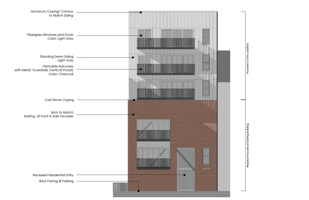
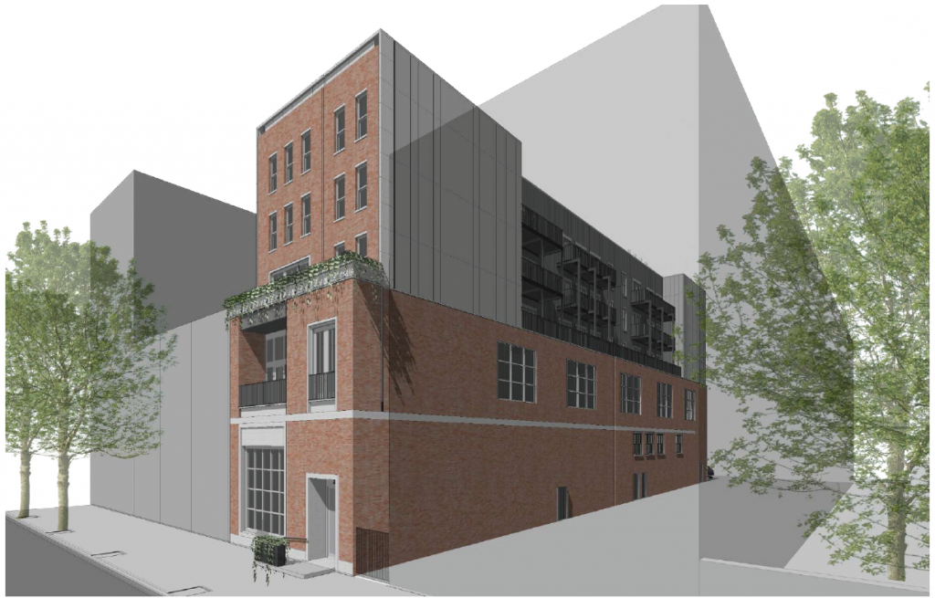
Last month, Philly YIMBY shared that permits were issued for a three-story vertical extension for an existing three-story building located at 223-25 Market Street in the Old City section of Center City. Designed by the Atrium Design Group, the new addition will roughly double the building’s current floor area to 23,685 square feet and increase the total residential unit count to 22, while maintaining the ground-floor commercial space facing Market Street. Permits list TBC LLC as the contractor and a construction cost of $3.5 million. Our original report discussed the proposal’s prior design, which was clad in dark panels that were quite out of context with the surrounding historic district. Today we look at the plan’s latest iteration, which updates the Market Street-facing exterior with red brick while swapping the side and rear paneling for light gray.
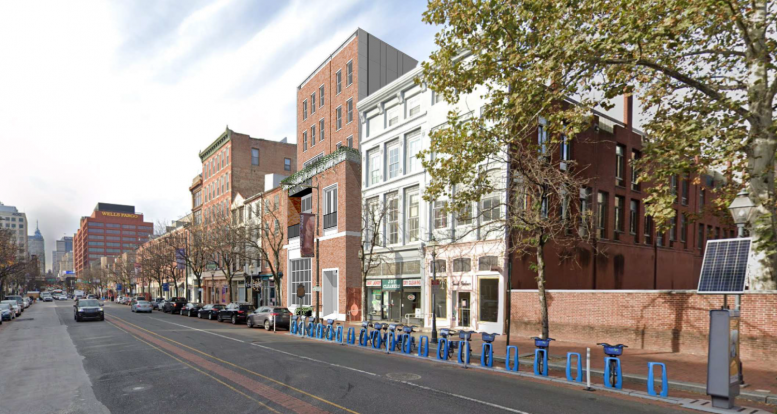
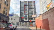
The original design’s sparse, asymmetrical Modernist design, clad in off-black panels and trimmed with black-railed balconies, stuck out like a sore thumb on a block lined with prewar buildings clad in a harmonious palette of soft red, white, green, and beige tones, a poor fit for the Old City Historic District, where the project is located.
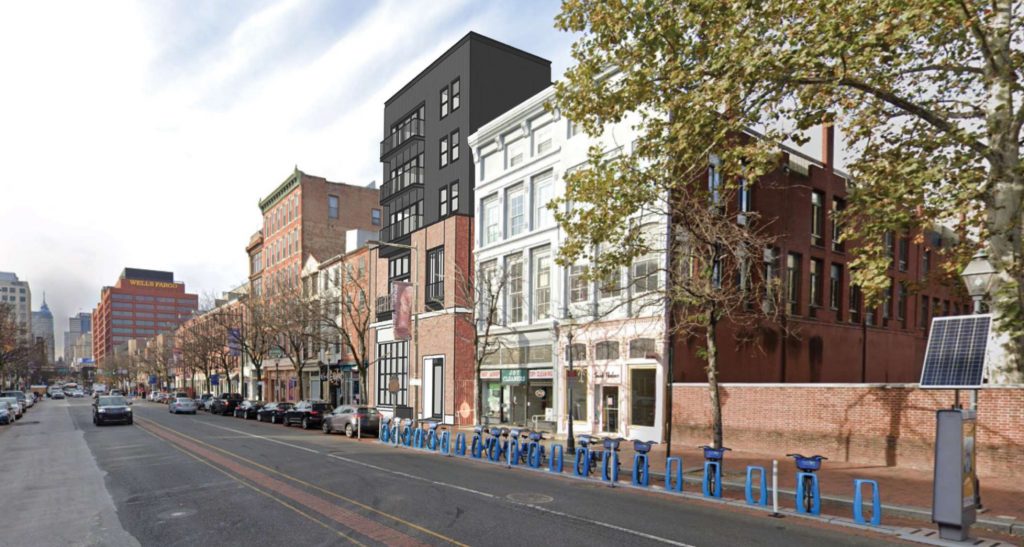
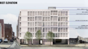
Rendering of 223-25 Market Street. Credit: Atrium Design Group.
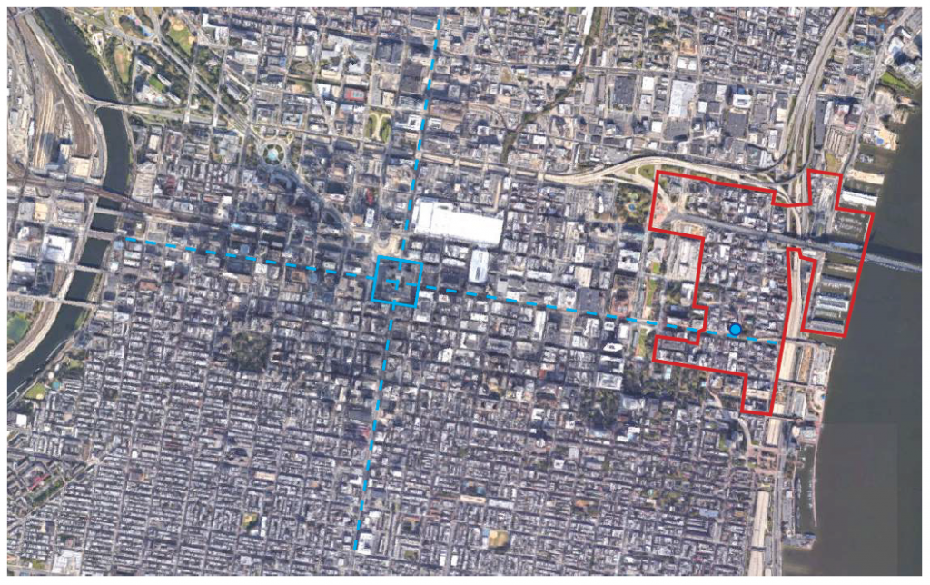
223-25 Market Street. Credit: Atrium Design Group
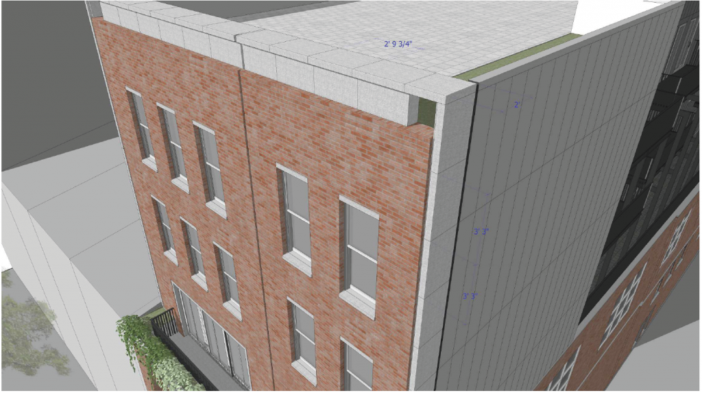
In the updated design, black metal paneling facing Market Street makes way for red brick that matches the building’s lower floors, a marked improvement over the prior version. The decision to replace balconies with more traditional sash windows, capped with cast stone sills and headers, makes the design all the more contextual. The same goes for a gentle cast stone reveal at the upper portion and a plain yet stately cast stone cornice at the parapet.
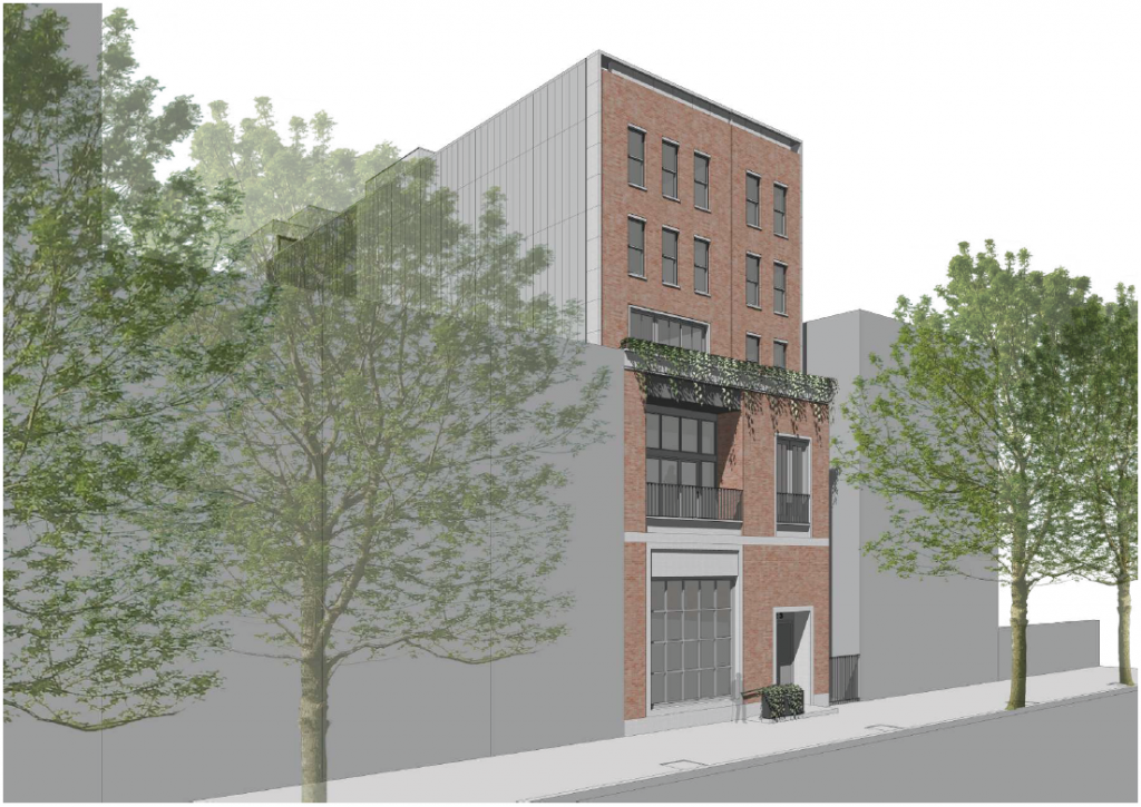
223-25 Market Street. Credit: Atrium Design Group
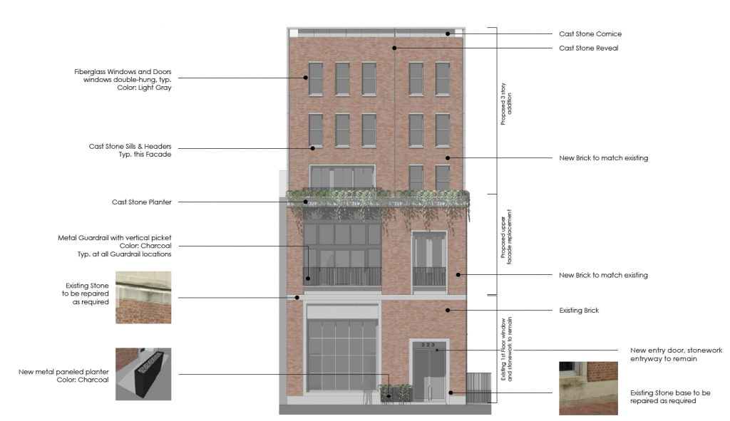
223-25 Market Street. Credit: Atrium Design Group
223-25 Market Street. Credit: Atrium Design Group
The third floor (which appears as the second when viewed from Market Street) will be renovated to harmoniously reconcile the lower and upper portions of the building. The setback above, which serves to distinguish the vertical addition from the lower portion, is made all the more delightful with a cast stone planter that appears to feature lush greenery.
A two-foot-wide cast stone edge will act as a transition between the Market Street-facing brick and the rest of the facade, which will be clad in and light gray and medium gray panels. The design update will be less obtrusive than the previous iteration, which, in its stark, all-black cladding, loomed like Darth Vader over over the surrounding buildings, many of which date to the Colonial and Post-Revolutionary eras.
223-25 Market Street. Credit: Atrium Design Group
223-25 Market Street. Credit: Atrium Design Group
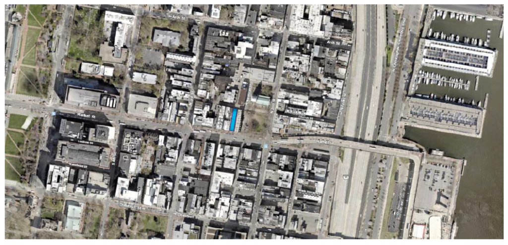
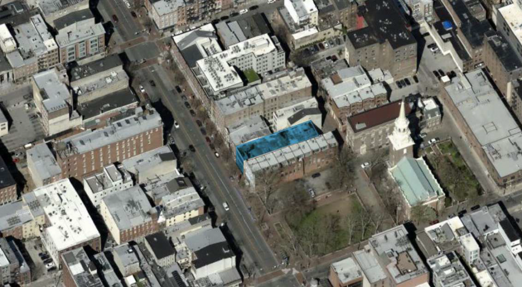
The design was all the more galling because of its near-immediate adjacency to Christ Church, a landmark that was built in 1744 and once included among its parishioners George Washington, Benjamin Franklin, and Betsy Ross.
The updated design will exude a gentler presence when seen from the church grounds and the adjacent Wilson Park, from which it will apparently be visible. However, the current design is still arguably too severe given its historically sensitive site, and would have fared better if the rest of the facades were also clad in red brick to match that of Market Street and the surrounding neighborhood.
223-25 Market Street. Credit: Atrium Design Group
223-25 Market Street. Credit: Atrium Design Group
Subscribe to YIMBY’s daily e-mail
![]()
Follow YIMBYgram for real-time photo updates
Like YIMBY on Facebook
Follow YIMBY’s Twitter for the latest in YIMBYnews

Big improvement. Not every building has to wiggle or scream……
This looks much better and more in synch with the historical buildings surrounding the area.
Its a nice looking building, i do wish it were a few stories taller and completely clad in that brick, and ideally some more artistic designs in the brick work but I’m happy they changed it to this instead of the sore thumb it was previously