In the 1920s, banks were looking for space in cities around the country as the economy boomed. In Philadelphia, multiple high-rises were under construction and in proposal stages as Center City was rapidly transforming. One of these financial institutions, the Philadelphia Savings Fund Society, was scouting the city for space for a new office building and eventually selected the site at 1200 Market Street, where the William Penn Charter School once stood. Architects George Howe and William Lescaze designed the PSFS Building, which stood as one of the most massive buildings in the skyline for decades. In this feature, Philadelphia YIMBY presents massing renderings of an early iteration of the that was drawn up in 1928.
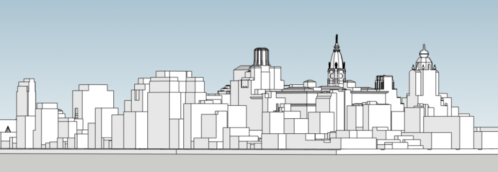
PSFS Building first iteration looking northwest. Models and image by Thomas Koloski
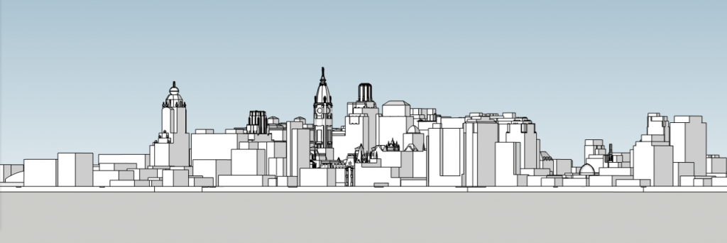
PSFS Building first iteration looking southeast. Models and image by Thomas Koloski
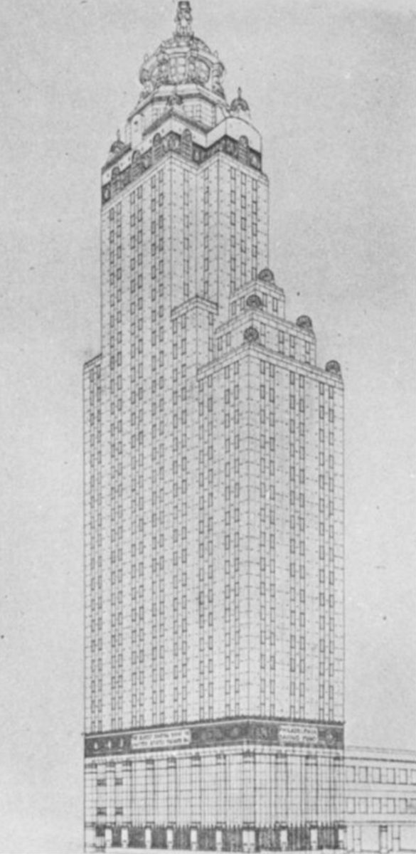
At a quick glance, the building is reminiscent of the Woolworth Building in Lower Manhattan, which was completed in 1913. The design features floor plates extending to the north, while the centered crown shifts up to the south side of the building. Above the north extension, the floorplates step up and shrink as on the top of the building, changing to an octagon to form the crown. Spherical metal decorations are all over the tower, including at the top, where a large sphere appears similar to the one atop the Daily Planet Building in the Superman comics and the extended DC Universe.

PSFS Building first iteration looking southwest. Models and image by Thomas Koloski
As seen in our massing renderings, the tower is still the most massive structure on the skyline. If built, the tower would have greatly complemented The Drake as both have curvy walls that run up to a circular top. The building would also have a more traditional feel as it is way more ornate that the current iteration. The past design would be seen from multiple angles, with the best views being from New Jersey.
Subscribe to YIMBY’s daily e-mail
![]()
Follow YIMBYgram for real-time photo updates
Like YIMBY on Facebook
Follow YIMBY’s Twitter for the latest in YIMBYnews

Isn’t this the same story published last week?
I specifically recall mentioning the characteristics of the design appears similar to the Woolworth building in Lower Manhattan.
I am grateful for the more modern design that PSFS has chosen.
No, this story is a more in depth feature along with additional massing renderings. The publication you refer to showcased images from the architects
I personally prefer the current design MUCH better. 😉
I will say that had the first iteration been used and then built, there would have been a fierce competition for office buildings to be built close by and we might have had our first shopping mall where the 1977 mall was built,. Junk omg stores would have been bulldozer for a compact site shopping mall. Existing stores would have remained within buildings built for Gimbel’s, Strawbridge & Clothier and John Wanamaker’s.
Who knows, other buildings would have been built for banks and law firms on the east side of Market Street.
TK, each of YIMBY’s four PSFS posts, including the current massing renderings, adds to our understanding of the development of one of PHL’s iconic towers. Thank you.