The majority of the skyscrapers that dominate the Philadelphia skyline are the trophy towers that were built in the late 1980s. One of these buildings is the 848-foot-tall, 58-story Two Liberty Place at 50 South 16th Street in Center City, the city’s fourth-tallest building. The skyscraper is a part of the Liberty Place complex that consists of two towers connected by a mall and a hotel. The skyscraper was designed by Helmut Jahn, who also designed buildings such as MesseTurm in Frankfurt, Germany, 50 West Street in New York City, and the Bank of America Tower in Jacksonville, Florida, among many others. The developer of the project was Rouse and Associates, which eventually transformed into Liberty Property Trust, which built both of the Comcast skyscrapers that today dominate the skyline.
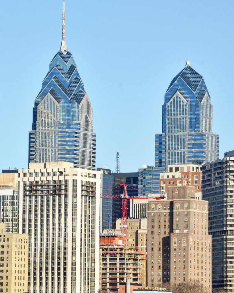
The Laurel Rittenhouse Square (center) and Liberty Place. Photo by Thomas Koloski
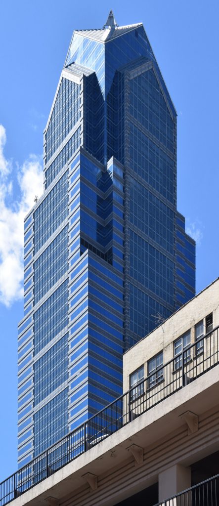
Two Liberty Place from 15th Street. Photo by Thomas Koloski
The tower was first proposed in 1984 along with a shorter One Liberty Place, but in the next year the architect revised a new iteration of Liberty Place with a 700-foot-tall Two Liberty Place. However, the anchor tenant Cigna requested more floor space in the tower, leading to a series of quirky design concepts. Eventually, the design was finalized kept the shape of the crown, but eliminate some stone cladding andprovided additional floor space within a wing extending to the north.
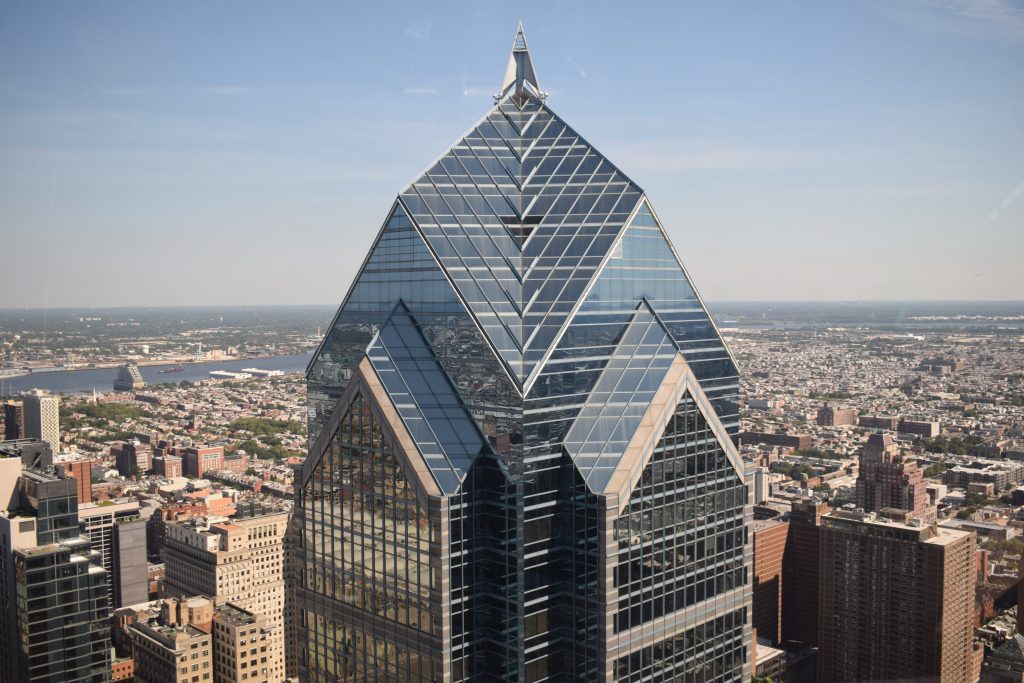
Two Liberty Place from One Liberty Place. Photo by Thomas Koloski
The groundbreaking was held in February 1988. Since the site was so large, it took some time to dig out the ground for the foundations. A crane was erected at the site by the summer, and the structure of the tower was about to rise by the end of the year. By the spring of 1989, the building was looking massive, with a chunky core rising halfway up and the imposing steel skeleton creeping its way up. The core topped out in August, while the steel and the short spire were topped in September 1989. The tower eventually opened, together with the mall, in November 1990.
Subscribe to YIMBY’s daily e-mail
Follow YIMBYgram for real-time photo updates
Like YIMBY on Facebook
Follow YIMBY’s Twitter for the latest in YIMBYnews


I often wondered when they gave additional floor space why didn’t they add floors instead of making the building wider? Was it more economical to add floor space horizontally? If floor space were added vertically how much tller would the tower be and what not?
The architects and corporate sponsors of this squat, ugly building couldn’t see beyond 20th century office logistics that dictated big wide spaces with big wide server and paper filing rooms, and big wide cubicles for big wide bodies. Lo and behold, the entire paradigm of office space shifted within not even two decades and you have a giant condo building.
The worst part of the Liberty Place complex is the terribly designed Westin Hotel. It looks like an afterthought and is a total waste of prime real estate but it’s definitely not the worst example of this happening unlike 1919 market street.
Liberty One is a 1.2 million square foot building. Liberty Two was originally planned to be 1.0 million square feet with the dinkier spire. The problem was that Cigna later came along and wanted 1.5 million square feet.
Since the developers wanted to keep Liberty One, with its spire, as the taller of the two, they decided to make Liberty Two look like Liberty One’s fat little sibling.
The high floors are wonderfully light filled, but the massive lower floors were terrible work spaces.