Construction is beginning to make progress at 36-38 South 2nd Street, site of a future mixed-use development in the Old City section of Center City. Designed by CANNOdesign, the building will stand seven stories tall, an appropriate height for Old City. Commercial space will sit on the ground floor and 61 residential units will be located above. The building will hold 51,623 square feet of space and include a roof deck. Tester Construction is the contractor behind the project. Construction costs are estimated at $10.5 million.
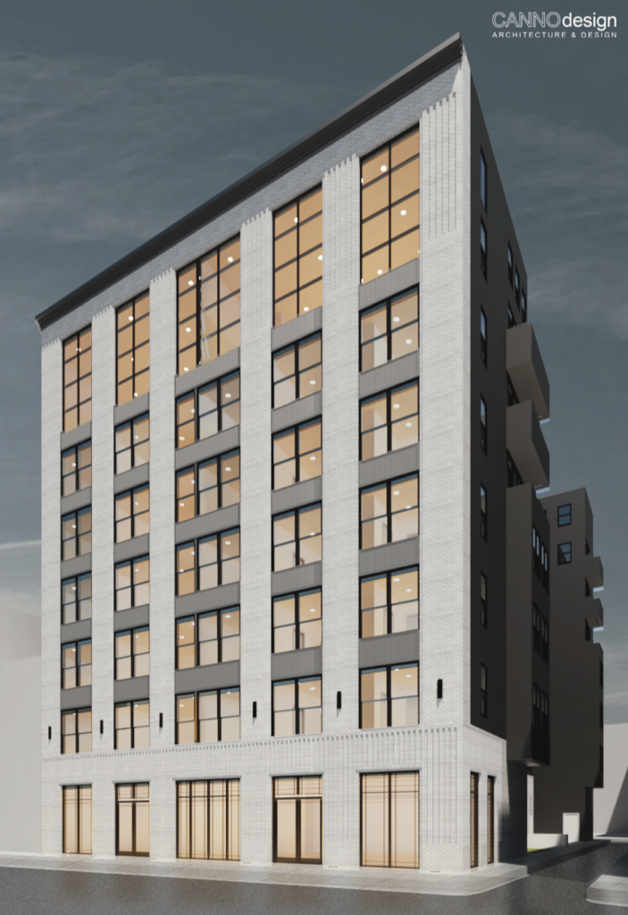
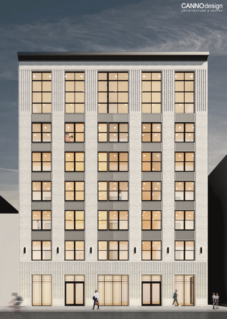
Rendering of 36-38 South 2nd Street. Credit: Canno Design.
The new building will feature a modern exterior while taking notes from its historic surroundings. White brick will cover nearly the entirety of the 2nd Street-facing wall, with multiple patterns adding detail. Floor-to-ceiling windows will help the building meet the street on the ground floor in an attractive manner, while slightly smaller windows will be situated on the upper floors. Small strips of light gray cladding will separate the floors. On the non-2nd-Street portions of the building, black paneling will be used, helping lower construction costs.
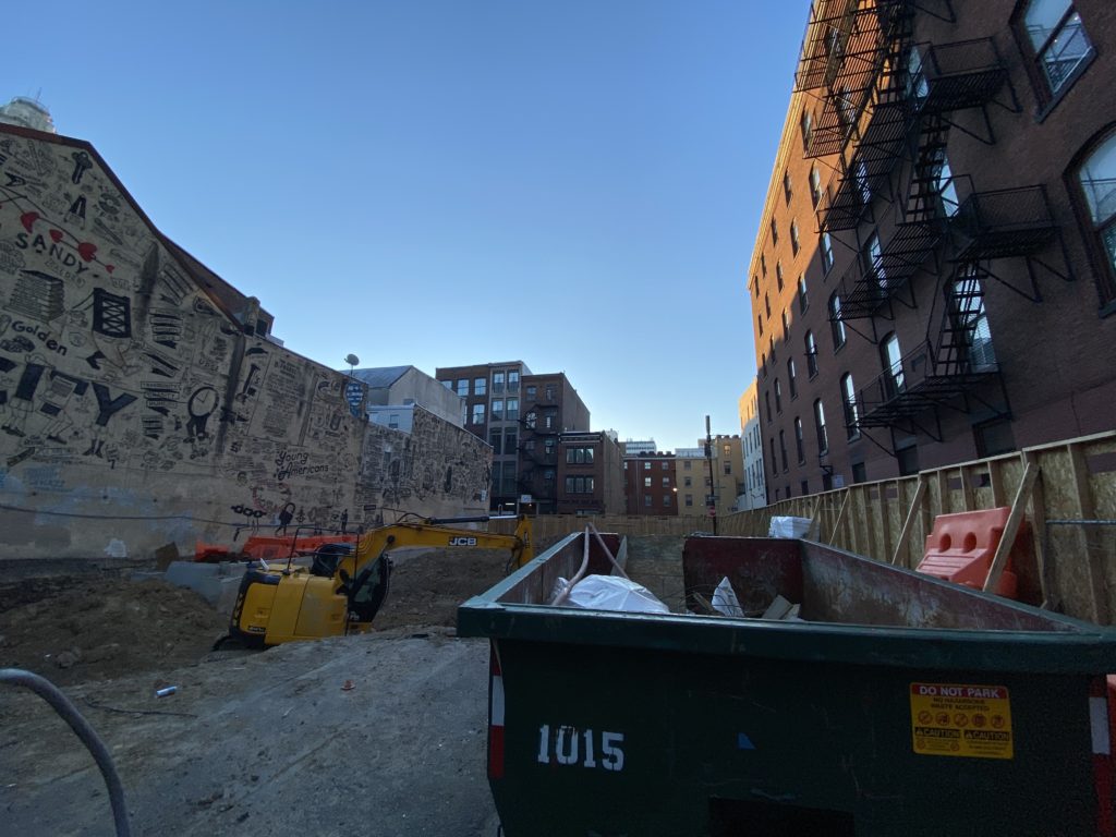
36-38 South 2nd Street. Credit: Colin LeStourgeon.
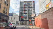
Now at the site, digging equipment can be seen, and the building’s foundation is starting to be carved out of the ground. Towards the southern section of the property, concrete can be seen, indicating that some foundation work may already be underway.
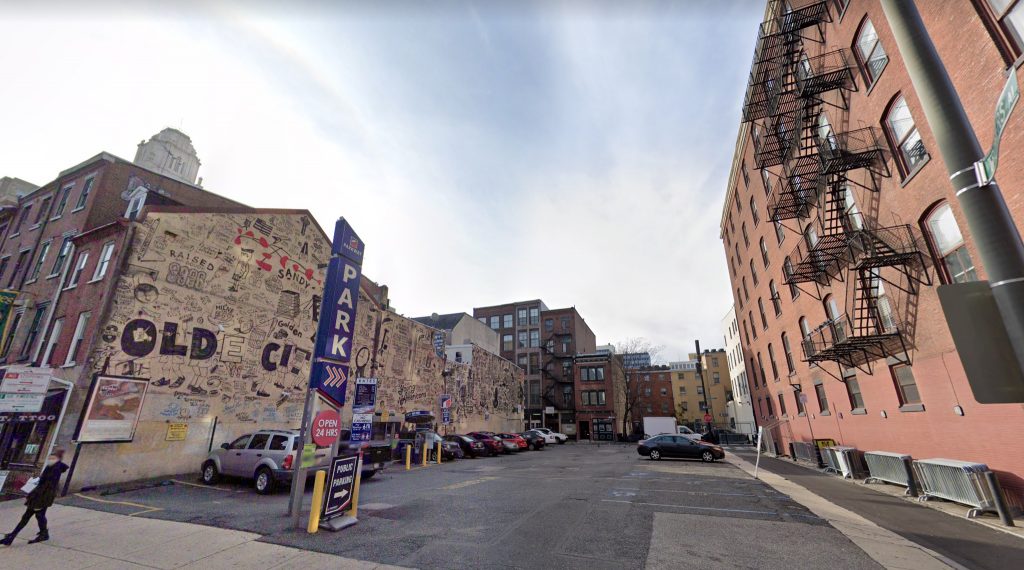
Current view of 36-38 South 2nd Street. Credit: Google.
The structure is replacing a parking lot, which spanned the site for quite some time. During the period of the city’s decline, many historic buildings throughout the surrounding area unfortunately met their demise, most for the sake of the automobile. Since that time, a surface parking lot had formed a major hole in an otherwise largely intact neighborhood. A mural painted to the south of the lot helped make the space look more attractive, although it will now be blocked by the new construction.
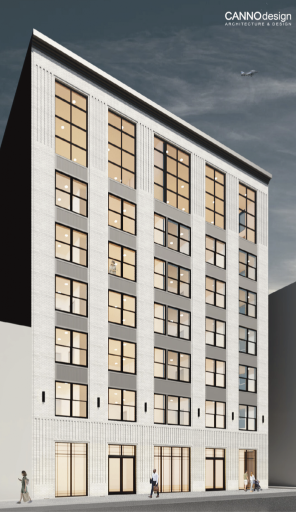
Rendering of 36-38 South 2nd Street. Credit: Canno Design.
Overall, the change of use at the site is a massive improvement, adding a large scale mixed-use building at the site of a former parking lot. The new density will support the area’s commercial offerings, while the retail space on the ground floor will contribute to the commercial district. Hopefully, more developments of this type will arrive to the few surface lots remaining in the neighborhood.
YIMBY will continue to monitor progress on the project moving forward.
Subscribe to YIMBY’s daily e-mail
![]()
Follow YIMBYgram for real-time photo updates
Like YIMBY on Facebook
Follow YIMBY’s Twitter for the latest in YIMBYnews

The only thing that is awful about this building is it’s design. It should be using the traditional red brick instead of white. I’m not sure why the historical commission approved this.
The building to the right just over Trotters Alley also has a white stone front so as long as it’s not overly bright white it might not look that bad.
…and the store front. why does the frame of windows go to the ground….and not to a raised base? no marker of the entrance, silly lights as building decoration. It’s really not that hard to design a simple facade well, or perhaps it is.
I agree about the windows. A bad design choice for the area
There’s just a tad bit of overreacting in these comments…
Do you think? I think there is a bit of under reacting to lazy design……