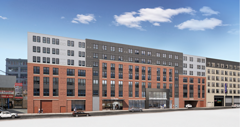
A recent site visit by Philly YIMBY has observed that construction work is nearly complete at a seven-story, 181-unit rental building at 1306-14 Callowhill Street in Callowhill, Lower North Philadelphia. Designed by Bernardon, the development spans 184,679 square feet and will feature 3,208 square feet of retail as well as 51 parking spaces. Permits specify a construction cost of $18 million.
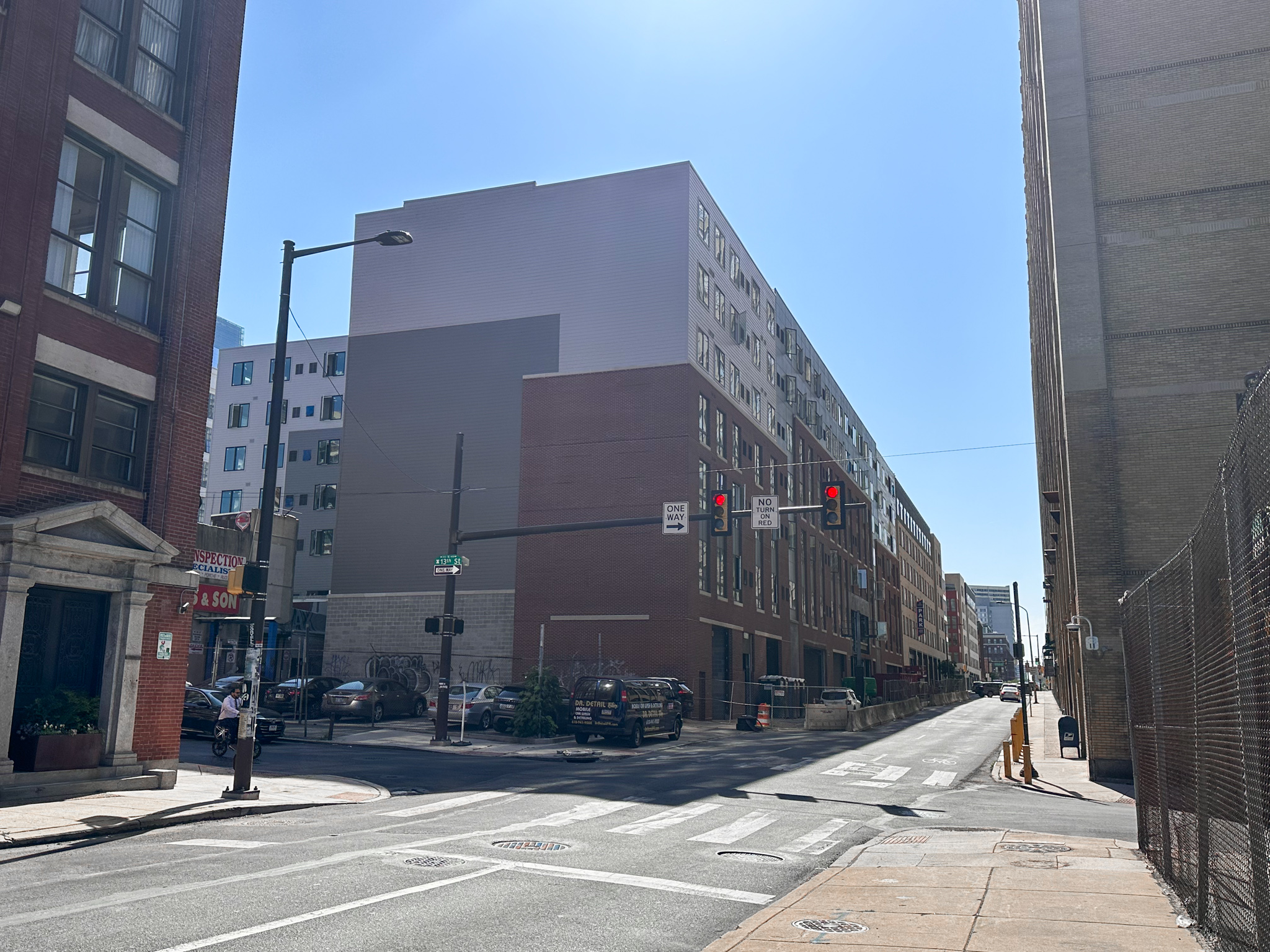
1306-14 Callowhill Street. Photo by Jamie Meller. May 2023
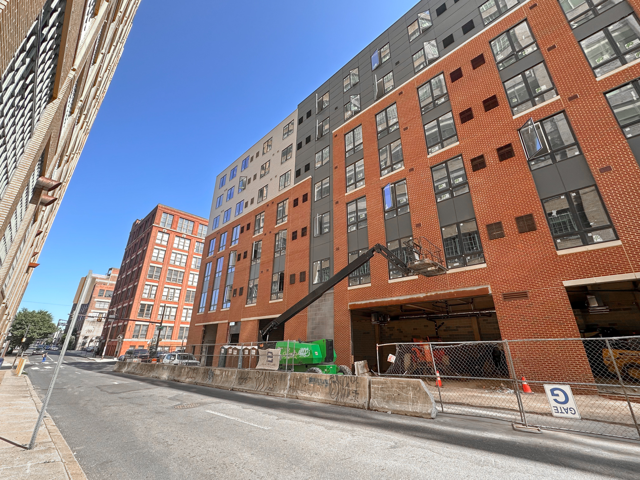
1306-14 Callowhill Street. Photo by Jamie Meller. May 2023
When YIMBY last visited the site in January, the structure stood largely complete, with windows installed, although facade work had not yet begun. In the four months since, exterior finishes have wrapped the structure entirely. For the most part, construction work remains apparent only on the lower floor and in the interior.
The building’s imposing form, massed as a relatively tall yet ultimately squat, horizontal-oriented structure, makes for a proper fit for a street lined with hulking prewar factory lofts. The structure’s lower floors pay architectural homage to said lofts via extensive use of red brick on the lower floors, though, curiously, the facade treatment makes way for conventional horizontal siding on the upper levels. The brick veneer sections stop at different height levels and are further broken up horizontally with vertical siding bands, in what appears to be an attempt to style the broad structure as several shorter, smaller edifices.
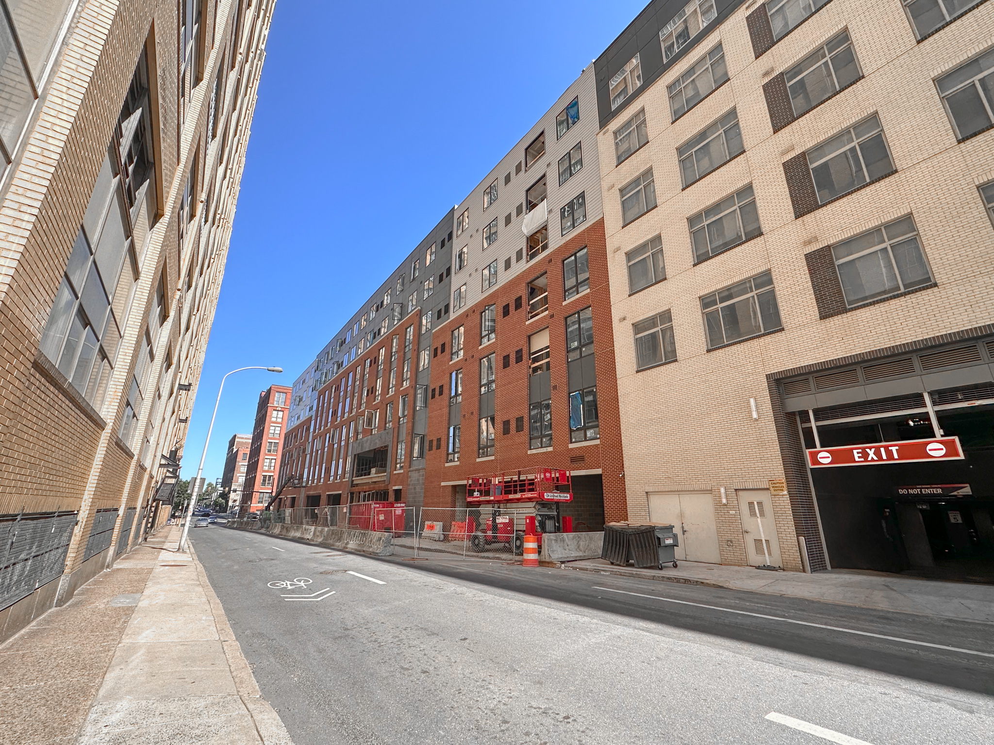
1306-14 Callowhill Street. Photo by Jamie Meller. May 2023
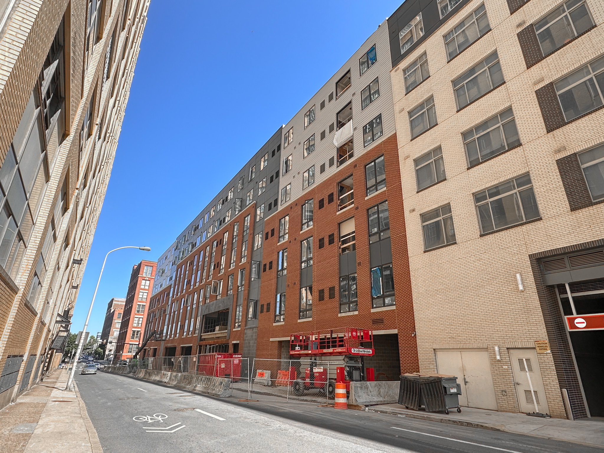
1306-14 Callowhill Street. Photo by Jamie Meller. May 2023
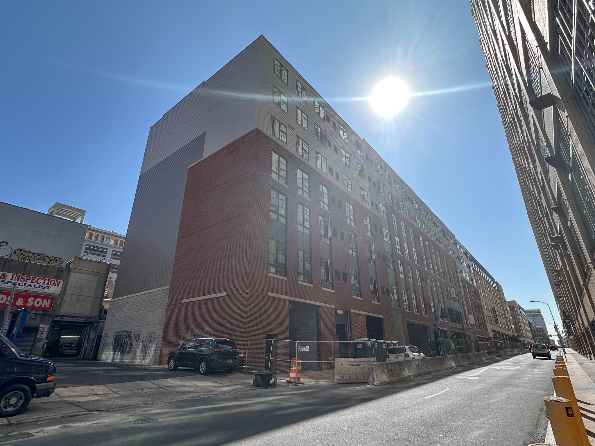
1306-14 Callowhill Street. Photo by Jamie Meller. May 2023
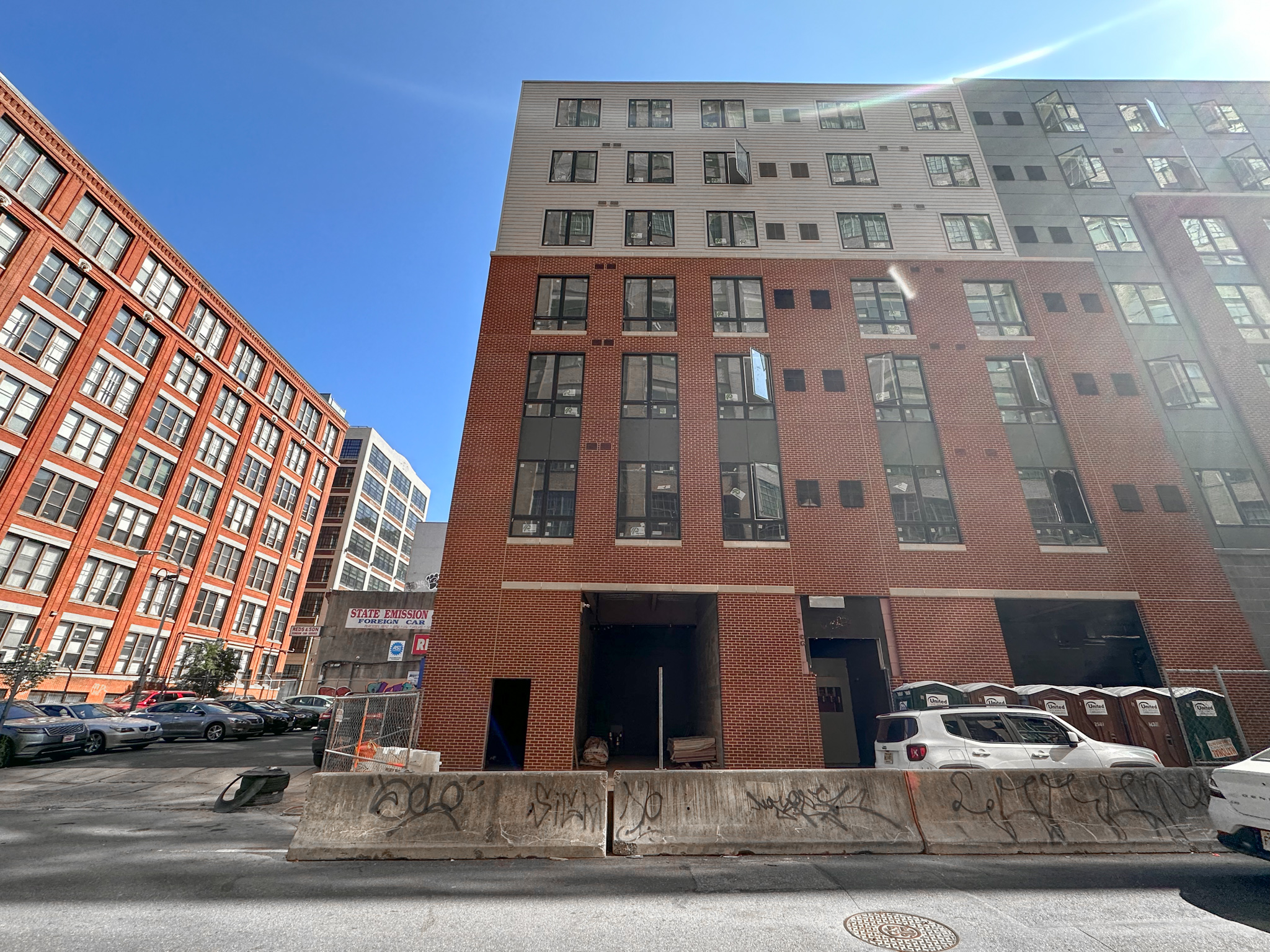
1306-14 Callowhill Street. Photo by Jamie Meller. May 2023
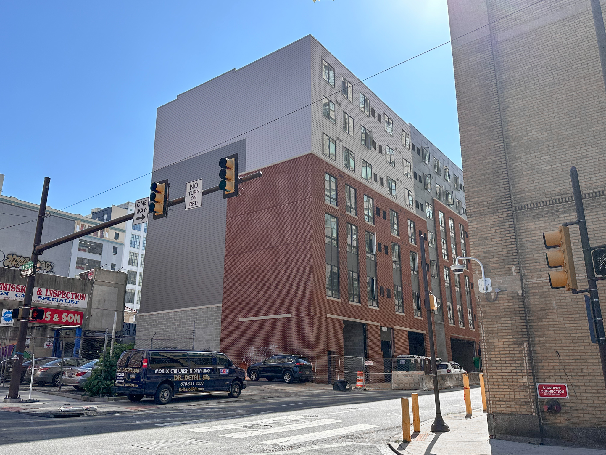
1306-14 Callowhill Street. Photo by Jamie Meller. May 2023
In keeping with basic urban planning principles (if not with the city’s woefully outdated and restrictive planning code), the massive, centrally located site, situated just two short blocks to the northeast of the Race-Vine Station on the Broad Street Line, ought to have supported a much larger (and quite likely taller) building with many more residential units, which would had made a further impact on relieving the city’s dire housing shortage. However, even at its present scale, 1306-14 Callowhill Street is a welcome addition to the neighborhood.
Given the current pace of construction, we anticipate 1306-14 Callowhill Street to be completed well before the end of the year.
Subscribe to YIMBY’s daily e-mail
![]()
Follow YIMBYgram for real-time photo updates
Like YIMBY on Facebook
Follow YIMBY’s Twitter for the latest in YIMBYnews

¡Hola! Me llamo Laura y estoy encantada de saludarte.
Quería escribirte porque me ha parecido interesante comentar contigo la posibilidad de que tu negocio aparezca cada mes en *periódicos digitales como noticia* para posicionar en los primeros lugares de internet, es decir, con artículos reales dentro del periódico que no se marcan como publicidad y que no se borran.
La noticia es publicada por más de sesenta periódicos de gran autoridad para mejorar el *posicionamiento de tu web* y la reputación.
¿Podrías facilitarme un teléfono para ofrecerte *hasta dos meses gratuitos*?
Gracias
I’m sorry, where is this located? Vancouver? Suburban Detroit? Anyone for Berlin? Melbourne?
While I’m pleased to see new construction, this is still “canned housing”. I would not go out of my way to see this or most recent buildings in the city. Nothing to catch and delight the eye.
FRANK FURNESS-WHERE ARE YOU?
we are barely able to afford this crap…you want million dollar apartments everywhere?
A little imagination can go a long way. Take a look at the brickwork on the working-class row houses on the 2200 block of N. Van Pelt and compare them with most of the recently built ultra expensive bland townhouses in C.C. Doesn’t need to cost a million dollars, just architects willing to take the time and effort.
You’re right…it doesnt cost 1 million…but much closer to a million than this design. Margins are much much lower than you think. The block you are referenced was done with near-slave labor wages, at a time when there was nearly no regulation whatsoever and where you dindt have to hunt for cheap deals. There’s a reason why europeans make half as much and pay twice as much for their housing…its the architecture you admire
A connoisseur of the Quonset hut are we?
Regardless of the development at hand, I 1000% agree that we need a Frank Furness revival. If nothing else, we should see reconstruction of his demolished buildings (of which there are far too many), even if they’re not rebuilt at their original locations or with their original purposes; honestly, I’d be happy even with a faithful facade recreation, even if the interiors are all different. Wishful thinking, I know, but it’s definitely not impossible, especially with modern tech such as machine-programmed stone cutting and 3D printing, among others.
It would go a long way just to finish the entire facade in brick instead of the cheap as hell looking styrofoam stucco cutouts. I’ll be so glad when this architectural trend goes tits up.
That is all this building needs. If the front facade were all brick, then it’s perfectly fine infill.
Why are u building this??
Having looked out on that empty lot for a number of years before the buildings on the SE and SW corners of Broad and Callowhill went up, personally I think the design is fine. If you read the article, the specifically didn’t do all brick to break it up. That’s not a very wide street right there and it went from being completely open to a tunnel. It looks like it belongs with Beaux Arts at 1238 Callowhill and even the poorly maintained Wolf Building. Although, one of the things I love most about this city is the variety of architectural styles that can often be in one block. As much as I love Paris, Haussman made it somewhat bland when it comes to architecture.