In the past month, YIMBY has posted multiple publications on the PSFS Building and its history. The building stands at 1200 Market Street in Market East, Center City, with a height of 491 feet that dominates the local skyline even now, and did even more so when it was recently built. The tower was designed by George Howe and William Lescaze, who drew up several designs of the building prior to construction. In this feature, Philadelphia YIMBY shares the fourth iteration of the PSFS Building, which also had a physical model built.
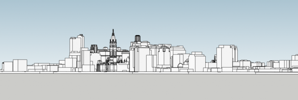
PSFS Building fourth iteration looking southeast. Models and image by Thomas Koloski

PSFS Building fourth iteration looking southwest. Models and image by Thomas Koloski
If we track down visuals for the third iteration, which also allegedly exists, Philadelphia YIMBY will happily share the design. The fourth iteration of the tower strongly resembles the current building that stands at site. Each floor has a T-shape similar to the structure that stands today. The design also appears to feature a board room in the same spot as the current one, but it is possible that another room or an extension was planned to stretch all the way to the west face. The stone cladding would have likely been executed in lighter shades, as well, with the pattern continuing on the southeast side. The design would have also included a smaller PSFS signage at the top, though facing north and south instead of east and west as it does today.
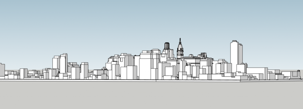
PSFS Building fourth iteration looking northwest. Models and image by Thomas Koloski
This version of the building noticeably features much more mass than the previous two iterations. The stepped structure on the south side had been extended into a rectangular form, adding floor space and visual strength to the building. The addition of the three stories above the roof on the south side of the building also create greater mass in the buildings design. The building would have appeared much like the current structure.
Subscribe to YIMBY’s daily e-mail
Follow YIMBYgram for real-time photo updates
Like YIMBY on Facebook
Follow YIMBY’s Twitter for the latest in YIMBYnews

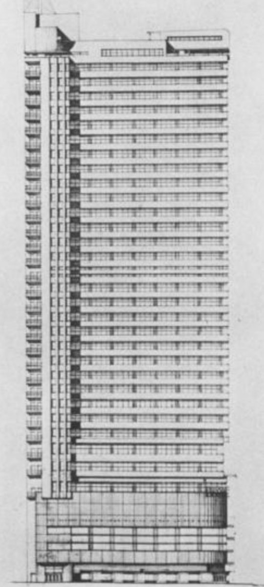

This is a much better design than the others in the series.
The iconic sign for the Philadelphia Savings Fund Society is as iconic as the PNB, CP and the ARAMARK signs that were previously seen on the Philadelphia skyline.
But when iconic signs were removed, those affected buildings just look wrong.