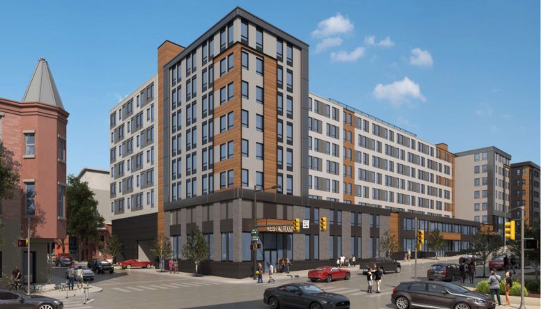
Renderings have been revealed for a 275-unit mixed-use development planned at 4301 Chestnut Street in Spruce Hill, West Philadelphia. Designed by JKRP Architects, the building will rise seven stories tall and feature 30,300 square feet of retail space on the ground floor. The residential space will total 147,562 square feet. Amenity space on the second floor will span 3,278 square feet, with 7,895 square feet of common space on the ground floor. A 6,055-square-foot roof deck will be located at the top of the building. An underground garage will hold 75 parking spaces, with two expected to be handicap accessible, one set to be van accessible, four for electric vehicles, and two reserved for interior loading spaces.
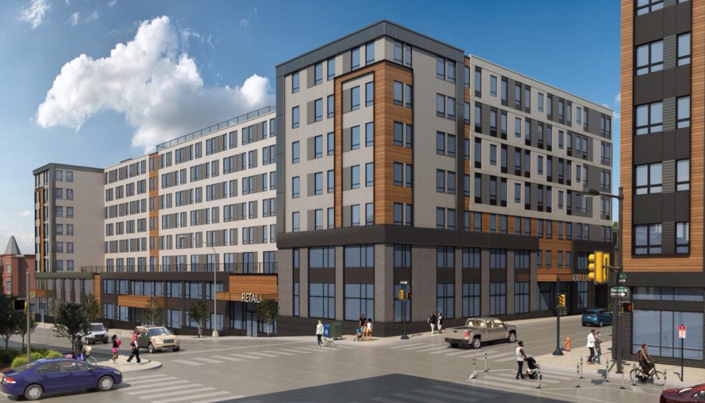
Rendering of 4301 Chestnut Street. Credit: JKRP Architects.
The building will feature a modern exterior with light gray cladding used as the primary exterior material, and darker gray also situated in certain locations. Wood-styled cladding will act as an accent and add an extra element to the building’s design. Floor-to-ceiling windows will make for a pleasant street presence, further enhanced with street trees.
The new building will replace a strip mall surrounded by a sizable parking lot. The structure stands one-story tall and features a bare exterior comprised of low-quality cladding and stucco. The building is makes for a horrible use of the prominent location, with automobiles consuming a large portion of the block.
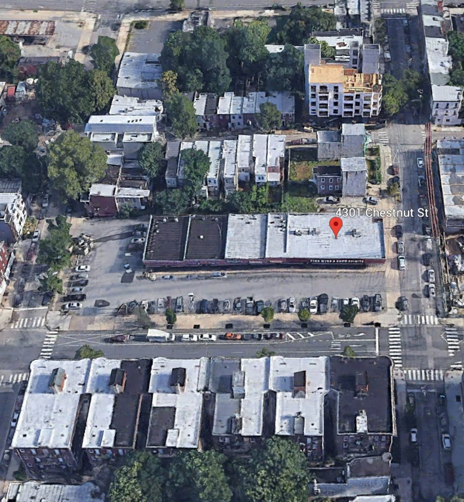
Aerial view of 4301 Chestnut Street. Credit: Google.
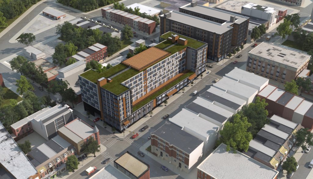
Rendering of 4301 Chestnut Street. Credit: JKRP Architects.
The new building will offer a much better use of the site, adding high residential density to the site while also preserving retail, although we would like to see further refinements to the design.
JKRP Architects also worked on a mixed-use building across the street, which is now largely complete. The project, dubbed Next LVL, also rises seven stories tall, with retail space in the ground floor, and 281 residential units situated above. Between these two projects and many others in the vicinity, thousands of residential units will be added to the surrounding area.
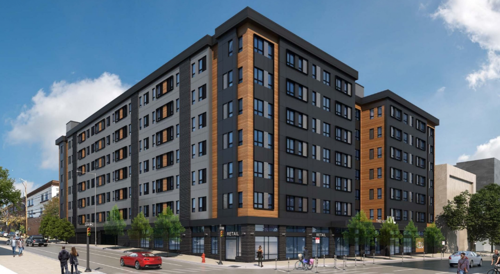
Rendering of Next LVL. Credit: JKRP Architects.
Philly YIMBY will continue to track the development’s progress.
Subscribe to YIMBY’s daily e-mail
Follow YIMBYgram for real-time photo updates
Like YIMBY on Facebook
Follow YIMBY’s Twitter for the latest in YIMBYnews

The strip mall was bad, but there were a lot of decent businesses there. Let’s hope they can move into other spots in the neighborhood or even in this building.
The address can and should handle a lot of apartments. The materials are awful, yet again. Someone will call me a NIMBY for not accepting every medium to high density development at face value… We deserve quality materials that are made to last, not panels that will fall off in ten to fifteen years.
JKRP is the absolute worst for this. They all look like this, and the worst is the one for Broad and Spring Garden being built now
Kilimanjaro Cafe is going to be relocated to the new building (not sure what will happen during construction though). The Fine Wine & Good Spirits store in the strip mall should be moving to the Next Lvl building next door. The other businesses are SOL, which is unfortunate.
Alterra has imposed a new neighborhood character on the community with these two buildings, that is a shame because they are quite ugly and use too many materials. It would have been better if they used the cost savings of employing modular construction to having a brick facade for the entire building. Also, what’s with all the black and gray color palate? Earth tones and red brick colors would have made more sense to blend with the surrounding neighborhood.