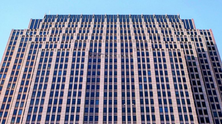
In the 1980s, new skyscraper proposals surged after the proposed Liberty Place project was poised to break the 548-foot height limit established by the tower of City Hall. Five of the proposals now stand in the skyline, which include the 739-foot-tall Bell Atlantic Tower at 1717 Arch Street in Logan Square, Center City. Designed by Kling Lindquist, the setbacks of the 55-story skyscraper were partially inspired by structures such as the Empire State Building and One Liberty Place, which itself is similar to the Chrysler Building. Brandywine Realty Trust has owned the skyscraper since 2010, and is now officially known as Three Logan Square. Today Philly YIMBY looks at the alternate designs that were once considered for the structure.
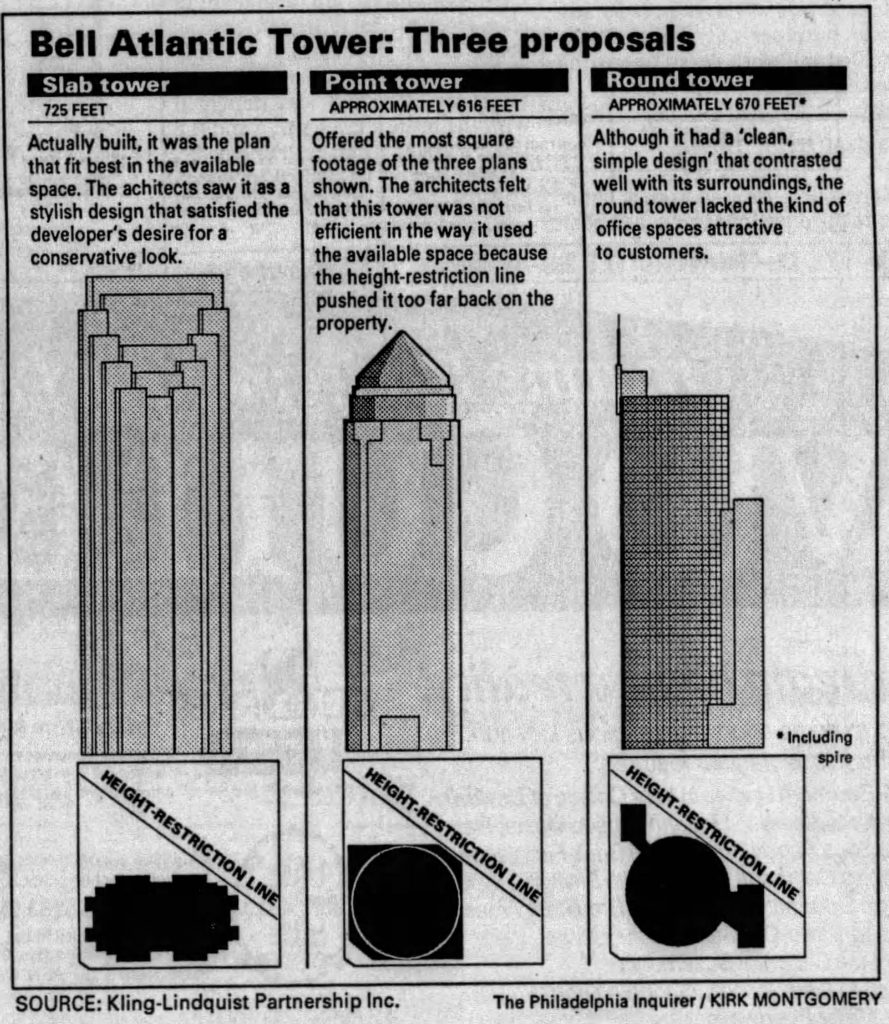
Conceptual drawings of the Bell Atlantic Tower. Image via The Philadelphia Inquirer
While One Liberty Place and One Commerce Square were under construction, an announcement was made on January 6, 1987 that Bell Atlantic was planning to have a skyscraper built in Center City, with over one million more square feet as One Liberty Place. A site was selected three blocks to the north and one block to the west of One Liberty Place, leaving a large distance between the two structures. A collection of smaller buildings rising a few stories tall previously stood at the site.
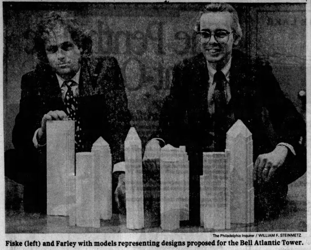
Conceptual models of the Bell Atlantic Tower. Image via The Philadelphia Inquirer
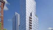
A series of designs were considered before the selection of final tower. Some had angled tops to match Liberty Place and Mellon Bank Center, while others were wildly different. A circular 670-foot-tall tower with a spire on the top of the west side was considered, as well as a pointed tower that was planned to stand 616 feet tall and was designed with a pointed top along with a mostly curved exterior, with setbacks before the crown. At last, the most efficient design is the one we see standing today, and the architects themselves apparently thought it was the most stylish choice out of all of the other options.
Subscribe to YIMBY’s daily e-mail
Follow YIMBYgram for real-time photo updates
Like YIMBY on Facebook
Follow YIMBY’s Twitter for the latest in YIMBYnews


My favorite of the height breakers. I’m glad they went with that design. Plus it was taller. That 3rd one is similar to ComcastII. Too bad they couldn’t build all of those models pictured.
That is a very handsome building with art deco design. It gives a good contrast with its reddish brickwork. I thought Comcast would bu the building for its long rumored third building as they rented space there pending construction completion of its second buikding,
This is also my favorite from the eighties generation. I feel this tower never gets the attention that it fully deserves.
I really enjoyed this article because I watch much of Philadelphia’s skyscraper development over the last 50 years but I never knew about these alternate designs. Glad they went with the slab model.
Worked on the 38th floor in this building in the mid 90’s and during storms and on windy days the elevator would tap the walls because the building mildly swayed.