Center City West is seeing a surge in construction, where one of the more notable developments is an overbuild proposed at 2300-24 Market Street. The original iteration was designed by Tantillo Architecture, with Lubert-Adler as the developer. The architect behind the latest design is KieranTimberlake, and Breakthrough Properties is the developer. The building was originally planned at 202 feet and 14 stories tall, but now the plans show a slightly shorter, nine-story structure. In a city meeting, four slides were presented showcasing diagrams and three new renderings of the new, distinctive design.
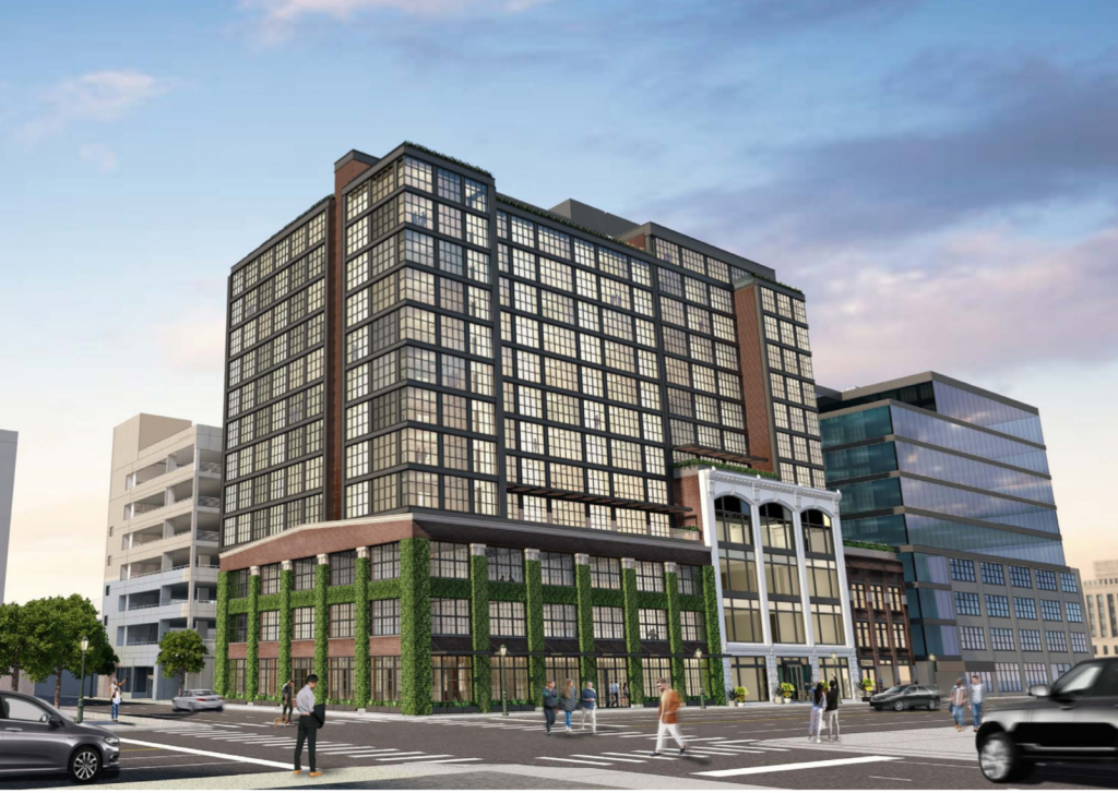
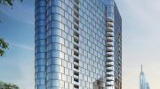
Rendering of the tower via Tantillo Architecture.
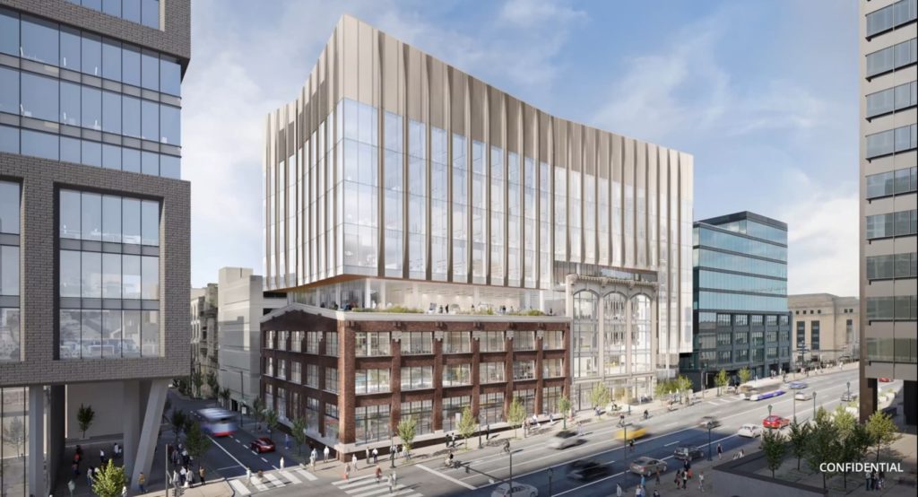
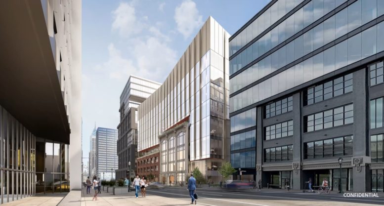
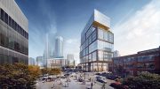
2300-24 Market Street looking southwest. Image via Breakthrough Properties and KieranTimberlake
The first proposal was revealed in March 2021, when reports went out along with a Civic Design Review submission. The building was shown sandwiched between 2222 Market Street and 2400 Market Street, and boasted more height and mass than the current iteration. The structures on the block are planned to be preserved, but the property on the east side of the block would have additional greenery on the exterior. The shape of the building seemed arbitrary, where the exterior was a dark shade of stone cladding above brighter and older buildings. Also planned was amenity space on top of two existing structures.
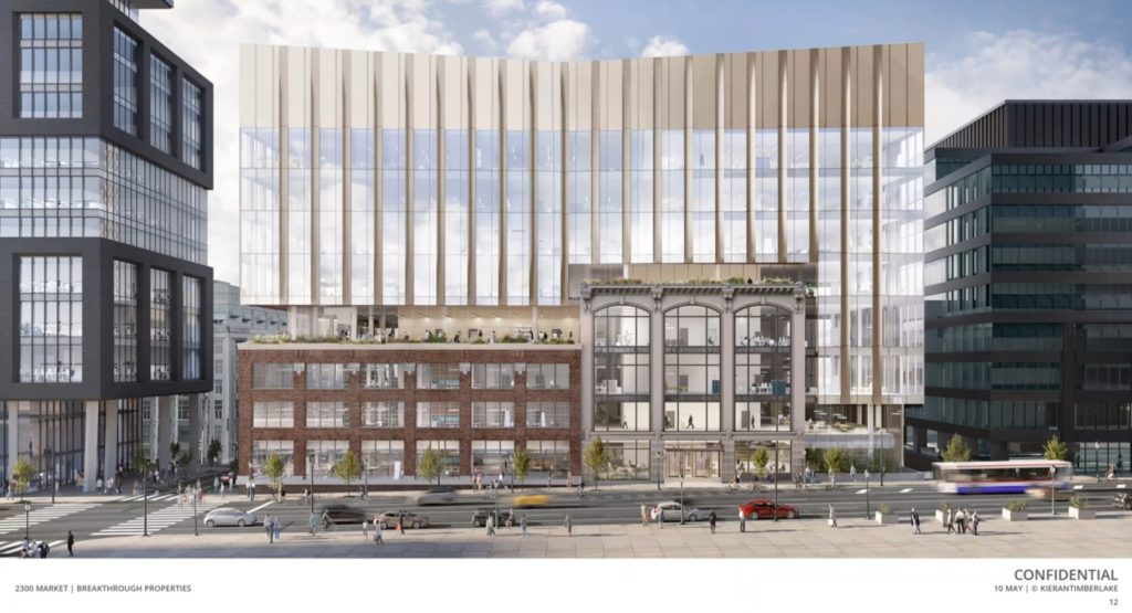
2300-24 Market Street looking south. Image via Breakthrough Properties and KieranTimberlake
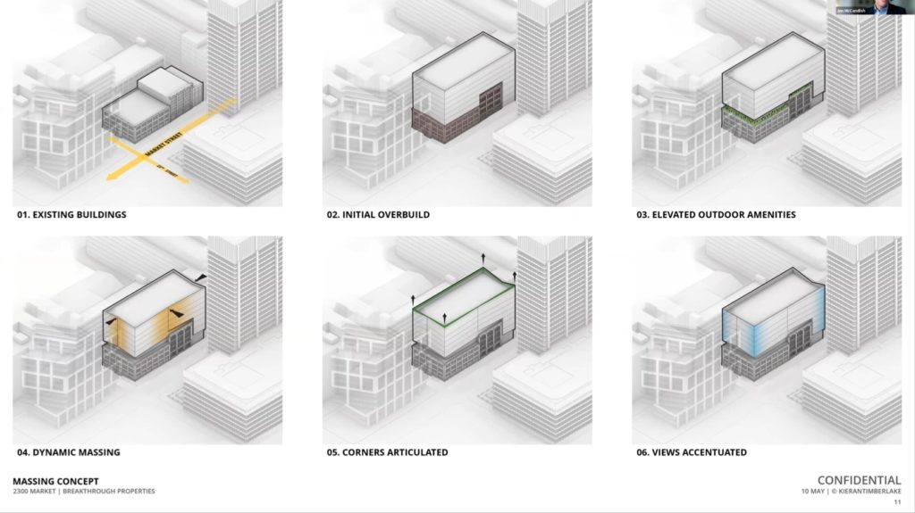
2300-24 Market Street massing diagrams. Image via Breakthrough Properties and KieranTimberlake
The latest diagrams and renderings show a completely different design than what was shown last year, providing a more fitting and modern approach. Though the height is shortened, the change shows significant improvement with a simple yet striking design. From street level and above the existing properties, the north and south faces are angled inward while the east and west faces angle in different locations. The crown features all four corners extended upward, leaving the inward angles at a lower elevation for a cutting-edge pinnacle. The exterior will feature multiple vertical additions from the ground level to the top, as well as glass with a bright tone that will greatly contrast with the PECO Building across the street.
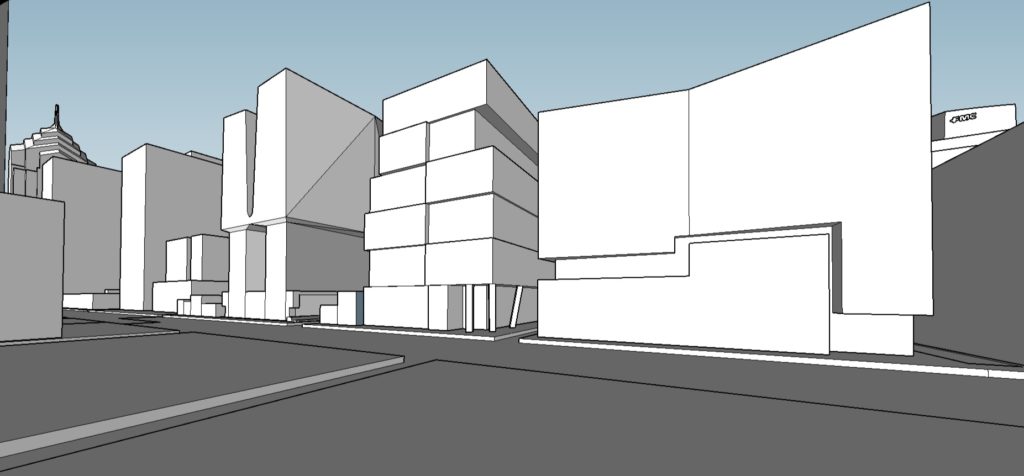
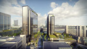
21M, 2222 Market Street, and 2300-24 Market Street. Image and model by Thomas Koloski
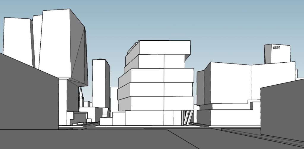
21M, 2222 Market Street, and 2300-24 Market Street from John F. Kennedy Boulevard. Image and model by Thomas Koloski
The building will be complete in the second half of 2024.
Subscribe to YIMBY’s daily e-mail
Follow YIMBYgram for real-time photo updates
Like YIMBY on Facebook
Follow YIMBY’s Twitter for the latest in YIMBYnews

That over build is horrible.
WE NEED SOME “HEIGHT” IN THIS AREA!
Why are they building a shortened version of what was originally planned. Was it the banks on financing the construction who designed how high it could be built or was it opposition by others?
Will this be some office or lab space? The last iteration was planned to be residential.
I like the new iteration.
It’s how an apparition floating over the historic buildings without weight by lightness of color and inflection. Yet it connects the flanking modern buildings by its pure form without replicating them; it’s verticality provides much interesting juxtaposition.
The renderings also appear to show Market and 23rd St lowered slightly? And adjacent parking garage on 23rd appears to be slightly shorter too.
This is BARF…………
KT can do much better!
they should tear down all the old, and start over with a clean NEW building
they should tear down all the old, and start over with a clean NEW building, built by Tantillo Architects
Tantillo’s design absorbs the existing façade MUCH better. Sorry KT, too modern and stark!