Updated plans have recently been released for Two Cathedral Square, a 470-foot-tall, 34-story mixed-use commercial and residential tower planned at 227 North 18th Street in Logan Square. Designed by Solomon Cordwell Buenz and developed by EQT Exeter, with Studio Bryan Hanes handling landscape design, the 700,000-square-foot-plus building is the largest component of Cathedral Square, a redevelopment master plan for the block-sized archdiocesan campus centered on the iconic Cathedral Basilica of Saints Peter and Paul. Today YIMBY takes a closer look at the most recent iteration of Center City’s latest trophy tower.
The building will offer 450,000 square feet of office space on floors two through 14. Luxury residential space will span 250,000 square feet on floors 15 through 34. The ground level will feature 4,500 square feet of retail. The development will also include parking for 200 cars as well as a bicycle storage room. The building will be serviced by eight office elevators, two residential elevators, a freight elevator, and a swing passenger-freight elevator within the residential component.
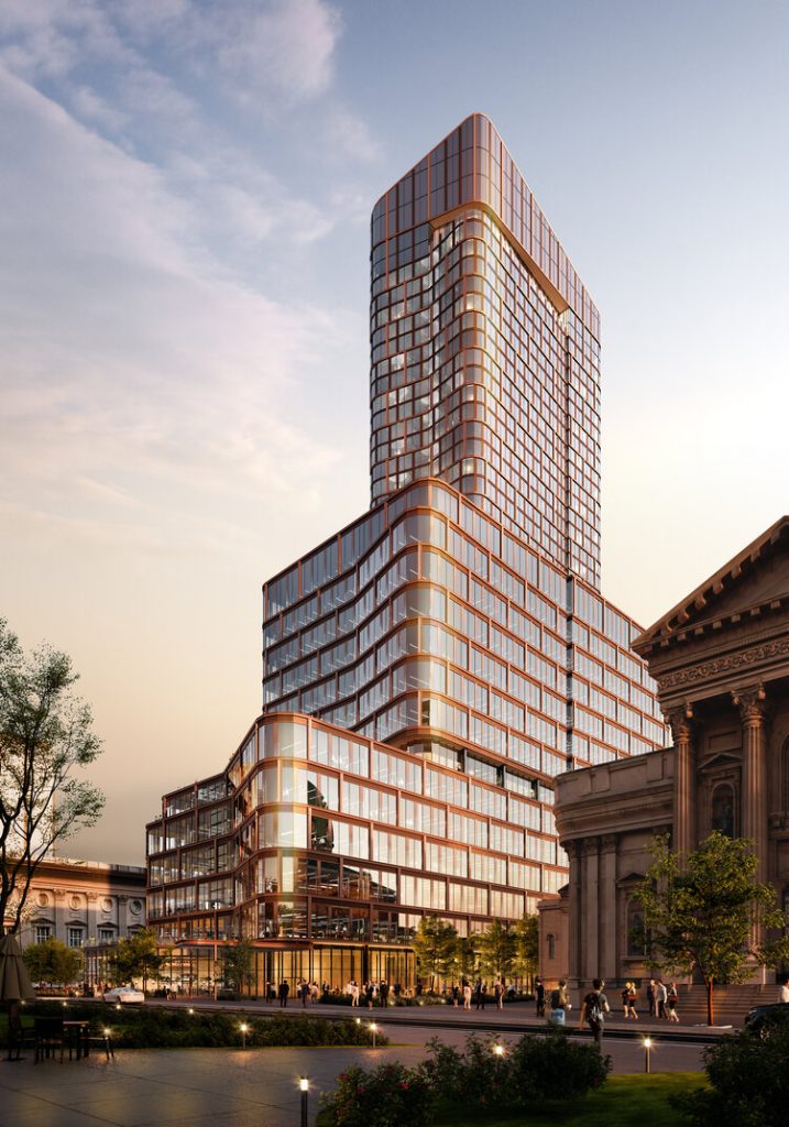
Two Cathedral Square at 227 North 18th Street. Credit: Solomon Cordwell Buenz
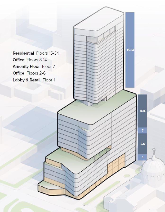
Two Cathedral Square at 227 North 18th Street. Credit: JLL and Solomon Cordwell Buenz
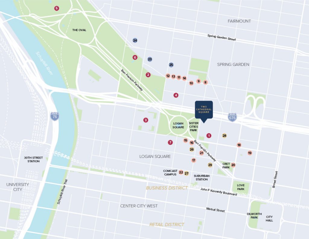
Two Cathedral Square at 227 North 18th Street. Credit: JLL
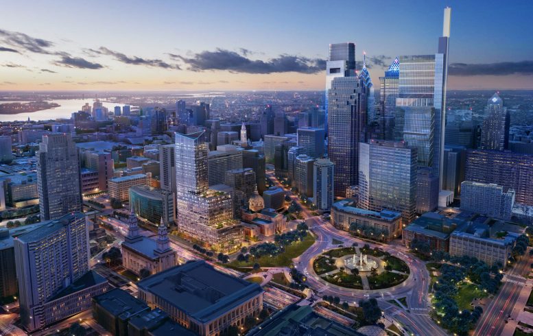
The structure will take up roughly the northern third of the superblock bound by Race Street to the south, Vine Street to the north, North 17th Street to the east, and North 18th Street to the west, and situated a block east of Logan Circle. The building’s previous, conceptual iteration was tentatively known as Cathedral Square Phase Two (and Cathedral Place Phase Two prior to that), and was listed under the address of 1700 Vine Street.
Cathedral Square comprises a thorough redevelopment of the archdiocesan campus, which is centered upon the cathedral, which was completed in 1864. Although the cathedral is a landmark listed on the National Register of Historic Places, its fenced-in, parking-dominated, anti-urban campus left much to be desired, and its redevelopment will bring much-needed improvements to the site. One Cathedral Square is a 23-story, 273-unit residential tower that is already under construction at 222 North 17th Street at the southeastern corner of the superblock. A landscaped public space called Cathedral Plaza will sit mid-block at the eastern side of the site between the Cathedral and the two new high-rises.
Two Cathedral Square will offer a vast improvement over the site’s current condition, replacing a fenced-in, pedestrian-unfriendly parcel consisting primarily of a large parking lot, as well as a four-story building of the Holy Family Center and an adjacent green space that was off-limits to the general public.
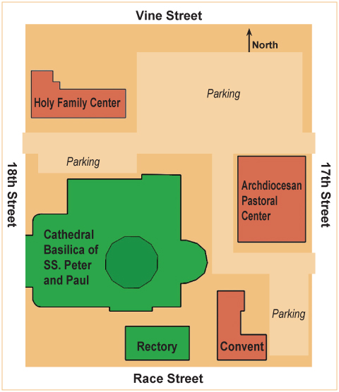
Archdiocesan campus block map. Credit: Barbara Hagan via Catholic Philly
Despite its bulky scale, the proposed building’s sensitive siting and massing ensure that it neither overwhelms the adjacent landmark church nor overshadows any of the stained-glass windows that illuminate its spectacular Renaissance interior. The tower recedes in a series of graceful, curving setbacks from its main entrance at North 18th Street.
The first setbacks is sited above the sixth floor, roughly halfway up the office portion of the skyscraper. The next setback occurs at the 15th floor, around 220 feet above the sidewalk. At this point, the office portion of the building, which takes up the lower floors, makes way for the slender residential section, which rises from the structure’s northeast corner (as far away from the Cathedral as the site allows) and spans roughly one-quarter of the building’s total footprint.
The lower setback will approximately match the height of the Cathedral’s nave, while the second setback will rise roughly to the level of the 209-foot-high cross atop the dome. As such, the setbacks will read as a contextual extension of the Cathedral’s massing, minimizing visual competition with its majestic, intricate exterior.
Each of the setbacks will be topped by tenant-accessible open space. Two minor terraces the second and fourth stories will feature office tenant roof gardens, while the much larger decks at the seventh and 15th floors will be dedicated to shared outdoor space for office and residential tenants, respectively.
The office component will offer floor plates measuring 30,833 to 39,268 square feet with 14-and-a-half-foot-high ceilings.
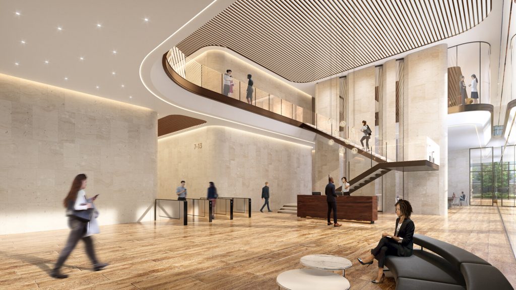
Two Cathedral Square at 227 North 18th Street. Credit: Solomon Cordwell Buenz
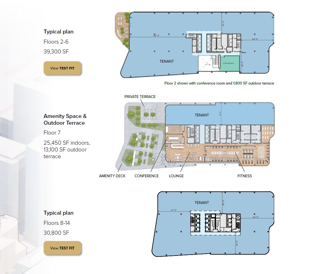
Two Cathedral Square at 227 North 18th Street. Credit: JLL and Solomon Cordwell Buenz
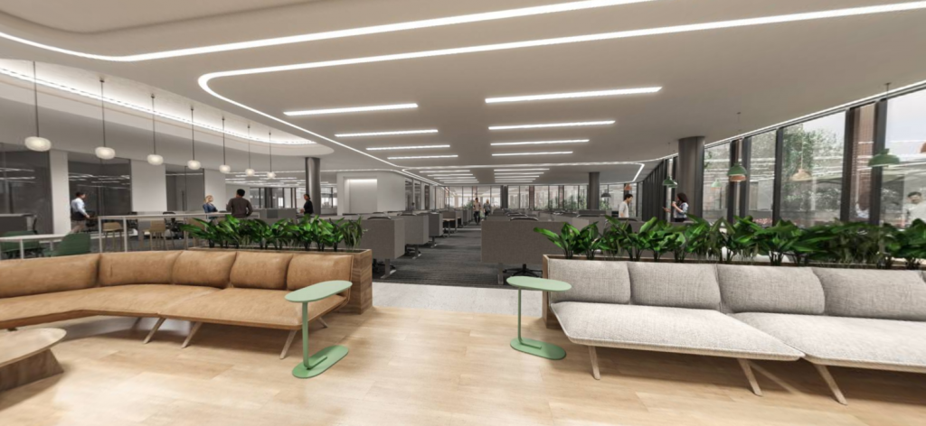
Two Cathedral Square at 227 North 18th Street. Credit: Solomon Cordwell Buenz
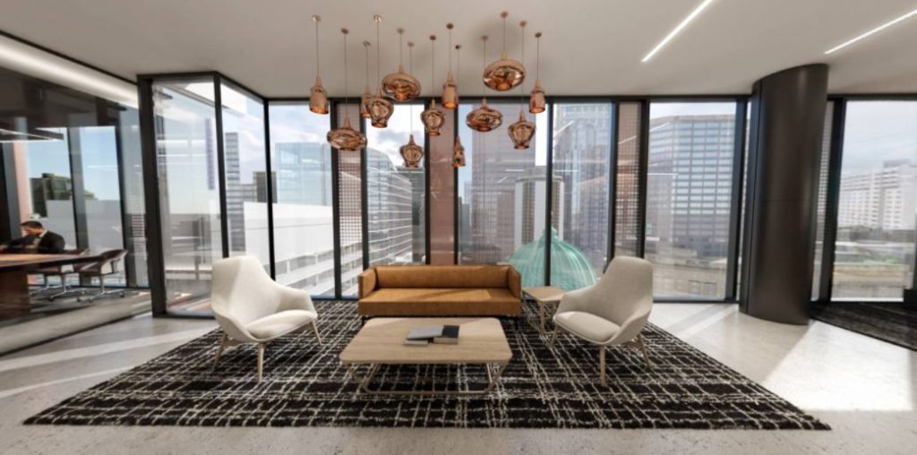
Two Cathedral Square at 227 North 18th Street. Credit: Solomon Cordwell Buenz
Given its sensitive approach to the site, as well as fantastic degree of improvement at the pedestrian level, we have no issue with such a massive structure rising next to the venerable Cathedral.
There would have been a problem if the developer cheapened out and opted for a budget-rate eyesore. To our great pleasure, the opposite is the case here. EQT Exerter, an investment firm with a global portfolio, had contracted Solomon Cordwell Buenz, one of Philadelphia’s leading architecture firms, which crafted a design worthy of the prominent site.
A staggered bronze grid, with a tiered hierarchy of gently projecting I-beam-styled mullions and recessed bronze panels, adds character and texture to the predominantly glass curtain wall. As such, the building is able to supply the ample sunlight and views that floor-to-windows provide to both office and residential inhabitants, without descending into trite “glass box” territory.
The bronzed, glass-ceiled canopy at the main entrance is a natural extension of the design aesthetic, as are the round columns that frame the all-glass walls of the lobby and retail spaces within the ground floor, which is capped with 20-foot-high ceilings.
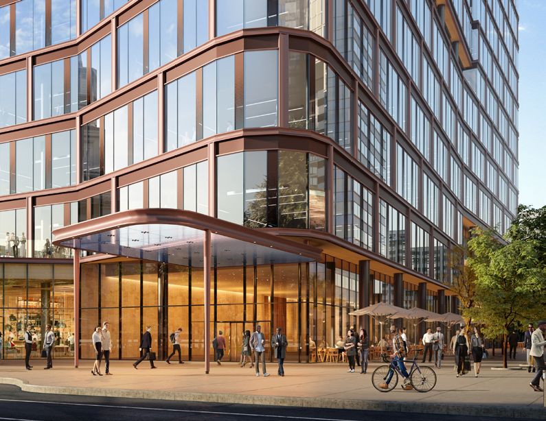
Two Cathedral Square at 227 North 18th Street. Credit: Solomon Cordwell Buenz
Curving edges soften the presence of the bulky structure, with flowing curves that add elegance to the composition. A gentle slant at the tower crown creates an understated yet notable element at the skyline level, which is an important consideration given the building’s future prominence and visibility on the skyline.
The building will appear especially striking once the city eventually (hopefully) caps the sunken Vine Street Expressway with a park, creating ample public space immediately to the north.
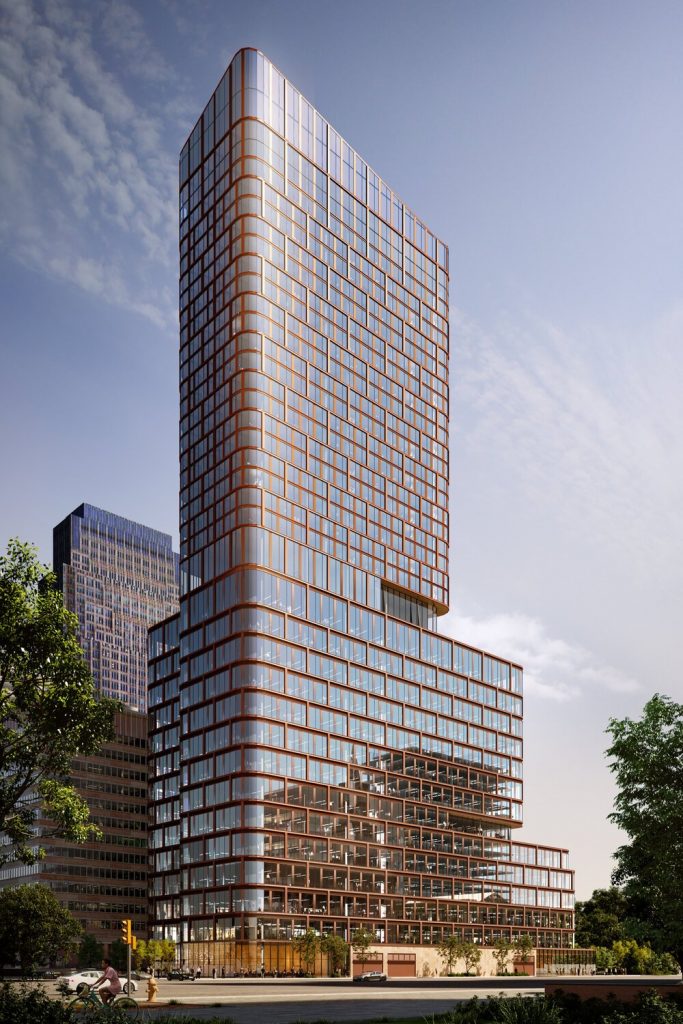
Two Cathedral Square at 227 North 18th Street. Credit: Solomon Cordwell Buenz
Two Cathedral Square will add an instantly imageable element to the Philadelphia skyline, dramatically improve the pedestrian experience in a former “dead zone” within the centrally-sited neighborhood, and strengthen the connection between Center City proper and Lower North Philadelphia to the north, all while adding hundreds of thousands of square feet of top-tier commercial and residential space. As such, YIMBY looks forward to further progress on the proposal.
Subscribe to YIMBY’s daily e-mail
![]()
Follow YIMBYgram for real-time photo updates
Like YIMBY on Facebook
Follow YIMBY’s Twitter for the latest in YIMBYnews


This was the most insightful review so far on this exciting development. A few thoughts:
(1) Love it
(2) In addition to a potential capping of the Vine, imagine if the Parkway and Logan Square can be truly reconfigured with the pedestrian in mind?
(3) The view of this building from the Art Museum steps will be fantastic.
(4) This proposal reminds me of what you would get if you put the new Penn Medicine Pavilion and CHOP University City Tower into a test tube and shook it. But I mean that in a good way: it builds off the positive characteristics of each.
(5) Appropriate and extremely impactful height for the location.
Love, love, love this project. This addition will further add to the great composition of Philly’s skyline. Also impressed with the design. Philly definitely boasts some of the best architecture in American cities. Quality over quantity.
Wow this is great! Correct me if I’m wrong… wasn’t this supposed to originally be 600+ feet?
Design looks great, but you’re right, it was supposed to be a skyscraper over 600 feet. But now it’s been reduced to a tall building. So sad we can’t get a top notch skyline.
The drawings you might be referring to, full of nicely curved buildings, were just to show what could be built on the site, maybe w/o a change in zoning. Unfortunately they were never going to be built. The difference between this which is structurally about 400′ and a 600′ tower is a large pile of extra cash. The sq.ft. cost goes up the taller you build. Philly’s sweet spot seems to be in the 30 to 34 story range.
This is one of the most delightful designs I’ve seen in a while; it is the fulfillment of joining downtown’s Business District to Franklintown. What we are seeing here is a cutting edge 21st Century design that enhances the grandeur the 19th and early 20th century Logan Circle.
I wonder what the lighting scheme for the building will.
There is no such place as “Franklin Town.” The developers of Franklin Town in 1971 announced their planned city-within-a-city private redevelopment, to be completed in a decade, by eminent domaining the families and businesses on those fifty acres. They demolished then had funding issues, leaving surface parking lots and grassy wastelands that are still there (but mercifully lessening). The neighborhood’s name has been changed to Baldwin Park. Google it.
BTW, love this rendering.
This is a potentially great addition to the area and the city as a whole, and I’m really happy they are not putting in yet, another boring glass box.
I would, however, love to see the bump out flipped to the north, which would accomplish two subtle enhancements: It now looks like the building has it’s back turned to the church, the focus is now north rather than south. Also, if you read about Morris Lapidis’ design of the Fontainebleu hotel in Miami, he felt that creating the famous curve gives the feeling of a “hug” or inclusiveness to anyone within. An opposite facing bump will make the building include the church, and will also curve WITH Logan Circle, in the current configuration it is working against the flow.
Agreed on the orientation of the curve. I suppose it is meant to angle toward the art museum, but it does look like it is blocking out the church. Other minor gripe of mine is that the loading dock is on Vine street instead of 17th. If we want to make capping 676 a reality, that doesn’t help the argument.
Excellent article and gorgeous renders! 😀
One of my fav developments.
Great article written by Vitali. It was both detailed & informative. I’m really excited to see this project come to fruition along with the Schuylkill Yards & the Penn’s Landing projects as well. However, I’m a little surprised that “TK” didn’t write the article. Doesn’t he (“TK”) get to do all the “prime” or “featured” stories here on Yimby?…Lol! 😂
Nice, but I would prefer to trade some girth for a bit more height.
Very good design…
THE TWO CATHEDRAL SQUARE’S FACADE MIMIMICS UNIVERSITY OF PA’S PAVILION DESIGNED BY LORD NORMAN FOSTER OF LONDON ENGLAND. THE PENN PAVILION HAS A WIDER GIRTH AROUND THE WINDOWS THAT ALLOWS A FULL ANIMATION OF LIGHTS. I SAW THE TESTING OF THE NIGHT LIGHTS AT THE PAVILION, WHAT A SHOW, IT SURPASSES THE LIGHTING SCHEME OF THE CIRA TOWER.
BY THE WAY, LORD NORMAN FOSTER’S DESIGN OF THE TULIP TOWER IN LONDON WAS REJECTED BY THE LEAD ARCHITECT. I WONDER IF THE TULIP WOULD WORK AS PART OF THE SCHUYLKILL YARDS DEVELOPMENT. WE WOULD GET THE 600 FOOT TOWER THAT’S SO DESPERATELY NEEDED AS SUGGESTED BY MICHEAL. PHILLY NEEDS A LANDMARK THAT CAN BE SEEN FROM ABOVE!