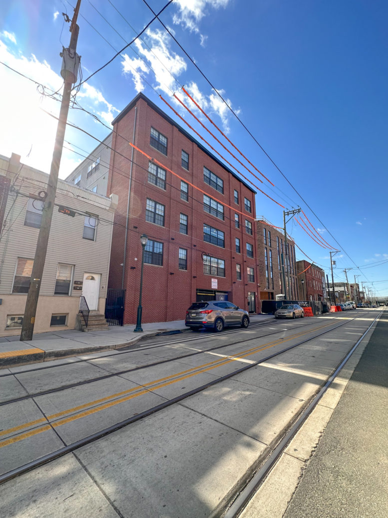
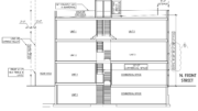
A recent site visit by Philadelphia YIMBY has observed that construction work is complete at a five-story, 28-unit apartment building underway at 3045-51 Richmond Street in Port Richmond, Kensington. Developed by Fifth Realty, the Neo-Industrial-styled structure rises on the southeast side of the block between Elkhart Street and East Clearfield Street. The substantially large structure spans 37,807 square feet of interior space, which will include 12 one-bedroom and 16 two-bedroom units. Features include full sprinkling and a ground-level garage for 22 cars. Permits list Lonny Rossman as the design professional and TBC LLC as the contractor. The construction cost is specified at $4.25 million.
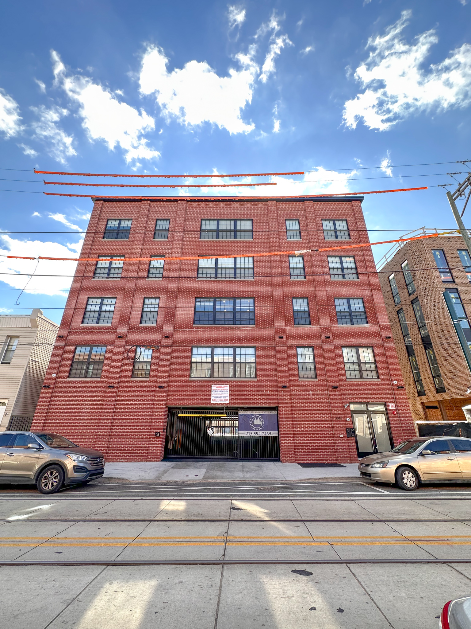
3045-51 Richmond Street. Photo by Jamie Meller. March 2023
The structure replaces a marginally utilized property that housed a dilapidated, single-story, 1,885-square-foot commercial structure surrounded by an overgrown surface lot. Demolition permits were issued in December 2020, and foundation work was in progress as of January of last year.
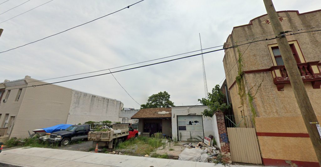
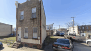
2045-51 Richmond Street, prior to demolition. Looking southeast. August 2019. Credit: Google Maps
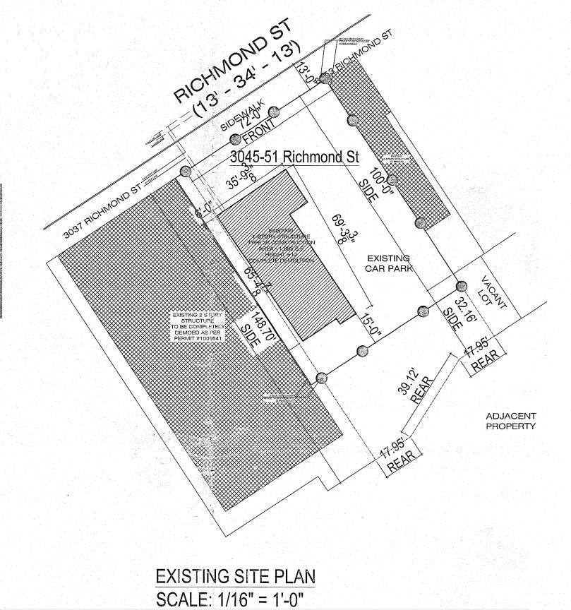
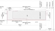
3045-51 Richmond Street. Site plan prior to demolition. Credit: Alfa Engineering & Construction
The building is among the largest in the surrounding area, which offers a pleasantly surprising density bonus at the neighborhood’s southern fringe, right next to the Interstate 95. Yet although the building towers over its neighbors, it does not appear out-of-place, thanks to the already dynamic and diverse composition of the block’s building stock.
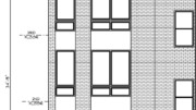
A key reason why such a hulking structure fits within its two- to three-story prewar surroundings is its well-crafted, context-sensitive design. The street-facing facade follows the established architectural conventions at the block, such as a continuous streetwall, a red-brick facade, sash windows, off-white stone sills, and a cornice, an all-important traditional feature that is sadly missing from many modern buildings, even traditionally-styled ones. Projecting brick piers add much-needed texture to what would otherwise be a flat facade. Paneled, black-trimmed windows and a matching black cornice evoke prewar factory lofts and pay homage to the neighborhood’s industrial legacy.
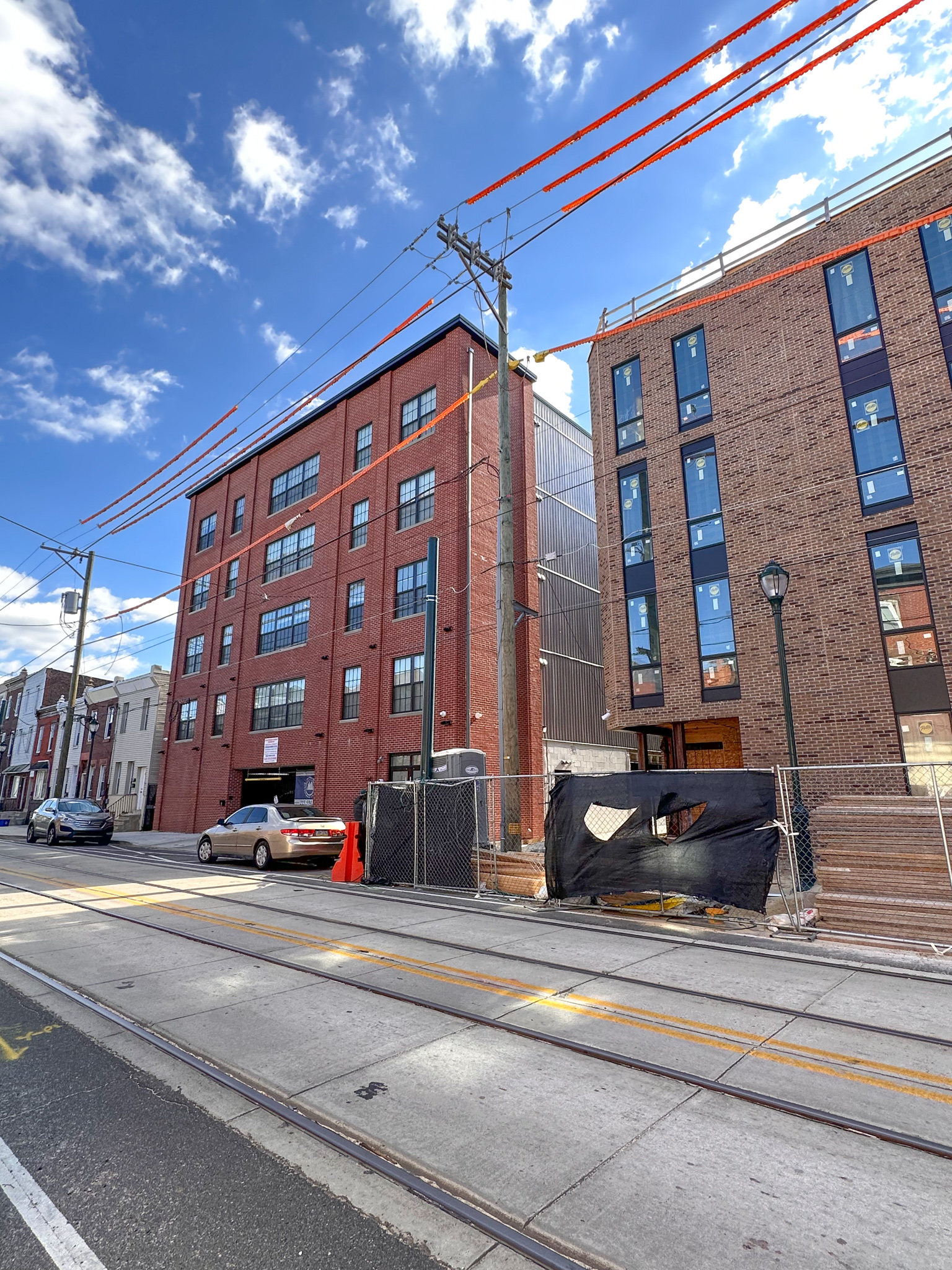
3045-51 Richmond Street. Photo by Jamie Meller. March 2023
The brick facade wraps around the sides of the building around 15 feet deep into the lot walls and feature brick piers that match those at the street-facing exterior. This contextual feature further entrenches the structure as a cohesive part of the established architectural ensemble and diminishes the visual impact of plain side walls clad in vertical gray siding, which would otherwise be disruptive. Windows at the slightly set-back lot walls are another welcome feature, both to future residents as well as passersby, who would avoid the displeasure of passing by a massive blank wall.
The only detrimental feature is the ground level treatment, which creates a less-than-ideal street presence with its windowless walls and large garage entry and sidewalk curb cut. While inclusion of ample parking is somewhat justified at the rather remote site, we do wish that the builders opted to include a retail component or street-facing residential amenities at the front end of the site, which would immensely improve the building’s relationship with the street. At this point, however, the best we can hope for is that the building base will be spruced up with planters, as the renderings promise, and perhaps further enhanced with murals above.
Aside from the unfortunate ground level treatment, we are impressed with the building’s stately, site-sensitive architecture and are excited about its addition of housing stock to a neighborhood where we would love to see further growth in the future.
Subscribe to YIMBY’s daily e-mail
![]()
Follow YIMBYgram for real-time photo updates
Like YIMBY on Facebook
Follow YIMBY’s Twitter for the latest in YIMBYnews

VO, you’ve insightfully outlined the structure’s many positives and the one significant negative. Regarding the latter, underground parking would have allowed for ground floor retail. And almost 1:1 parking is excessive on a street that has trolley service with a stop just up the block.
Not every base needs retail space. That said something could have been done to address the blank expanse of brick. Some simple brick detailing would have gone a long way and cost virtually nothing. Growing some ivy would also do the trick.
Agree that “not every base needs retail space”.
Regarding the benefit of “some simple brick detailing”, as the post says, the architect included “projecting brick piers [that] add much-needed texture to what would otherwise be a flat facade.” The final product shows the limitations of this approach. Had there been underground parking or fewer parking spots, ground floor retail or ground floor apartments with windows would have activated the street, just as with virtually every other building on the block, including the under construction structure next door.
Guess we have ankokther shot