In 1682, William Penn’s surveyor general Thomas Holme laid out a rectangular street plan for the new planned city of Philadelphia. Today, the area covered by the original plan comprises Center City, yet its grid continued to extend in all directions until it either hit a natural boundary, or was shelved in the postwar period when gridded city plans fell out of favor. As such, most of the city’s central neighborhoods follow the rectilinear plan, with a few notable exceptions. One among these is Francisville, a neighborhood situated west of Broad Street in Lower North Philadelphia. Here, a small yet clearly noticeable group of streets run at a roughly 45-degree angle to the main grid, as they follow Ridge Avenue and predate the grid’s extent this far north. The neighborhood fell on hard times in the postwar period, yet today it is awash in new construction as low- and mid-rise buildings are rising in every direction. The construction boom translated to 28 category tags over the course of the past year, landing Francisville at the 30th place on Philly YIMBY’s First Anniversary Countdown, where we track article categories we tagged most frequently over the course of the past year. Today we visit the most notable developments that we have covered in the neighborhood during this period.
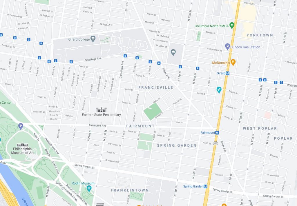
Francisville. Credit: Google Maps
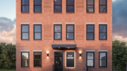
The Maven, 1533 Ridge Avenue
Residential (with ground-level retail), five floors, 23,665 square feet, 28 units. Designer: CANNOdesign. Developer: Khosla Properties. Status: under construction.
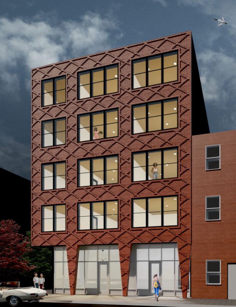
Rendering of The Maven. Credit: CANNOdesign
The Maven, featured on the front image of this article, rises at 1533 Ridge Avenue on a densely-built block packed with recently constructed mid-rise buildings, and will stand out among the bunch thanks to its creative, diagonal brick pattern on the street-facing facade. Large windows will allow for ample sunlight to illuminate street-facing units, while a ground-level retail space will encourage pedestrian activity.
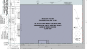
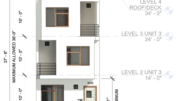
1754 Wylie Street
Residential, four floors, 5,600 square feet, five units. Designer: M Architects. Developer: Stamm Development Group. Status: under construction.
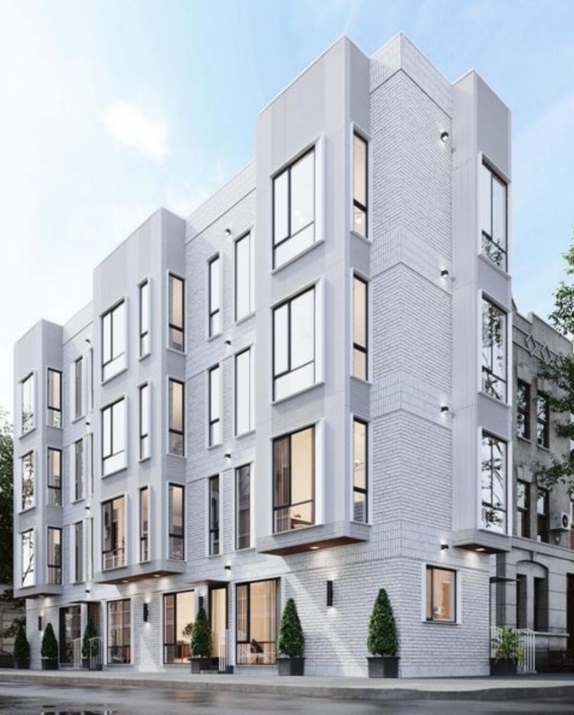
Rendering of 1754 Wylie Street. Credit: M Architects.
The luxury condominium rising at 1754 Wylie Street combines elements of traditional Philadelphia architecture (a brick facade) with elements endemic to the city’s ongoing new construction trends (cantilevered extensions, large windows) with a unique stylistic flair of its own (white exterior and bands of soldier-course brick between the floors and at the parapet). The building is an understated yet crisp and refreshing addition to the neighborhood.
Ridge Pointe, 1810 Ridge Avenue
Residential (with ground-level retail), five floors, 25 units. Status: under construction.
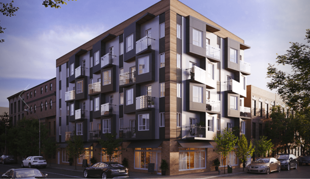
Rendering of Ridge Pointe. Credit: Metro Commercial.
Ridge Pointe, an apartment building that is nearing completion at 1810 Ridge Avenue at the intersection of Ridge Avenue and Ginnodo Street, is notable for its dynamic facade of pointed (an intentional pun with the building name?) projecting switchback windows and balconies. The black-and-white facade palette adds razzle-dazzle energy to the composition, while wood-patterned paneling at the intersection-facing corner and the cornice somewhat grounds the structure with a sedate touch. The ground-level retail space will energize the local pedestrian presence.
1801 Fairmount, 1801 Fairmount Avenue
Residential (with a ground-level restaurant), five floors, 18,195 square feet, 10 units. Status: under construction.
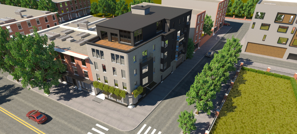
Rendering of the development via Fairmount1801.
1801 Fairmount, a five-story residential building under construction at 1801 Fairmount Avenue at the crossing of Fairmount Avenue and North 18th Street, makes for an impactful presence at the intersection with its bold, if somewhat plain, design. While its sharply contrasting black and off-white walls make for a pleasant, if rather conventional, presence, the design is at its most interesting in a few fine details.
The boxy structure features sharp corners and slanted angles throughout, except at the intersection-facing corner, which is gently curved along with the cornice. The restaurant proposed at the ground floor will feature an angled corner entrance, which is a fantastic, though exceedingly rare in new construction, throwback to classic Philadelphia architecture, which we briefly covered in one of the earliest Philly YIMBY articles published.
We just hope that the lush greenery hanging from the second floor in the renderings will come to fruition, and that it is not just an empty flourish meant to spruce up the imagery.
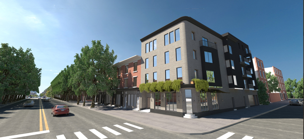
Rendering of the development via Fairmount1801.
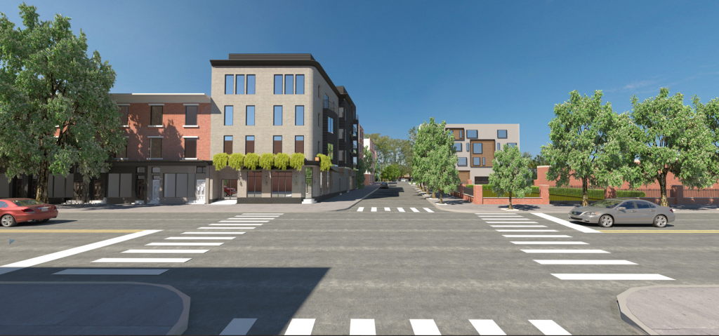
Rendering of the project via Fairmount1801.
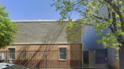
1728 Folsom Street
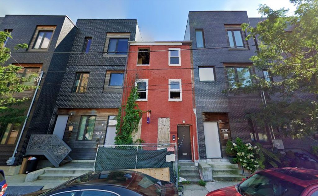
1728 Folsom Street. Looking south. Credit: Google
At the moment, details remain sparse on the building proposed at 1728 Folsom Street at the southern fringe of the neighborhood (it may arguably be described as located in Spring Garden). However, the development warrants inclusion in this rundown because of its intriguing juxtaposition that reflects the greater trend of the neighborhood’s development.
The block was so devastated by the postwar advent of depopulation and demolitions that, by the turn of the millennium, only two rowhouses remained on the once-dense block. One of which is the subject of the article, which towered forlorn above vacant grass lots.
By August of last year, when we reported on the structure’s impending demolition, the block was completely transformed with new buildings. The once-solitary rowhouse has found itself hemmed in by a phalanx of blocky, avant-garde townhouses, resembling the classic scene from the Pixar movie Up but with less charm from the extant structure and more appeal from the new neighbors.
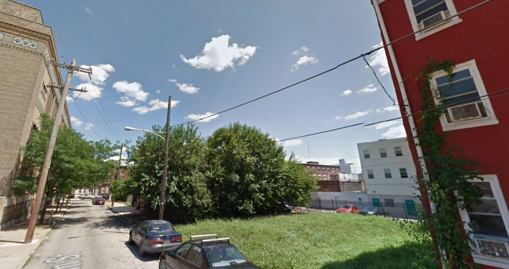
Folsom Street in July 2011, with 1728 Folsom Street on the right. Looking southeast. Credit: Google
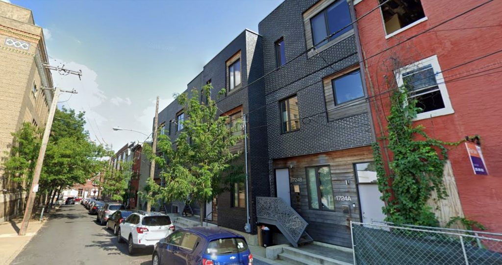
Folsom Street in August 2019, with 1728 Folsom Street on the right. Looking southeast. Credit: Google
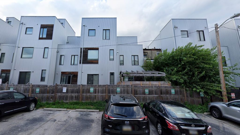
1728 Folsom Street (center right). Looking north from Olive Street. Credit: Google
909 Corinthian Avenue
Residential, three floors, 14 units. Developer: MM Partners. Status: completed.
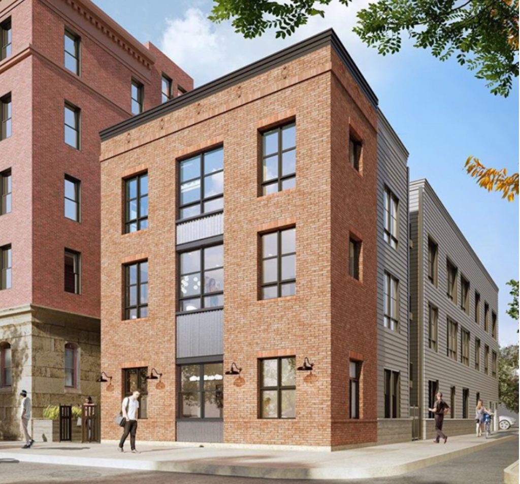
Rendering of 909 Corinthian Avenue via MM Partners.
Philadelphia does not boast many view-capped streets (where a centrally sited structure caps the vista down the street), but the few it has are awe-inspiring. There are Broad Street and Market Street, which act as a grand orientation device where City Hall looms in the distance even from miles away. The Benjamin Franklin Parkway follows the grand axis spanning from the high-sited Acropolis of the Philadelphia Museum of Art to, once again, City Hall. Westbound drivers and pedestrians crossing the John F. Kennedy Bridge look upon the regal Neoclassical colonnade of the 30th Street station.
And then there is the much lesser-known yet still incredible Corinthian Avenue in Francisville, aptly as it terminates at Girard College’s Founder’s Hall, a Greek Revival-styled National Historic Landmark that looms slightly larger than the Parthenon, which it closely resembles.
Inventive modern architecture certainly has its place, and such a classically dignified promenade ain’t it. Fortunately, the design team behind the multi-family building recently constructed at 909 Corinthian Avenue seemed to recognize the civic gravitas of the site’s location.
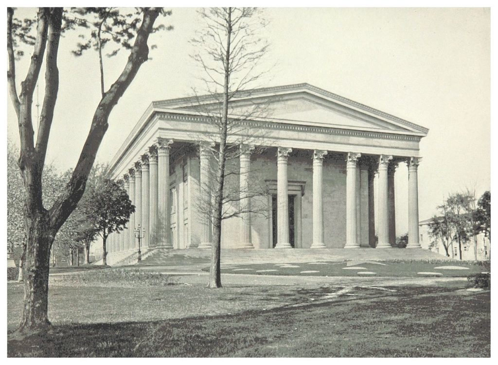
The Founders Hall at Girard College. Credit: Villanova University
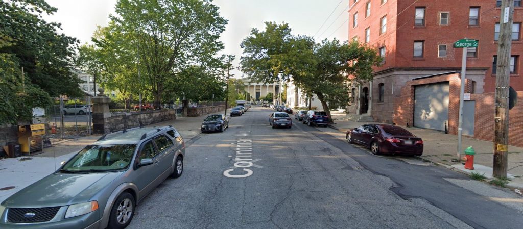
Corinthian Avenue, with 909 Corinthian Avenue on the right. Looking north. Credit: Google
The understated, symmetrical street-facing facade of the tall-ceiled building, clad in tasteful red tapestry brick, features minimal ornament aside from soldier course brick above the windows and a set of beige stone lozenges beneath an understated black cornice, which matches the black mullions at the austere paneled windows.
The side walls are clad in much more prosaic, gray siding, but the practice of respectfully treating the main facade while sparing detailing at the less-public sides is itself an architectural practice that dates back to the ancient world, much like the inspiration for columned edifice at the avenue’s terminus.
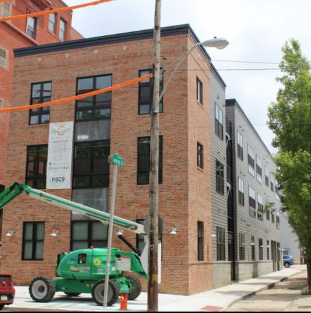
Current view of 909 Corinthian Avenue. Credit: Tester Construction.
The Vine, 1723 Francis Street
Residential, four floors, 20,971 square feet, 24 units. Designer: Gnome Architects. Developer: Stamm Development Group. Status: under construction.
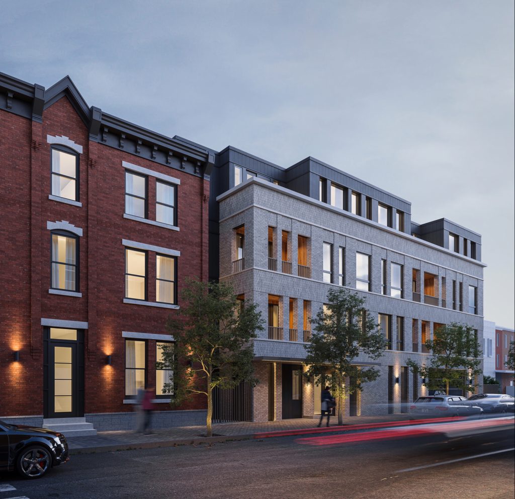
Rendering of 1723 Francis Street. Credit: Gnome Architects.
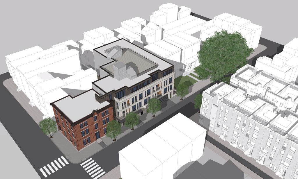
In order to be respectful of a new building’s historic context, architects are not required to compose outright historicist replicas. Instead, it is frequently sufficient to craft a design that respects the spirit of the surroundings without resorting to outright imitation or disregard of the zeitgeist. Case in point is The Vine at 1723 Francis Street, an under-construction development that involves partial restoration of a prewar building while integrating it with a ground-up addition.
The three-story building at the intersection of Francis and Perkiomen streets is attractive but yet rather conventional. Things get interesting on the Perkiomen Street side, where an extension is deeply set back from the street. Even more curiously, the annex snakes around into the block interior and connects to a rear building that appears to be a rare survivor from the tenement era, before such buildings were outlawed in cities around the country for sanitary and quality-of-life reasons.
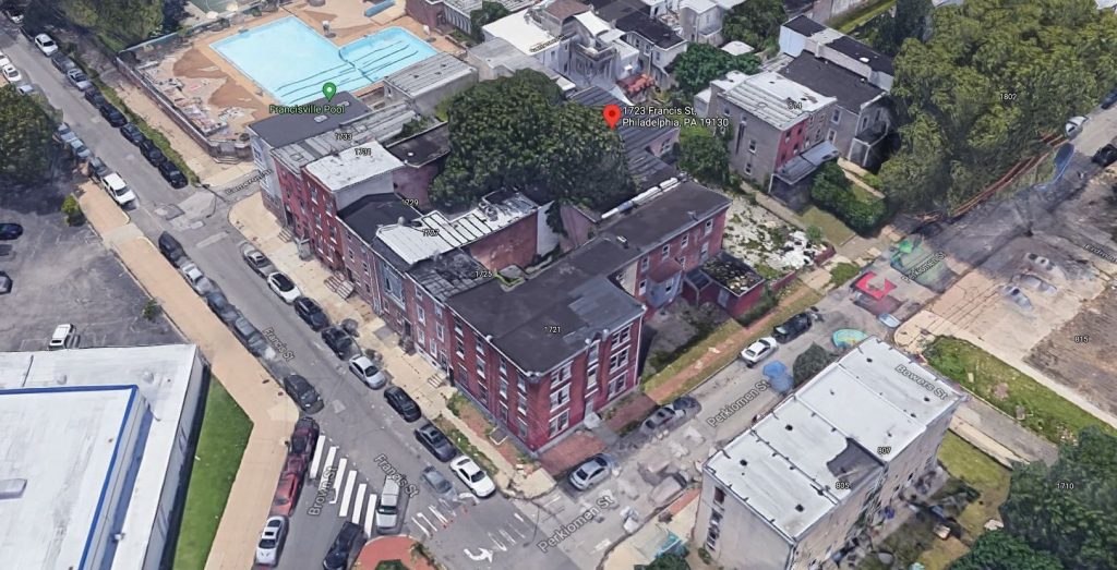
1723 Francis Street. Credit: Google Maps
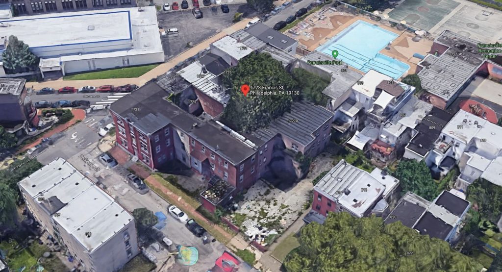
1723 Francis Street. Credit: Google Maps
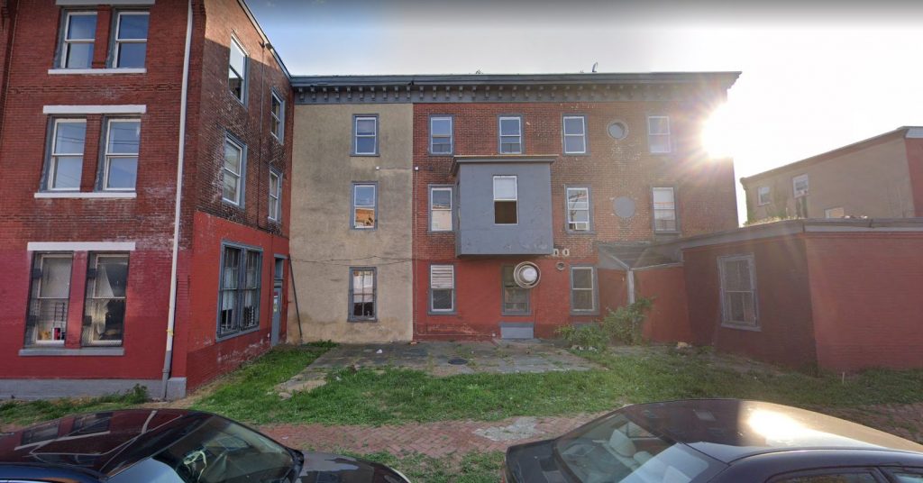
1723 Francis Street. Credit: Google Maps
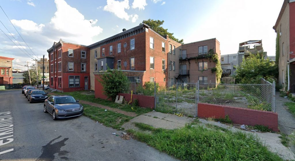
1723 Francis Street. Credit: Google Maps
The section that stands at the street corner is the most architecturally valuable part of the structure, and we are pleased to see it preserved and rehabilitated. Because of its uniqueness, it is sad to see the demolition of the annex, which will be replaced by the ground-up addition. However, curious as we are to see the floor plans of the original annex, we doubt that the structure could have been very convenient to live in, especially when compared to its replacement (ironically, the new addition will extend as deeply into the block as its predecessor, likely permitted via a grandfather clause, but it will still give more breathing room to adjacent structures). Moreover, the new building will improve the streetwall and will replace an adjacent vacant lot, which is an eyesore by any standard.
Rendering of 1723 Francis Street. Credit: Gnome Architects.
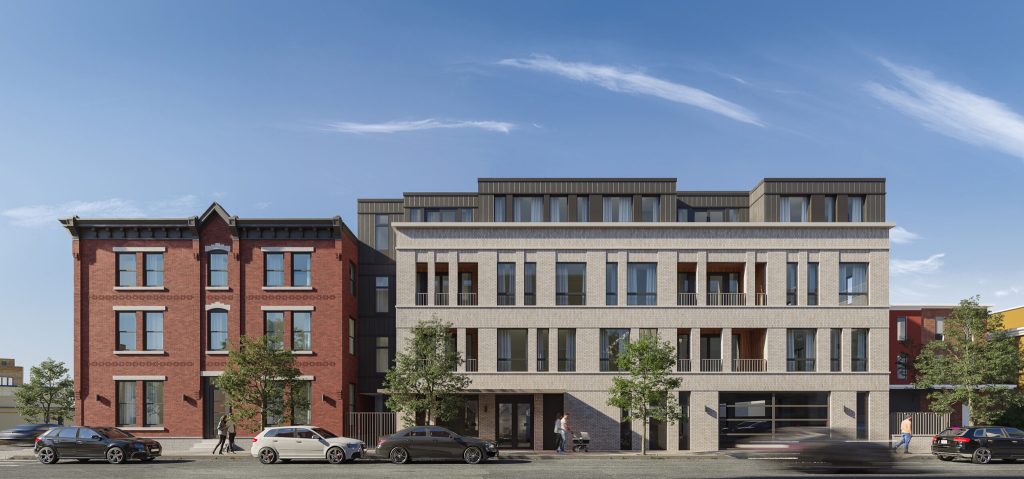
Rather than imitating the remaining prewar structure, the architects instead give it respectful nods. The new building will be clad in brick, and its street-facing facade matches the cornice line of the original structure, creating visual continuity at the street, while the fourth floor is set back. A streetwall gap in the form of a deep niche separates the original building from the new one.
By contrast, the annex will be clad in light gray, rather than traditional red, brick. While its tall apertures match the general form of traditional sash windows, they are decidedly modern, if understated, in their appearance. Some of the apertures are not windows at all, and instead open onto discreet loggias.
Rendering of 1723 Francis Street. Credit: Gnome Architects.
Dark gray vertical paneling at the fourth floor and at the connecting wing is the most contemporary feature of the design. While juxtaposing such decidedly modern elements against their more traditional counterparts may not be in everybody’s taste, the composition at hand accomplishes this in an understated manner that does not come off as jarring.
922 North Broad Street
Residential, seven floors, 176,156 square feet, 201 units. Designer: Cosica Moos Architecture. Status: proposed.
Rendering of 922 North Broad Street. Credit: Coscia Moos Architecture.
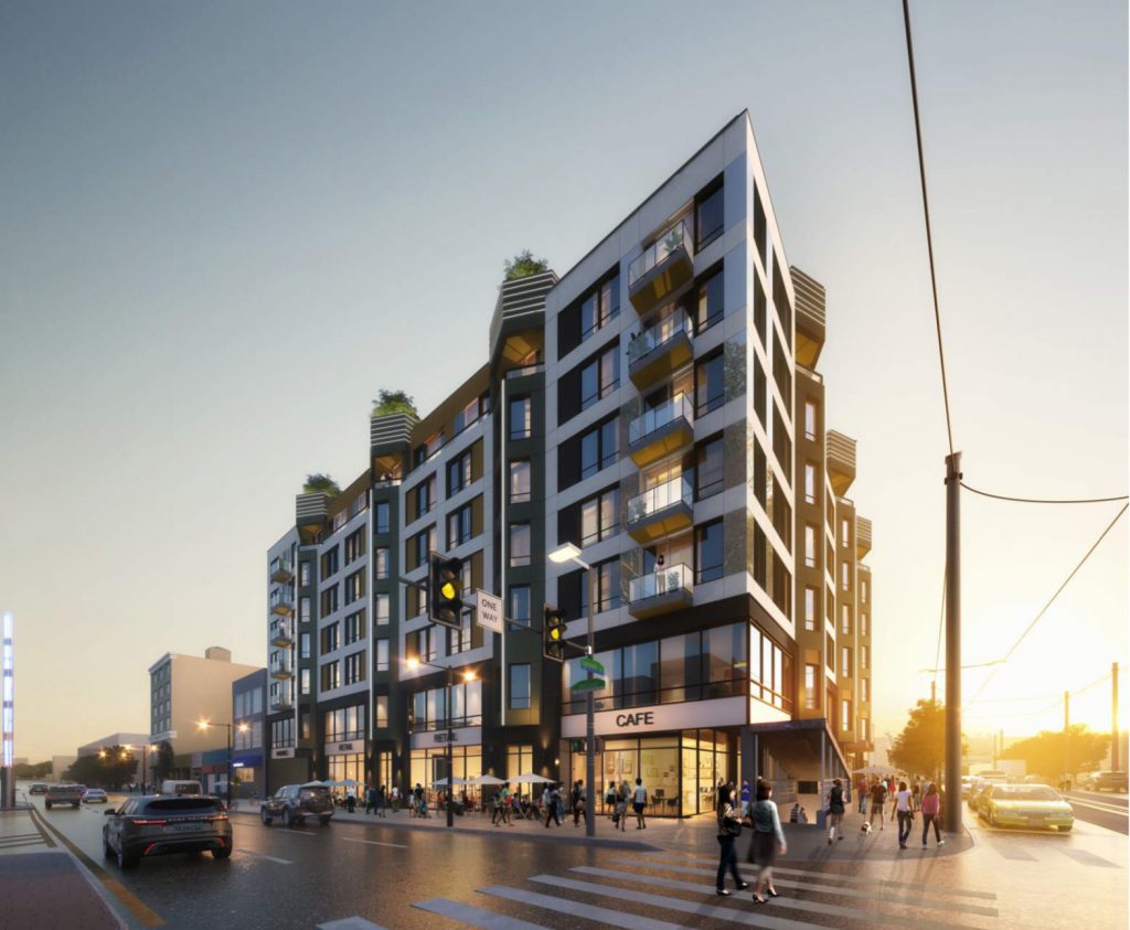
Urban-minded architecture does not need to be extravagant, high-brow, nor historicist in order to be successful. When done right, even a seemingly conventional structure that sticks to the basics can create a triumphant design. The building proposed at 922 North Broad Street falls into this category.
A rectangular structure with alternating colors, some balconies, and a green roof sounds like a trite recipe for conventional architecture. While the proposed building checks off all these boxes, the execution is rather delightful, even if it is highly unlikely to grace the front cover of an architecture magazine.
The two lower levels, which is the portion of a building that a pedestrian most closely interacts with, are glassed-in with large vitrines, allowing transparency for the retail spaces. However, the designers avoid the common mistake of making the building above seem like it levitates above a glassy base by “grounding” it at strategic locations, where chevron bay windows descend to the street level.
Rendering of 922 North Broad Street. Credit: Coscia Moos Architecture.
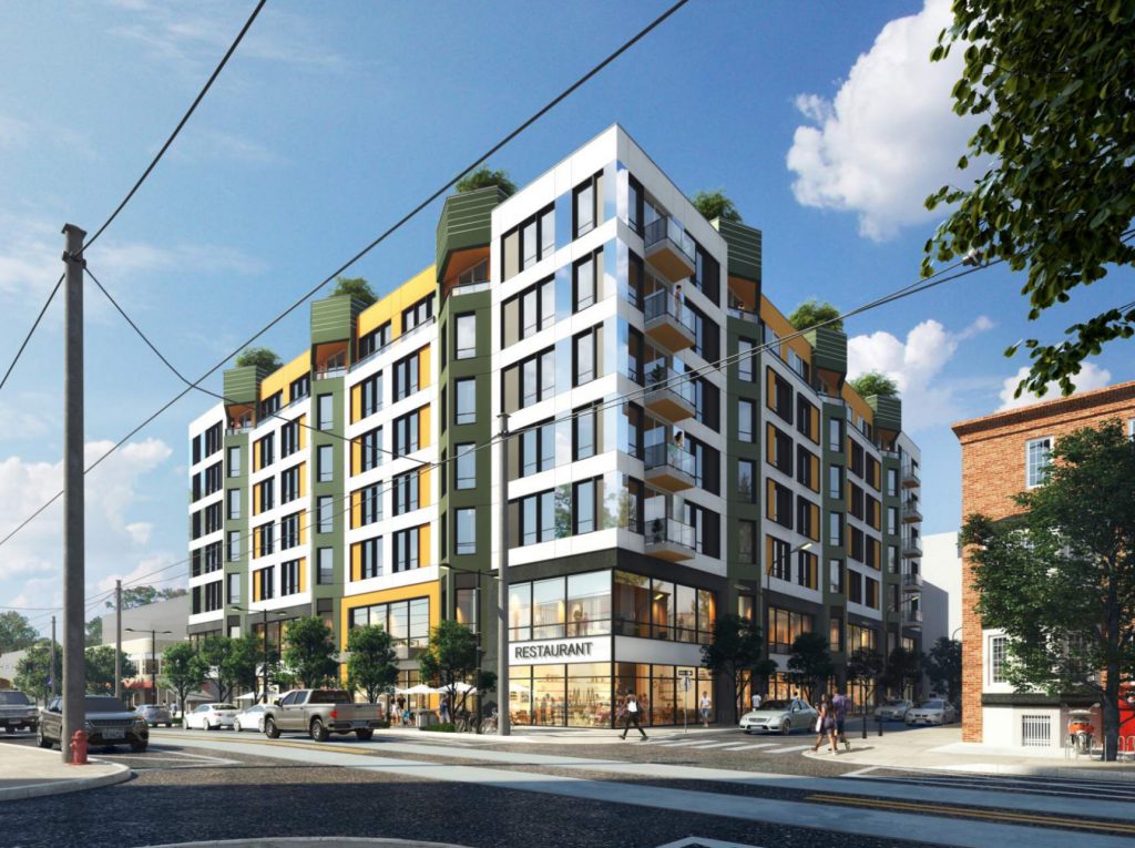
These chevron sections, with three per street exposure, serve as the highlight of the building, cheerful in their green cladding. However, they do not overwhelm the composition, and harmonize well with the predominantly white facade accented with radiant yellow panels. The resultant composition reads as bright and cheerful without being garish.
Not many contemporary buildings that use such a material palette can pull of this feat. In this case, the effect is successful because, rather than resorting to a chaotic hodge-podge, the designers stuck with a disciplined, symmetrical design that combines the regimentation of traditional architecture with a festive, modern presentation.
The concept extends all the way to the rooftop. Each green chevron is topped with a sizable tree, creating a look that would typically come off as cartoonish and hokey, but it adds so much delight to the composition that it is hard not to love it. Besides, while many new buildings feature green roofs (including the proposal at hand), every reminder of the need for green roofs that is easily visible from the street by the average pedestrian is welcome.
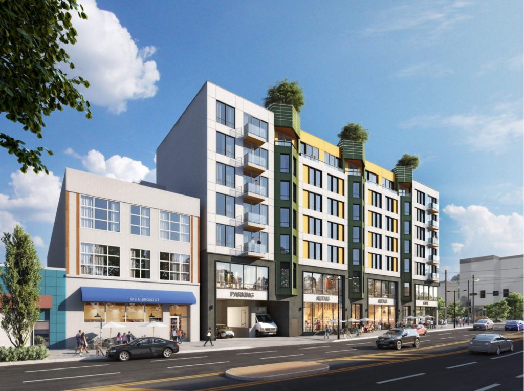
Rendering of 922 North Broad Street. Credit: Coscia Moos Architecture.
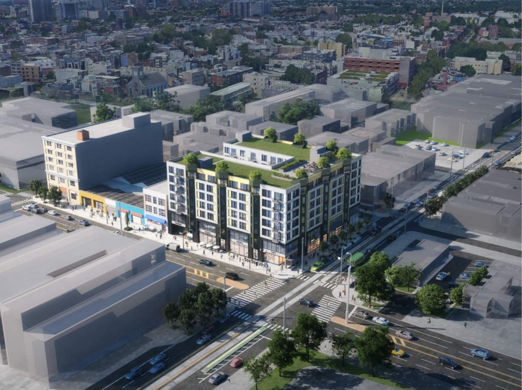
Aerial rendering of 922 North Broad Street. Credit: Coscia Moos Architecture.
The HQ, 710 North 16th Street
Residential, four floors, 35,000 square feet, 30 units. Developer: Stamm Development Group. Status: under construction.
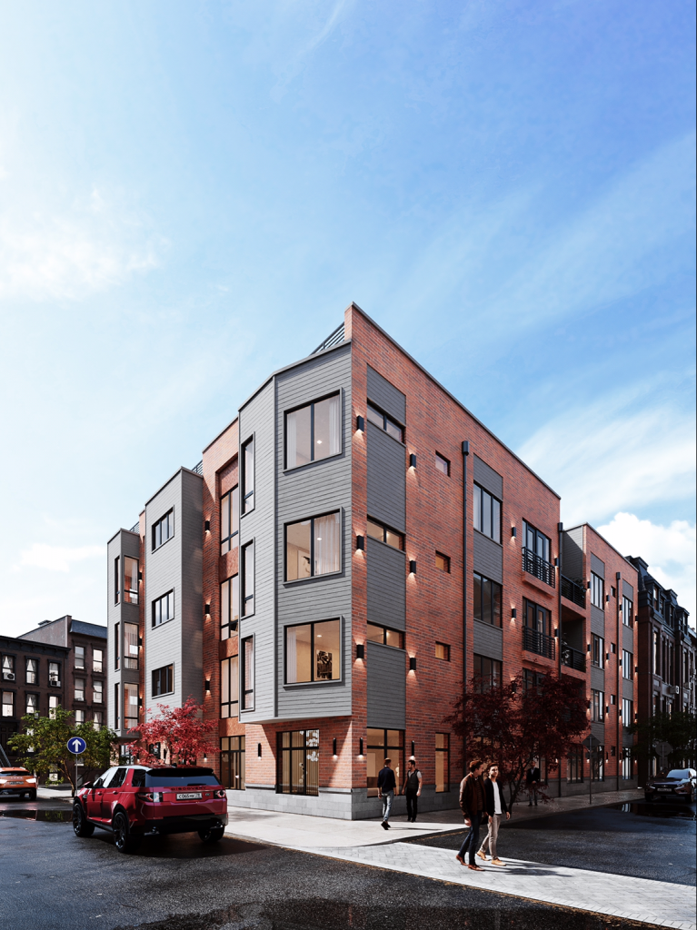
Rendering of The HQ at 710 North 16th Street. Credit: Stamm Development Group.
Designers of The HQ, located at 710 North 16th Street, thought outside the box by breaking down the inherent uniformity of a conventional rectangular structure via the use of contrasting red brick and light gray horizontal siding, varied windows, angled projecting cantilevers, and recessed loggias. Even straight wall sections, which many other designers may have left flat, were adorned with shallow recessed sections, which add further texture to the design.
As seen in a construction photo that the developer shared in July, the final product generally matches the renderings. The glaring difference, however, is beyond the builder’s immediate control. The intersection-facing angle, the site of the money shot in renderings, is in its physical form marred by a tangle of overhead wires, which were rightly mocked in our comment section.
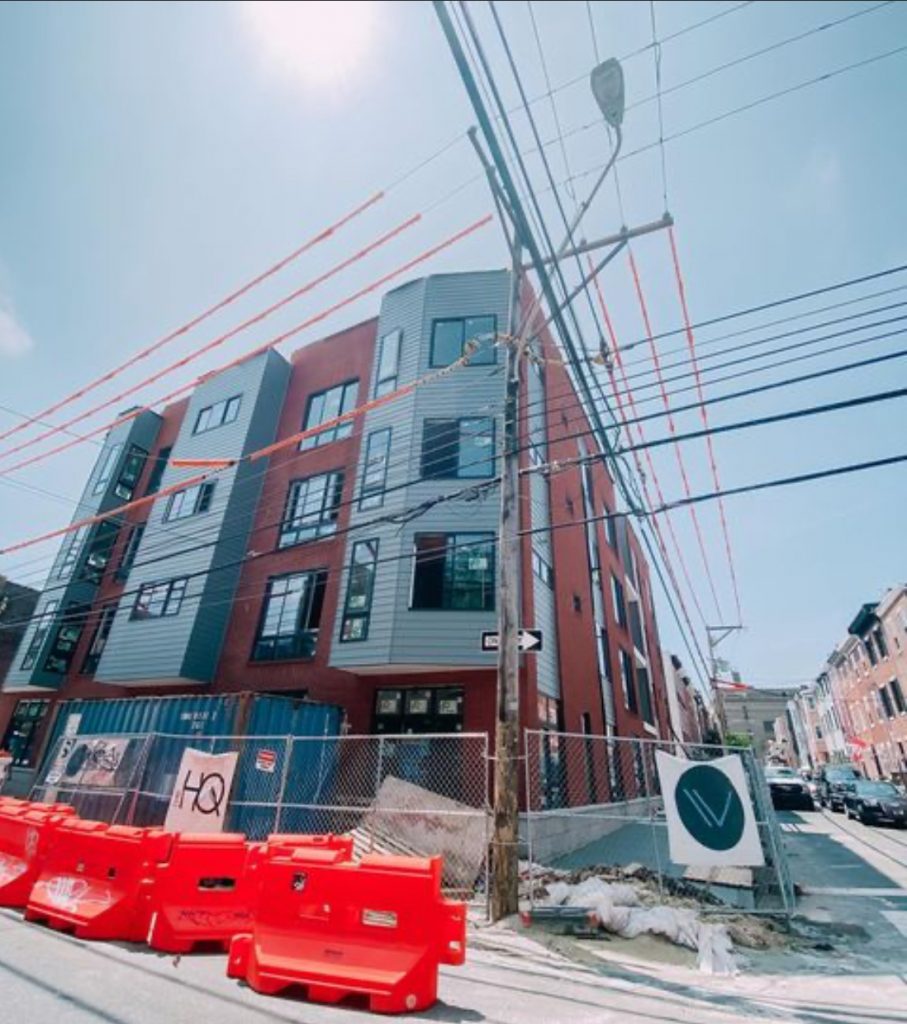
Current view of The HQ at 716 North 16th Street. Credit: Stamm Development Group.
We urge the city to move overhead wiring underground wherever possible, not in order to make construction photos more appealing (although that wouldn’t hurt), but rather to remove a public eyesore and to reinforce the city’s vital infrastructure against adverse weather effects such as storms. It is precisely during such events when overhead wiring is at its most vulnerable and is also when it is needed most, as people hunker down in their homes, and is also most difficult to repair. It is also a fiscally sound solution that would save the city money on repeat repairs to storm-damaged wiring.
901 Leland Street
Residential (with ground-level retail), six floors, 46,792 square feet, 50 units. Developer: Hightop Real Estate and Development. Status: under construction.
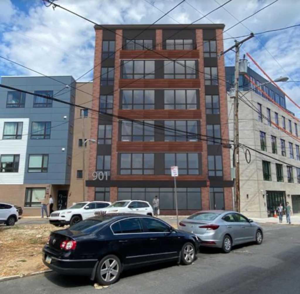
Rendering of 901 Leland Street. Credit: Hightop Real Estate.
The mixed-use building planned at 901 Leland Street will strike an austere, cosmopolitan presence on the streetscape. Its regimented, symmetrical facade provides a pleasant counterbalance to the asymmetric compositions that predominate in the area. The composition of red brick, dark gray and black paneling, and what appears to be cor-ten steel panels appears to pay homage to the neighborhood’s industrial roots and pulls off a look that comes off as somber without being gloomy.
The design respects two tenets tenets that Philly YIMBY stands by: respect the streetwall and add variety to the skyline. The building slots in neatly, like a puzzle piece, between its mid-rise neighbors, and maintains the urban composition by matching their sidewalk-aligned streetwall. In turn, its pinnacle, capped with an understated cornice, rises prominently above its neighbors, adding dynamism to the streetscape.
It is tempting to be remorseful about the demolition of the hangar-like industrial structure that previously stood at the site, as it was a fine representative of the neighborhood’s gritty industrial past, which, for better or worse, is rapidly disappearing. However, despite pleasant features such as a gable front, shallow brick pilasters, and a decorative metal band, the plain-looking building had few redeeming features that would warrant its preservation, especially since it appears to be getting a worthy replacement.
We can picture its garage-style entry and high interior space to be re-purposed as, say, a dining hall or a performance venue, but since the structure has already bit the dust, this is just a speculative exercise.
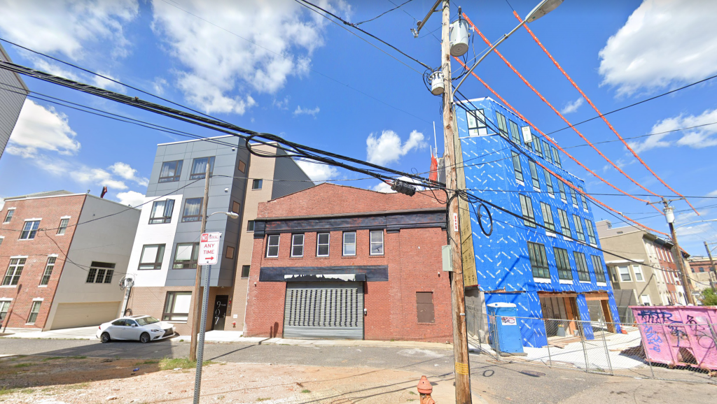
901 Leland Street. Credit: Google.
As in our entry about covering The HQ, overhead wiring mars views of the building. However, while the designers of the former carefully ignored the wire tangle in their renderings, the team behind the renderings for the Leland Street proposal seems to have oddly embraced the eyesore, with cables spanning front and center in front of the rendered structure. For aesthetic, financial, safety, and resiliency reasons described in the entry above, we again urge the city to place the overhead wiring network under the street, as numerous other communities have already done so to their great benefit.
801 North 19th Street
Residential, five floors, 104,596 square feet, 115 units. Designer: NORR. Status: proposed.
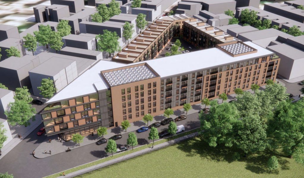
Rendering of 801 North 19th Street. Credit: NORR.
The largest development currently proposed in the neighborhood will be situated at 801 North 19th Street, at the largest available site in the area, the so-called Francisville Triangle located between North 19th, Wylie, and Cameron streets. The project consists of a five-story apartment building situated along Wylie Street and attached four-story structures along North 19th and Cameron streets.
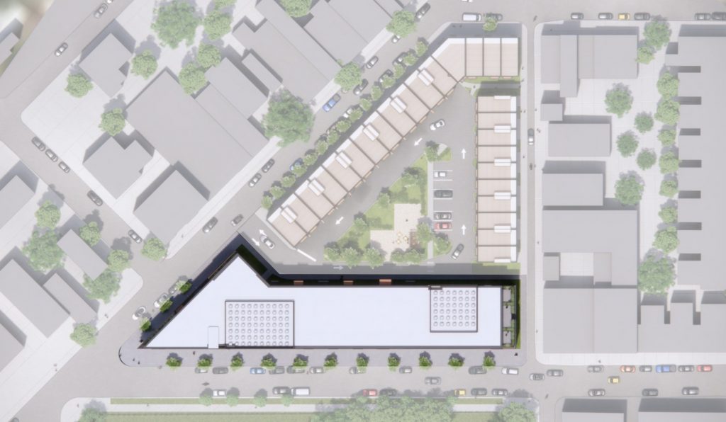
Rendering of 801 North 19th Street. Credit: NORR.
The designers softened the presence of the massive apartment building via a varying facade treatment of gray and light-brown panels. The structure meets the angled intersection of North 19th and Wylie streets with a sharp, Flatiron-style corner that appears to sail onto the intersection like a grand ocean liner. Large floor-to-ceiling windows at the “prow” ensure that the feature will provide visual excitement to those within the building, as well. A fifth-level terrace and a four-story-tall mural add extra flair to the structure.
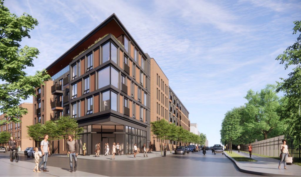
Rendering of 801 North 19th Street. Credit: NORR.
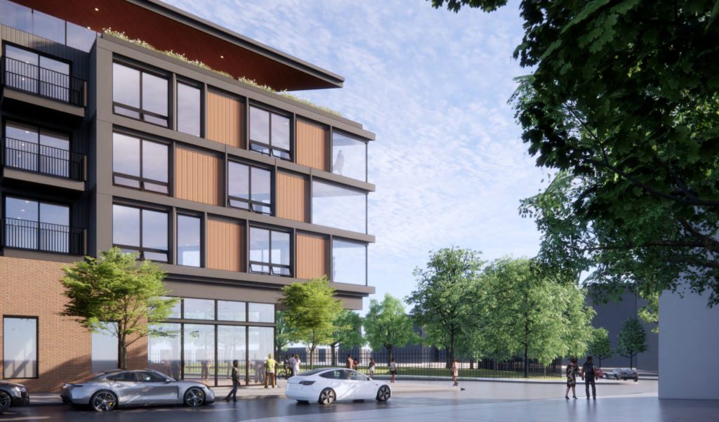
Rendering of 801 North 19th Street. Credit: NORR.
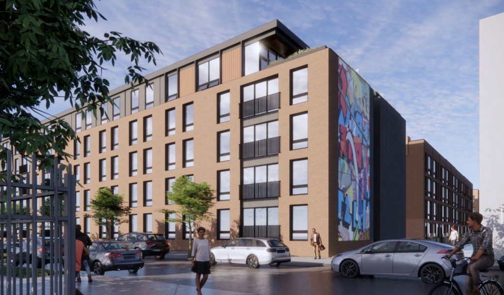
Rendering of 801 North 19th Street. Credit: NORR.
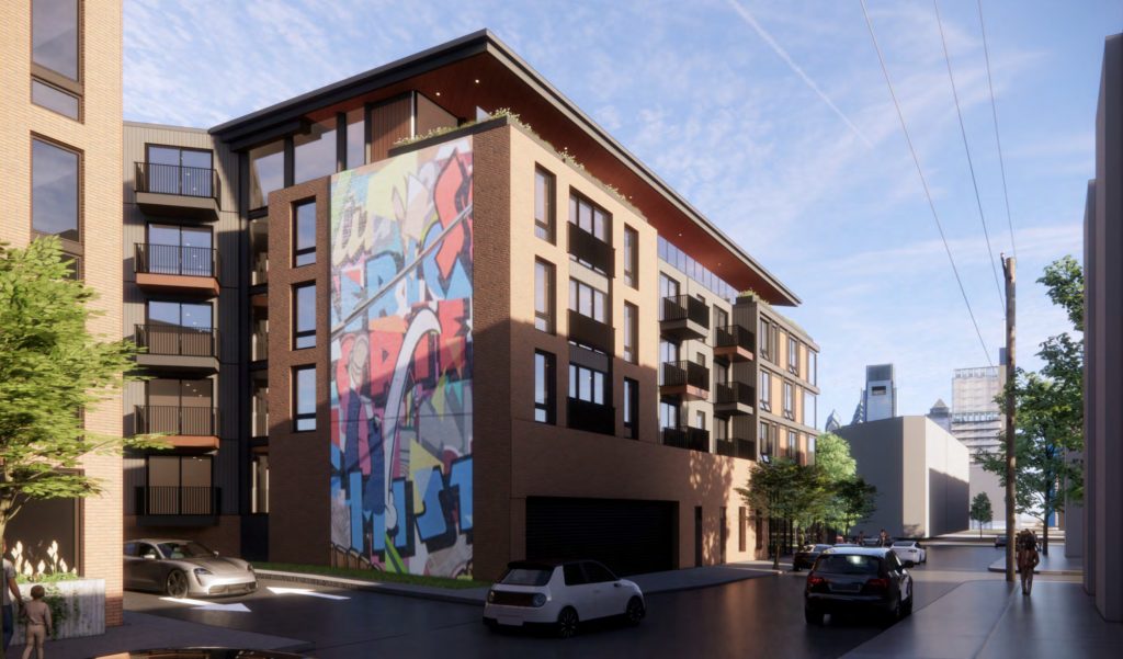
Rendering of 801 North 19th Street. Credit: NORR.
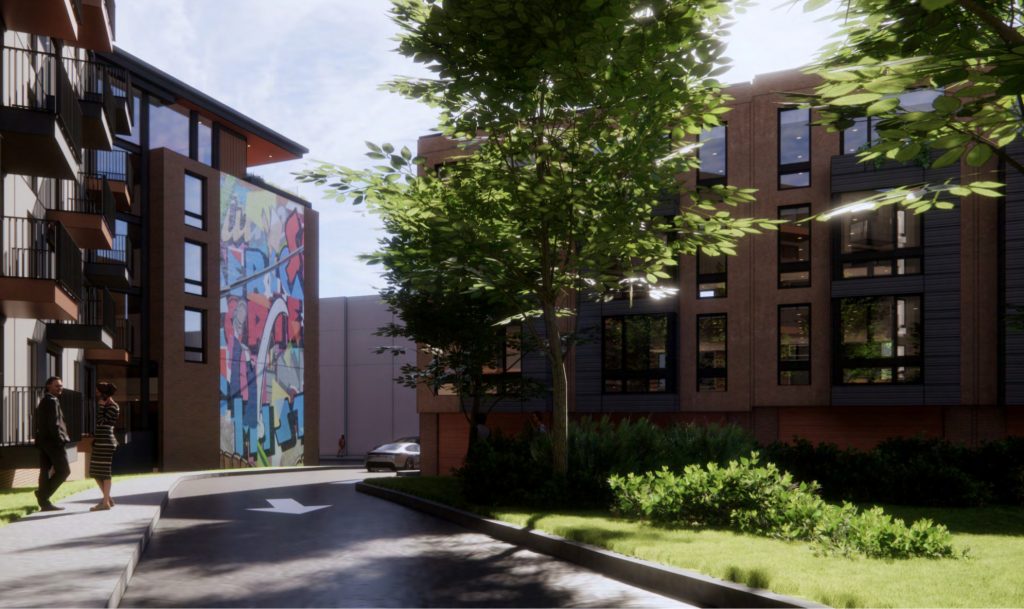
Rendering of 801 North 19th Street. Credit: NORR.
We do wish that the development team would further refine the project by adding a green roof and/or a roof deck to the building’s expansive yet largely featureless rooftop, which in its current state comprises a waste of valuable urban space.
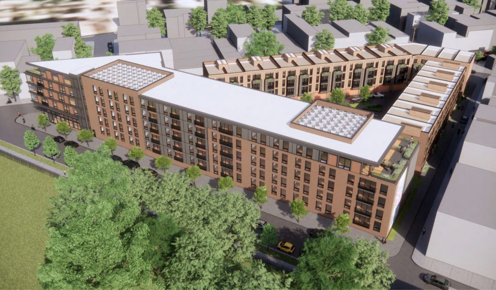
Rendering of 801 North 19th Street. Credit: NORR.
As YIMBY reporter Colin LeStourgeon noted in his July article, the presently vacant lot is used for recreation as a “makeshift park where residents walk dogs and play in the grass.” Certainly, the replacement of a large vacant lot with a dense residential complex is a boon for the neighborhood, especially since the site sits across the street from the large green space at the Francisville Recreation Center.
In theory, there exists a simple solution that would allow the neighborhood to have its cake and eat it, too. An increase to the building’s height would allow for dramatically shrinking the structure’s ground footprint, opening up ample space for a new park, playground, dog walk, or any other similar public amenity.
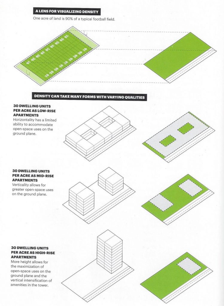
Building height diagram. Credit: A Country of Cities by Vishaan Chakrabarti, p.22
Unfortunately, most neighborhoods in the city, including Francisville, are hamstrung by absurdly low and rigid height limits, which prevent builders from considering such obvious and across-the-board-beneficial solutions. We urge city residents to contact their local representatives to address these unduly restrictive limitations, and to more strongly incentivize and reward developers that manage to add significant housing and retail stock to the neighborhood while providing amenities for the general public.
Such action may sound like a long-shot, but civic action starts at the local level. A few days ago, Philly YIMBY reader Gabriel Gottlieb mentioned in the comments section of an article that they spoke to the Planning Commission about the need to preserve retail space and zoning along Germantown Avenue and to the Planning Director about considering a train station along the regional rail line in Brewerytown, which would provide a relatively low-cost mass transit option for the distant-from-subway neighborhood, especially when compared to building a brand new subway extension. In a positive turn, the director said that she would ask people on her staff to study the idea.
Do not be afraid to speak to your local representatives about ways to improve our city, whether they revolve around putting overhead wires underground, calling for new train stations along existing rail lines, removing strict height caps, calling for increased incentives for developers that physically improve the community, or any other issue. Change starts with you.
Subscribe to YIMBY’s daily e-mail
Follow YIMBYgram for real-time photo updates
Like YIMBY on Facebook
Follow YIMBY’s Twitter for the latest in YIMBYnews

Bravo Vitali!!
Another installment of outstanding and factually journalism. Just a pleasure to read.
Everything was spot-on.
I am unable to contribute with any meaningful mentions.
Philadelphia Yimby has hired a clearly talented professional with Vitali.
On the mark in every delightful and meaningful way! 😉
Once again, thanks for your input and for the kind words, Brian!
I produced a 25-minute documentary on the history of the Philadelphia skyline last year.
I feel confident that Vitali is genuinely knowledgeable of Philadelphia’s rich history.
When I was a youngster growing up in the 70’s, the books in the Free Library of Philadelphia defined my interest in architecture and city planning.
You can always recognize that attribute in people.
I must wonder what types of books that Vitali read growing up.
This is the mark of excellence! 😉
801 North 19th Street cleared CDR and is a by right . Should pick up permits.
922 North Broad St passed CDR as a by right project. Should pick up permits . If Darrell Clarke is that demented to block development on Girard Ave my imposing a height limit, he should be committed to a psych ward as what he wants to do is to destroy the city’s ability to grow.
Great installment. Similar to Brewerytown, I would have guessed Francisville would have been a little higher on the list. I’m looking forward to the next 29.
Fantastic summation of “what’s happin’ in Francisville”! You are spot on with your descriptions, adjectives, and humor! Look forward to reading your work.