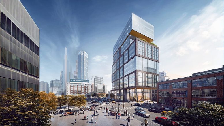
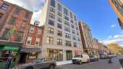
Philadelphia YIMBY’s recent site visit has observed that construction work is nearing completion at the 295-foot-tall, 19-story office development at 2222 Market Street in Center City West. Designed by Gensler and developed by the Parkway Corporation (alternately Parkway Commercial Properties), with IMC Construction as the contractor, the development will feature 329,100 square feet of tenant floor area, with 324,826 square feet of Class A office space and 4,274 square feet of retail, as well as a 47-car underground garage. The structure is being built as the new headquarters for Morgan Lewis, a major law firm. Building features will include ten-foot-high ceilings, floor-to-ceiling windows, several landscaped outdoor decks, flexible workspace plans, a conference center, a fitness center, Zoom conference rooms, expanded areas for servicing out-of-office visitors, and rooms with advanced audio technology to facilitate virtual court hearings.
Building features will include ten-foot-high ceilings, floor-to-ceiling windows, several outdoor terraces, flexible workspace plans, a conference center, and a fitness center. The project will feature Zoom conference rooms, custom areas to service visitors from other locations, and spaces with advanced audio technology to facilitate virtual court hearings.
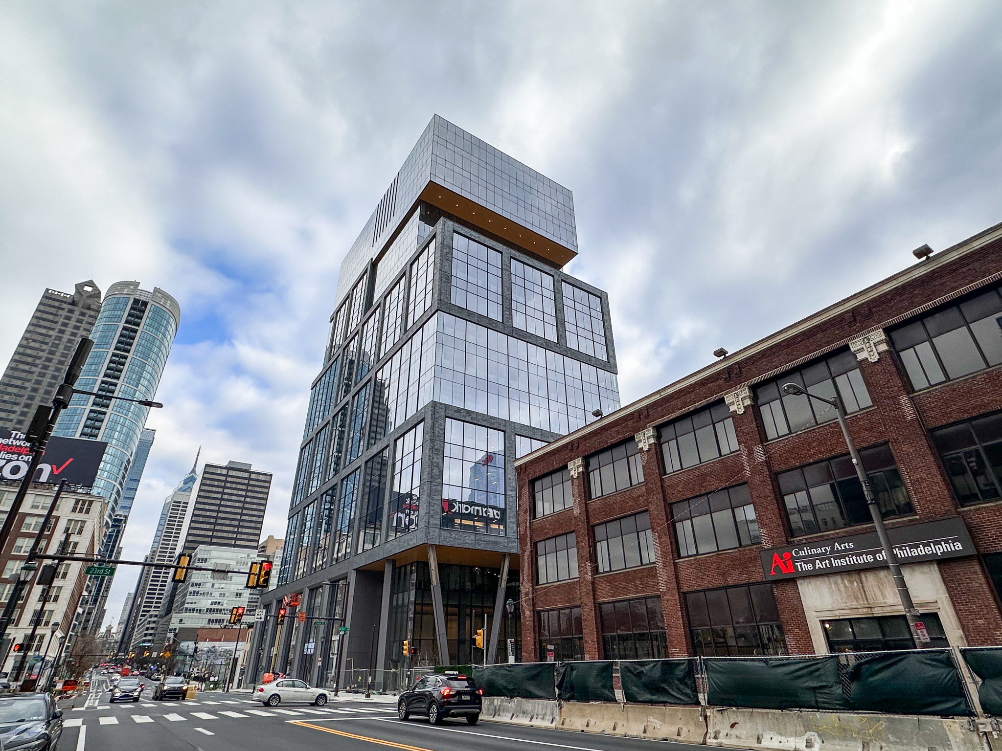
2300 Market Street. Photo by Jamie Meller. February 2023
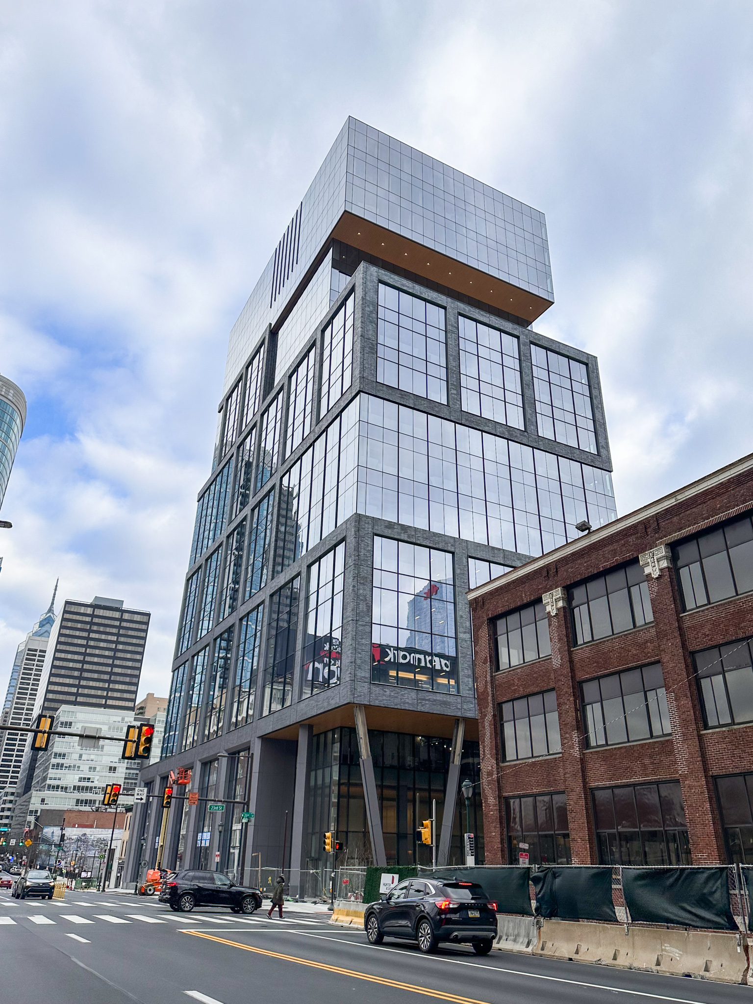
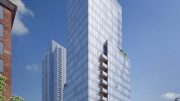
2300 Market Street. Photo by Jamie Meller. February 2023
The design team at Gensler opted to soften presence of the tower slab, which faces its broad side toward Market Street, by visually segmenting the facade into three-story horizontal sections, further enhancing the effect with projecting sections. Modules trimmed with gray running bond masonry alternate with all-glass sections, creating an effect of staggered horizontal layers that will imbue the building with a sense of horizontal motion that will play off the traffic movement along the thoroughfare. A trapezoidal floor plan creates a wedge-shaped eastern side that adds further dynamism to the composition.
2222 Market Street rises between South 22nd and South 23rd streets, a block to the east of the Schuylkill River waterfront. Aside from Riverwalk, the building is among the furthest-along of the numerous developments that are rising and planned in Center City West, a sparsely built-out section of Center City that spans roughly from 20th Street to the riverfront and borders onto Rittenhouse Square and Fitler Square to the south and Logan Square to the north. The rapidly developing district is sited directly between the Center City core to the east and University City to the west, and will connect two of the city’s primary business and institutional districts.
Subscribe to YIMBY’s daily e-mail
Follow YIMBYgram for real-time photo updates
Like YIMBY on Facebook
Follow YIMBY’s Twitter for the latest in YIMBYnews


clunky. why?
is the brick glued on with elmers? Seriously, did someone design this?
It’s thin brick – Wyatt panelized it. The panels are metal studs, R28 kingspan panel, girts, a stucco scratch coat, thin brick that gets pointed with pastry bags of mortar. Finished panels get trucked from Pittsburgh then set into place like a unitized curtainwall.
I get what you’re saying. I worked on the building and was happy that it wasn’t the typical Shiny Silver Metal Panel and Blue Glass bird killing Building. PMC Property group and Brandywine Realty Trust ruined this city.
“….will imbue the building with a sense of horizontal motion that will play off the traffic movement along the thoroughfare…” I just read this again….now I understand the relationship of the architecture to it’s context. REALLY? Did someone actually state that, from Gensler?!
One question – will the developer demolish the two small buildings and make them part of the new building?
2200 and 2204 Market remain, with only 2200 owned by developer Parkway Corp. 2206 Market was demolished in early 2021.
Can’t really decide if I like this design or not. Refreshingly unusual, for sure. At the same time, it seems somehow stubby and incoherent . Anyone else?
Love this unique-to-Philadelphia building because of the use of high quality material (huge windows and brick), a great design that provides for numerous outdoor spaces (multiple terraces and a large roof deck, all of which the office workers will enjoy), the elimination of one of the last remaining surface parking lots on West Market (although there are two left), underground limited parking accessed via narrow and insignificant Ludlow St., a varied indoor fit-out that allows for several different kinds of work spaces, razing of ugly 2206 Market St., the expansion of the Market St. ‘canyon’, and the unusual angled east facade (which will obligate some unusually shaped offices).
You must be the leasing agent. The brick is glued on to the facade hanging on the vast plains of unarticulated glass (not the best detailed curtain wall)….brick is a structural material with dimension but here is is pastiche. The building is hulking.
Yes, it’s good to have development but lets call a clunky building without refined detailing what it is.
Beauty is in the eye of the beholder. No need to be short with someone because they disagree with your overly critical review.
I walked by this building recently. I have a few critiques, but overall I think it looks very nice and a good addition to the area.
Chris. Everyone is entitled to an opinion, and, one’s opinion is always valid. That said, my comment was not like two gals on the street chatting: it was an architectural critism directed to the architects/developers of the building that shape the urban enviornment. Every architect at Gensler went through 3.5 – 5 years of architectural school where the scruitiny of every decsion is evaluated in a design project presentation. Materials are learned about for their structural capacity and their aesthetics and application. My comments were made to address the materials of and the overall design based on that criteria. Even you have a “few critiques” (sic) so by offering valid critisism, perhaps we can achieve a better city to inhabit for the long term with buildings that mean something.
I find it odd (yes, the building too!) that more office space is being developed since so many people work from home, but then the major tenant will be a large, successful law firm and they need each other!!
The same thought with the retail space. Every building from Center City to Roxborough that is either build or in the process has “retail space”. They do this because then they don’t have to provide parking spaces if they put “retail space” on the first floor. Don’t more people shop online than ever before?? Maybe they get a “tax break” if they can’t rent their “retail space”??!
Would you rather have a blank uninviting ground level? Retail spaces activate new development. “Retail” also includes restaurants, bars, coffee shops, which Western Market needs more of.
No, blank walls are super boring! If restaurants, bars, and coffee shops open, I’d be delighted, just not more dollar stores!!
How can someone purchase a unit in this building? Any contact info?
call god