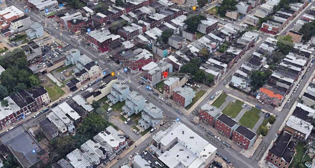
Permits have been issued for the construction of a three-story, mixed-use building at 2951 Frankford Avenue in Port Richmond, Kensington. Located on the southeast side of the block between East Birch Street and East Orleans Street, the building will rise from a 1,300-square-foot footprint and will hold 3,374 square feet of interior space. The program consists of commercial space and two residential units. Features include full sprinkling and a roof deck, which promises to offer sweeping skyline views. Permits list Mantag Ventures LLC as the owner, Kevin Korejko as the design professional, and Adam R. Sinclair as the contractor. Construction costs are specified at $450,000.
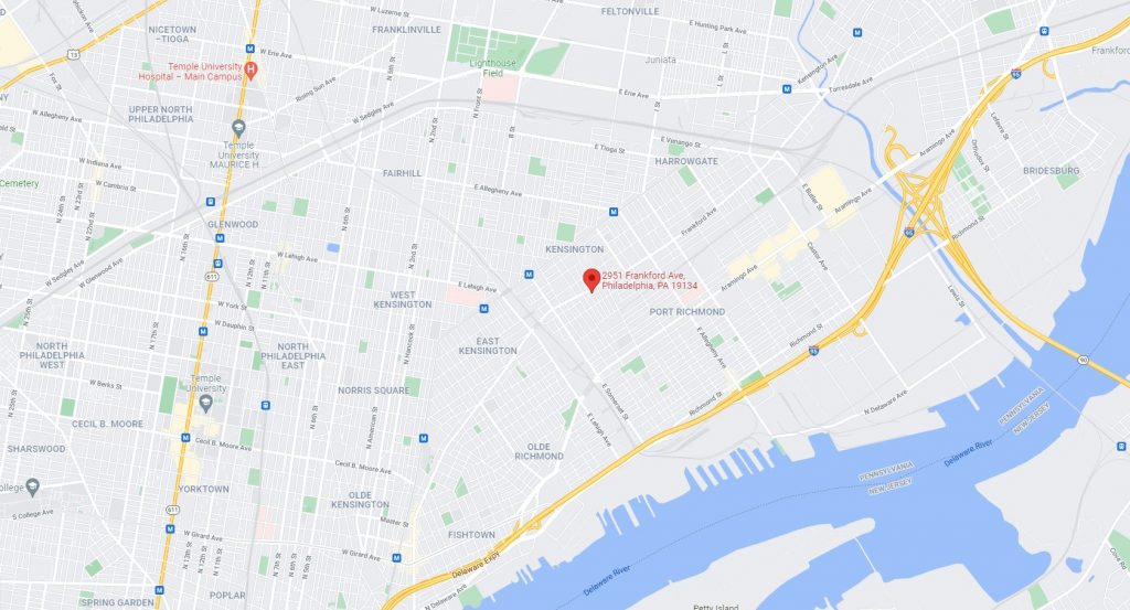
2951 Frankford Avenue. Credit: Google Maps
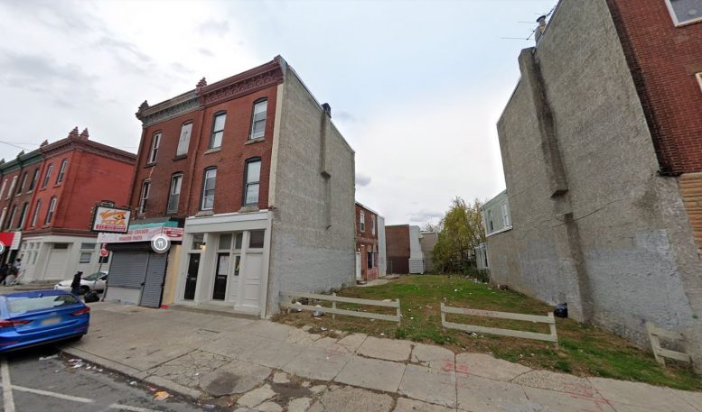
The building will replace a grass lot that appears to have housed a rowhouse in the past, but has sat vacant for over a decade. In fact, the entire corridor has seen virtually no construction in years, so the incoming addition is a positive sign for the neighborhood’s future prospects. The structure will fill a nuisance streetwall gap and will positively contribute to the commercial stretch.
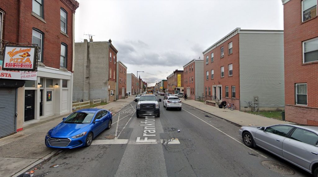
Frankford Avenue, with 2951 Frankford Avenue on the left. Looking southwest. Credit: Google Maps
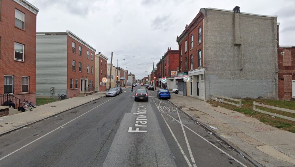
Frankford Avenue, with 2951 Frankford Avenue on the right. Looking northeast. Credit: Google Maps
The most notable addition to the street in the postwar years is the series of semi-attached rowhouses built along its length likely some time after the turn of the millennium, including several that stand directly across the street from the proposal site. Their three-story height, brick facades, and historicist, if sparse, detailing is a decent attempt to match the existing rowhouse stock.
On the other hand, from a planning perspective, the buildings showcase a number of glaring failures. The structures are joined in pairs, with a rowhouse-sized gap left at every other third lot. This appears to be a feature designed with the discredited postwar adage of “less density = good for the city,” a concept that is widely applied to the suburbs.
However, instead of creating pleasant breathing room and green space, the effect appears just as dismal as a traditional rowhouse street where every third building has been demolished. The yards sit entirely vacant, are separated from the street with chain link fences, and look upon largely windowless lot walls, in a baffling by-design imitation of abandoned lots. The fact that these gaps were left intentionally is underscored by the presence of electrical meters and occasional windows on the lot walls.
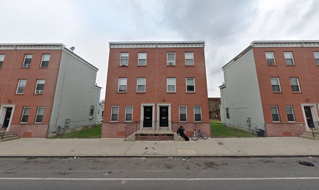
The semi-attached residential buildings across the street from 2951 Frankford Avenue. Looking northwest. Credit: Google Maps
Another problem is that almost none of the buildings feature any ground-level retail, which is detrimental to the street’s commercial corridor that was established back in the prewar years. Again, separation of use is a classic trope of postwar suburbia, which drains life from the street and creates foreboding, pedestrian-unfriendly sidewalks when applied to vibrant urban thoroughfares.
The proposal at hand is a return to classic urban form, as it fills a vacant lot, will apparently stand attached to the neighboring structure, and will feature ground-level retail. Though there is still much that must be done to overhaul the city’s deeply flawed zoning ordinances, it is pleasant to see that proper planning and common sense are making their way back to the city’s streets.
Even the suburban-minded aberrations built across the street and elsewhere up and down the block may be remedied in a relatively simple manner. The vacant lots between the existing structures need to be replaced with new, attached buildings with ground-level commercial space. This would resolve both the problem of streetwall gaps and lack of pedestrian-friendly retail. Only minor alterations, largely consisting of relocating the electric meters, would need to be made to the existing buildings.
2951 Frankford Avenue. Looking east. Credit: Google Maps
The measure would enliven a somewhat desolate stretch of the street and would add much-needed housing stock to the neighborhood. As expected, the greatest hurdle here would be not the alterations and construction itself, but rather the byzantine zoning and bureaucracy that would make such an improvement possible. We urge the city to put this concern on the long list of measures that need to be taken to restore neighborhoods to their vibrant, pedestrian-friendly form.
Subscribe to YIMBY’s daily e-mail
![]()
Follow YIMBYgram for real-time photo updates
Like YIMBY on Facebook
Follow YIMBY’s Twitter for the latest in YIMBYnews



I don’t believe it.
I grew up with two connected houses, separated; thus allowed front and rear patios, luscious front lawns with trees galore and a driveway in the rear with parking garages for each house.
We clearly have different priorities and I actually applaud this development and declare it a hands down winner with so much potential.
Yimby should hire me to add some interesting perspective to these articles because I guarantee you that it will be an interesting and enjoyable read. 😉
lived not too far from this street. a small improvement from what it looked like 14 years ago