Construction is just about complete at The HQ, a four-story, 30-unit residential development that stands at 710 North 16th Street in Fairmount, North Philadelphia, near the border with Francisville. Developed by the Stamm Development Group, the project packs 35,000 square feet of interior space and features units ranging from studios to two bedrooms. The amenity package includes a fitness center and a roof deck.
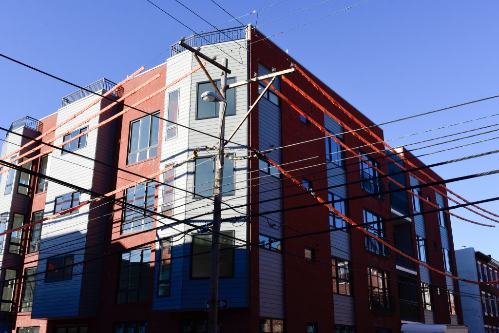
710 North 16th Street. Photo by Jamie Meller
When YIMBY last checked in at the site in July, the structure already stood nearly finished, although interior work was clearly in progress and fencing still wrapped around the building footprint. Surprisingly, our latest visit has revealed that little progress has been made over the past few months, though the structure visibly inches toward full completion.
Since our last visit, the amount of construction fencing has been reduced and the remaining barriers have largely retreated out from the roadway onto the sidewalk close to the building facade, and have been removed altogether in some sections. In all, the project appears on track toward its projected completion in fall of this year, although at this pace it may also be slightly pushed back.
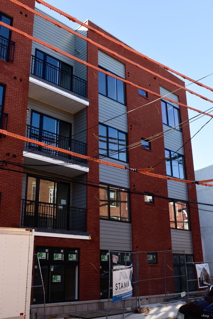
710 North 16th Street. Photo by Jamie Meller
The building stands in a cozy, urbane setting densely built out with prewar rowhouses. As such, the architects were ostensibly faced with the challenge of crafting a design that channels a distinct identity without overwhelming the more intimate rowhouse context. The design solution embraced an aesthetic that walks a fine line between the smaller-scale surrounding context and the building’s large bulk and contemporary aspirations.
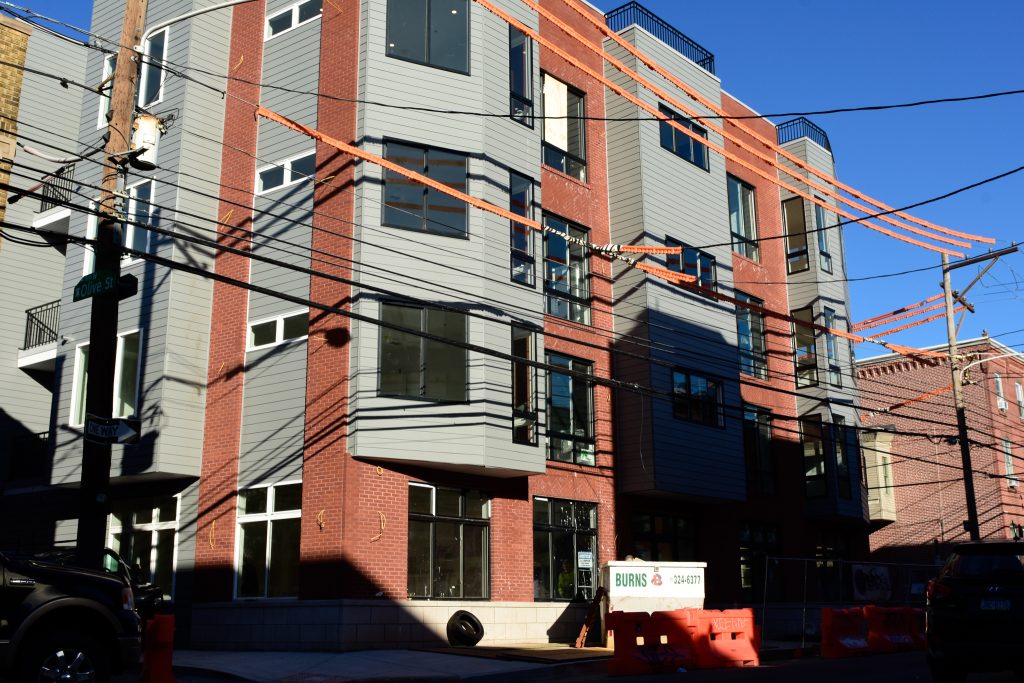
710 North 16th Street. Photo by Jamie Meller
Red brick comprises the majority of the exterior, in a nod to the classic Philadelphia rowhouse vernacular. Although the color is a tad too bright when compared to its subtler, more textured counterparts, the facade somewhat makes up for it with understated details such as rowlock courses beneath the windows and chevron patterns at window spandrels. An applied masonry base solidly anchors the structure into the ground, adding gravitas at the pedestrian level.
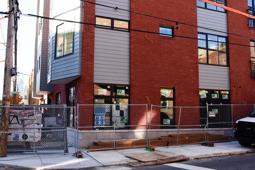
710 North 16th Street. Photo by Jamie Meller
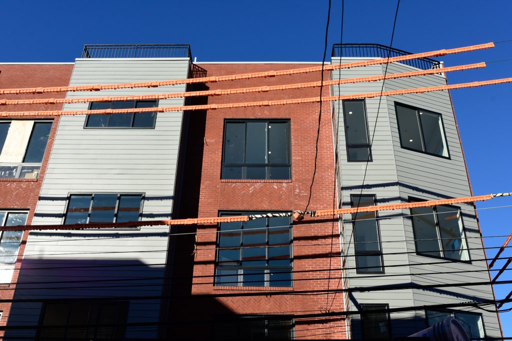
710 North 16th Street. Photo by Jamie Meller
Perhaps wisely, the designers avoided further historicist detailing, which can be a hit or miss depending on execution and effect on the overall design. There are no stone window lintels nor is there a cornice, aside from a thin wide band that neatly rounds off the design.
Instead, the building’s salient feature is an array of cantilevered sections clad in horizontal gray siding. The alternate material add a modern, though still grounded in historic vernacular, touch to the exterior, while helping visually break down the structure’s relatively large and generally boxy mass. Moreover, projecting sections, occasional angled cuts, and varied windows add further variety and formal interest to the composition.
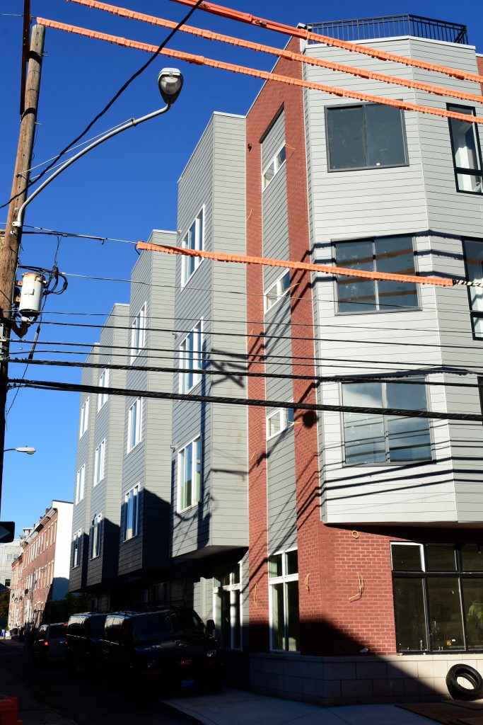
710 North 16th Street. Photo by Jamie Meller
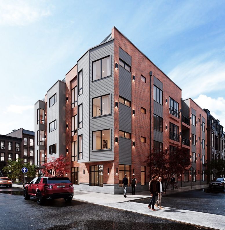
For the most part, the design matches the one shown on the renderings, albeit, unfortunately, wall sconces appear to be missing from the final product. More interesting are the minute differences we can observe in the mock-up setting versus reality. It is rather common for architects, especially of smaller projects, to embellish renders with whimsical details (remember the reverse-wing jet flying above The Maven?). Here, the whimsy of choice comes in the form of a surprisingly European setting, complete with paver crosswalks, distinctly European street signs, and elongated license plates of a variety commonly seen on the other side of the ocean. However, such window dressing does not seem out of place, given that the building’s actual setting has a distinctively Old World, prewar charm of its own.
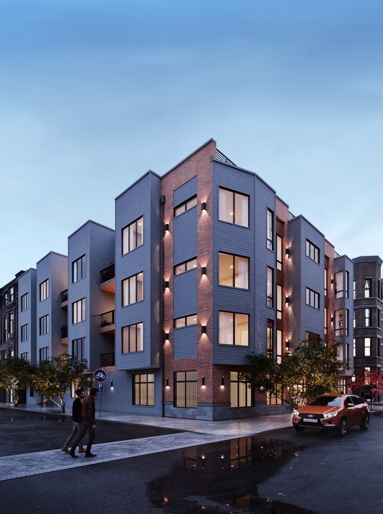
Rendering of The HQ at 716 North 16th Street. Credit: Stamm Development Group.
More noticeable, and relevant, is the situation with overhead wiring. Understandably, most developers omit showing overhead wires in building renderings (901 Leland Street, under construction nearby, is a notable exception) as they are universally considered a blight on any urban streetscape. As such, the team behind The HQ can hardly be blamed for omitting the unsightly detail from renders.
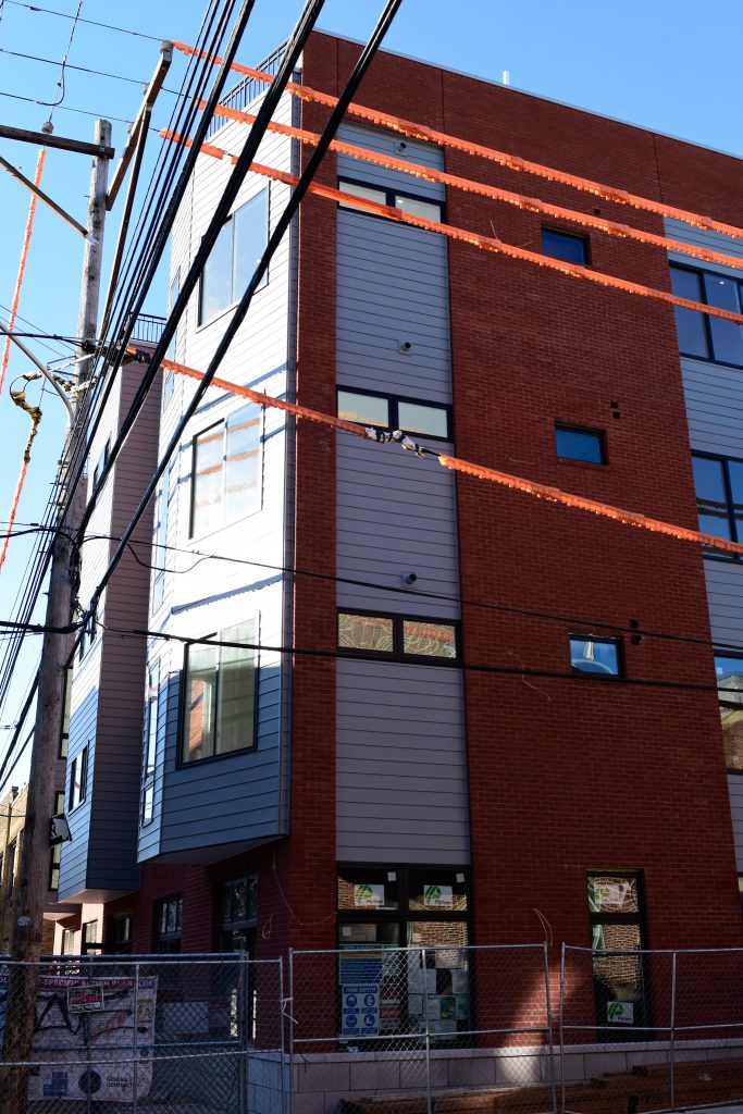
Unfortunately, in reality overhead wiring is arguably the most eye-catching element of the composition, with a haphazard jumble of cables hanging from worn, tilting timber posts and wrapped in utilitarian orange covering. We would be surprised if the reader has not already picked up on this obvious visual intrusion from our photo report.
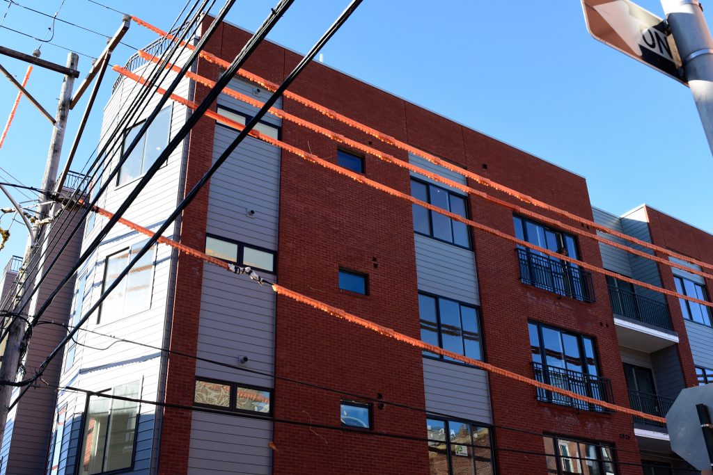
710 North 16th Street. Photo by Jamie Meller
710 North 16th Street. Photo by Jamie Meller
The issue at hand goes well beyond creating a nuisance for developer marketing material. Overhead wiring is an eyesore that cheapens the ambiance of the neighborhood. Exposed cables are particularly vulnerable to adverse weather events and may plunge entire districts into darkness and cold in case of a severe storm, a time when both utilities are needed most. Loose wiring may also endanger pedestrians if it reaches the ground. By contrast, none of these nuisances and hazards are an issue for any neighborhood where cabling has been buried underground.
We implore local residents to petition their representatives and city agencies to place overhead wiring underground throughout the city, improving infrastructure resiliency as much as the quality of life in their communities.
Subscribe to YIMBY’s daily e-mail
Follow YIMBYgram for real-time photo updates
Like YIMBY on Facebook
Follow YIMBY’s Twitter for the latest in YIMBYnews

I cant see the building through the third world Mogadishu wires.
I can see the wires for the exterior lights. It’s seems that they will be installed bases on the renderings.