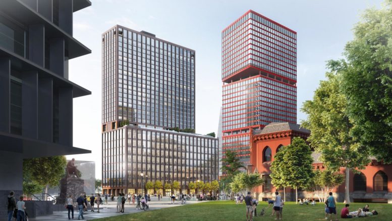
University City, the central hub of West Philadelphia, is teeming with new under-construction developments. Of these, one of the most significant is the 361-foot-tall, 28-story mixed-use tower currently rising at 3025 John F. Kennedy Boulevard. Designed by the Practice for Architecture and Urbanism and developed by Brandywine Realty Trust, the building will span a total of 559,583 square feet of interior space, combining commercial space on the lower floors with 326 residential floors situated above. Today YIMBY looks at imagery of the development’s proposed amenity space, both indoor and outdoor.
The majority of the project’s residential amenities are situated in the Lifestyle Club on the 9th floor, which boasts lounge space, a bar, co-working areas, conference and meeting rooms, a game room, a fitness center, luxury locker rooms, a terrace with lap and recreation pool, grills, a lawn, and other forms of recreational activity space.
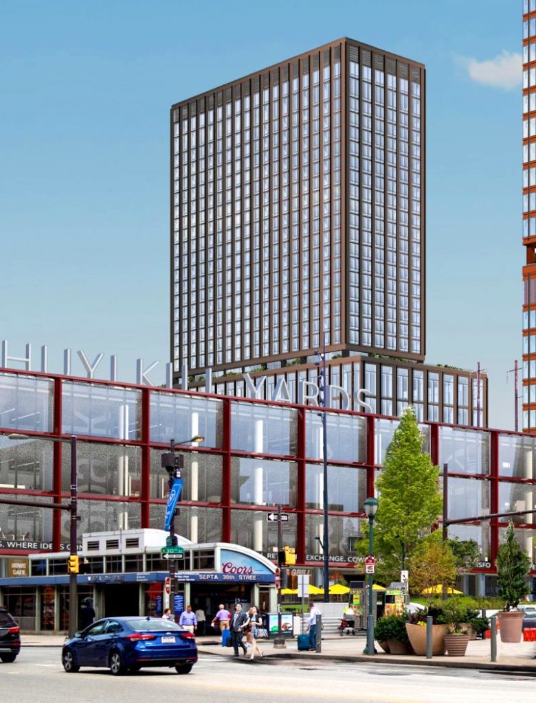
3025 John F. Kennedy Boulevard. Rendering via Brandywine Realty Trust
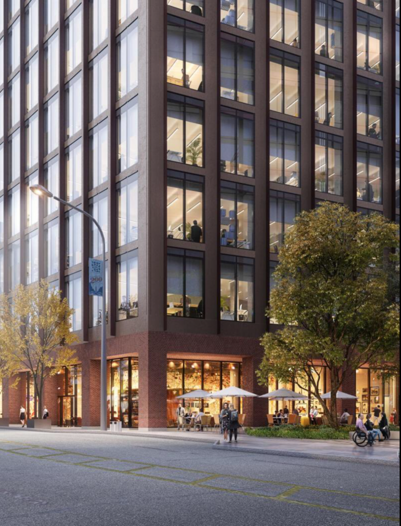
3025 JFK Boulevard Rendering via Brandywine Realty
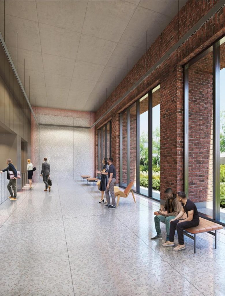
3025 John F. Kennedy Boulevard. Rendering via Brandywine Realty Trust
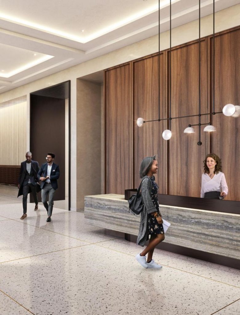
3025 John F. Kennedy Boulevard. Rendering via Brandywine Realty Trust
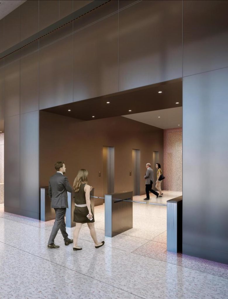
3025 John F. Kennedy Boulevard. Rendering via Brandywine Realty Trust
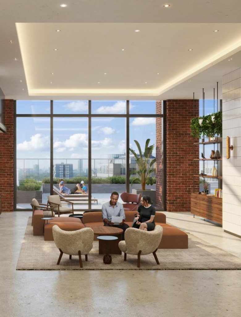
3025 John F. Kennedy Boulevard. Rendering via Brandywine Realty Trust
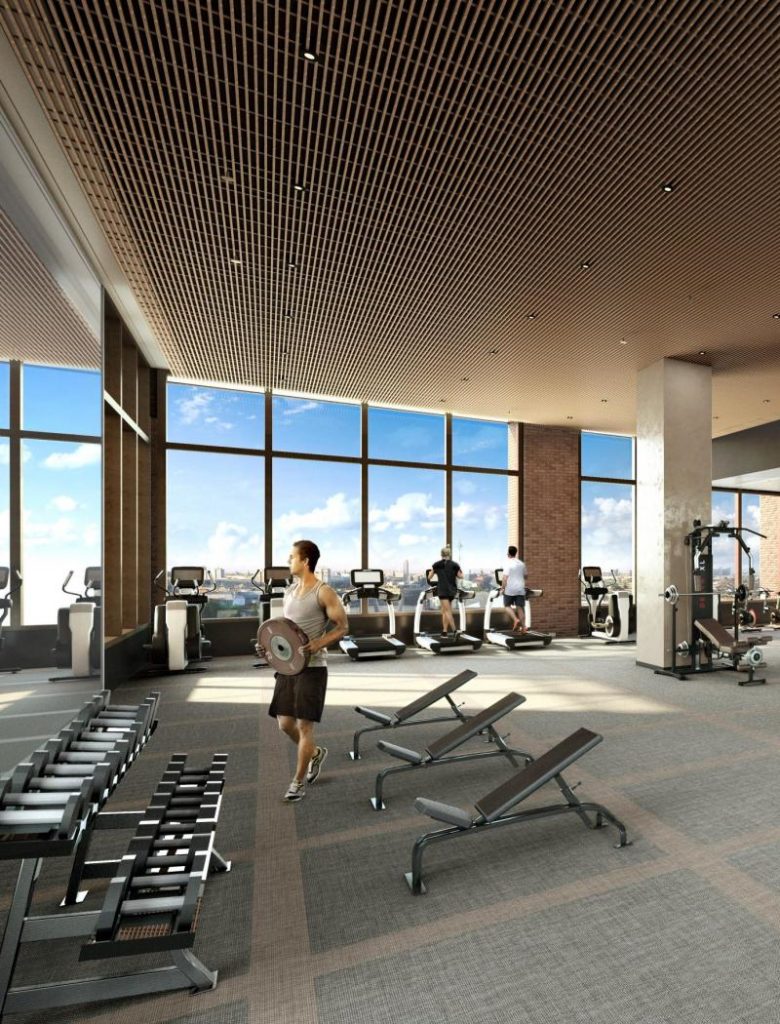
3025 John F. Kennedy Boulevard. Rendering via Brandywine Realty Trust
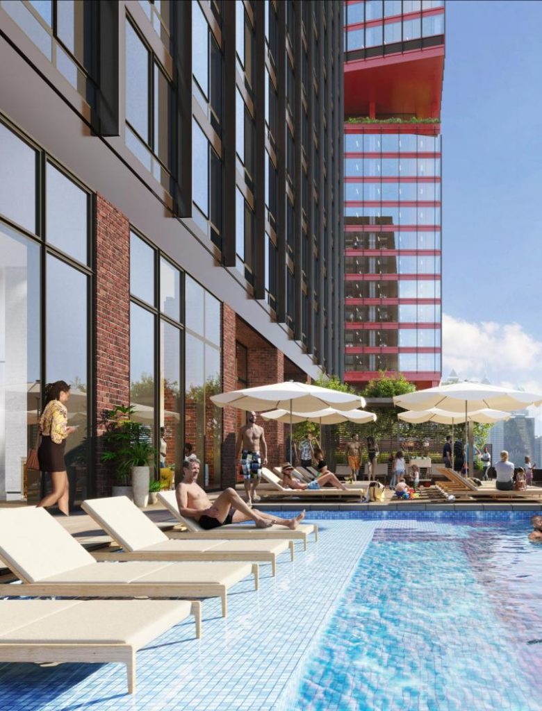
3025 John F. Kennedy Boulevard. Rendering via Brandywine Realty Trust
The skyscraper was issued construction permits in December 2020, with Hunter Roberts Construction Group as the contractor. As of today, the superstructure has already begun its skyward climb, with concrete being poured for the lower floors. The cost of construction is projected at $180 million.
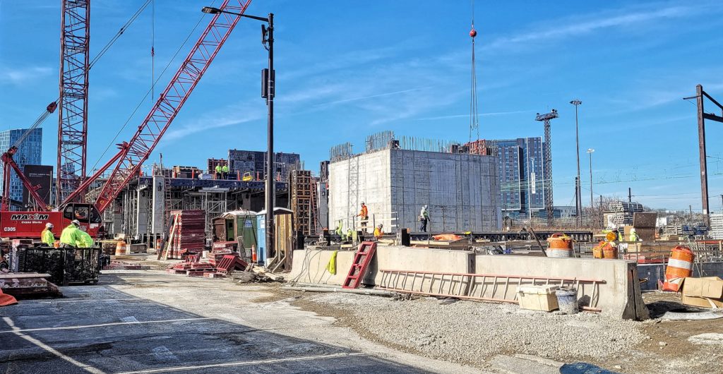
3025 John F. Kennedy Boulevard looking northwest. Photo by Thomas Koloski
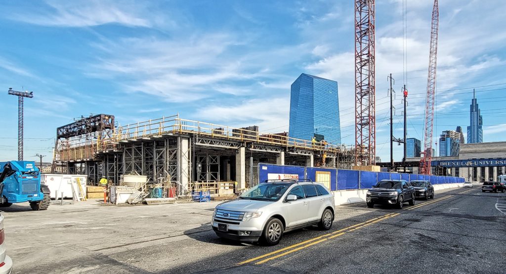
3025 John F. Kennedy Boulevard looking northwest. Photo by Thomas Koloski.
The project, also known as Schuylkill Yards West, is part of Schuylkill Yards, a 14-acre megadevelopment that will transform the northern section of University City. Named after its location by the railyard, the complex will consist of several high-rise and low-rise buildings with both commercial and residential programming, as well as public space.
Subscribe to YIMBY’s daily e-mail
![]()
Follow YIMBYgram for real-time photo updates
Like YIMBY on Facebook
Follow YIMBY’s Twitter for the latest in YIMBYnews

Cold, boring and sterile
no…..functional and clean…..
Blank buildings attracts blank people which results in a blank city
Looks like a stumpy 1 NY Plaza
It is possible to design a functional and clean building that is also attractive, but this building misses the mark. It has the aesthetic of a Mies van der Rohe structure without any of the nuance. I have long been perturbed by the commonality of the belief that creativity and functionality are diatonically apposed. A buildings function is just as deeply rooted in its appearance as it’s use. While I do not belief form should come at the expense of function, it is not a zero sum game. This building is unapologetically cheap. The lazy brick bottom story is an admission by the architects that they could not afford it anywhere else on the building. Any time you see more effort out into the ground level of a building than it’s raised counterpart you are seeing that there was not enough money allocated to the facade, and so the architects used it where they thought it would be most effective. This is not efficient or “cost effective” it is lazy and represents a lack of foresight and design emphasis by the developers. The green space mid-way up the tower is either rendered poorly or extremely sad. Breaking the building and then continuing a portion of it upwards is not architecture, but it does present architectural opportunities. This building appear to take advantage of none of those opportunities, instead opting for the same type of architecture reserved for a building built on top of a parking garage. Not to forget that the entire masterpiece is topped off with vents, which in some circles could be argued as the architects purposely drawing attention to the mechanical systems in the structure as a statement of modernism, but I doubt that was the intention here. That era is long gone, if mechanical systems are to be celebrated then that should be the design goal for the entire building not solely the top story. It looks like the cheapest easiest way to solve the issue, and I am disappointed in the lack if creativity. I sincerely hope I am proven wrong when the construction of this building is complete, because investments like this do not come often, and if the attention to detail is not taken now, it will leave many possibilities of greatness unrealized.