Philly YIMBY’s recent site visit has revealed the completion of construction at a four-story, four-unit condominium at 233 Christian Street in Queen Village, South Philadelphia. The development rises on the north side between South American Street and South 2nd Street, replacing an undistinguished three-story rowhouse. Designed by Gnome Architects and developed by Zatos Investment, the building spans 7,014 square feet and features a basement, full sprinkling and private roof decks. Permits list GRIT Construction as the contractor and a construction cost of $350,000.
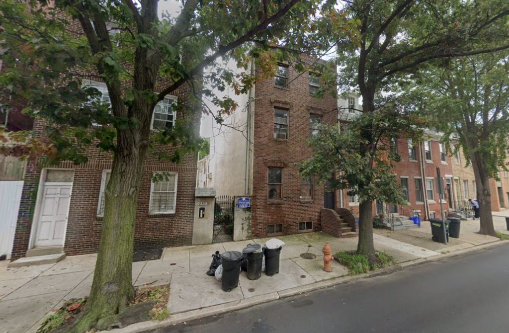
233 Christian Street, Looking northeast prior to demolition. September 2018. Credit: Google Maps
Philadelphia YIMBY frequently takes issue with demolition of existing rowhouses, especially when they are in good condition and their replacement offers only marginal increase in density. And though the rowhouse that stood at the site until around 2019 was indeed only one story shorter than the new structure and appeared to be reasonably well-maintained, we have no objections to its replacement.
The demolished building’s brick facade appeared surprisingly drab even considering its understated brick ornamentation. Its sheer front facade broke the roof line of the Federal rowhouse next door as drastically as the new building does. Furthermore, its lack of a projecting cornice detracted from its appearance in comparison to its neighbors.
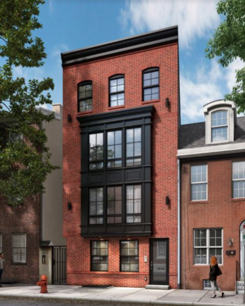
233 Christian Street. Rendering credit: Gnome Architects
As is the trend for the consistently high-quality output from Gnome Architects, the final product matches the renderings almost exactly, in this case the exception being the lack of arched windows at the fourth floor. Although the design of the new building is not perfect, particularly given its sidewalk-facing electrical meters and lack of an articulated base, it shows definite improvement over its predecessor. The crisp red brick catches the sunlight in a more attractive manner and its tone is a better match for the Federal and Colonial rowhouses to the east.
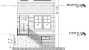
The gently projecting street-facing cantilever boasts large picture windows and understated yet stately mullions and trim, while its black color matches that of the plain yet attractive cornice at the parapet. Gridded windows echo the design of the apertures of the building’s historic counterparts on the block.
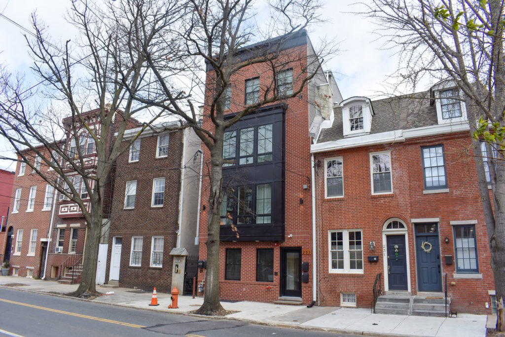
233 Christian Street. Photo by Jamie Meller. April 2022
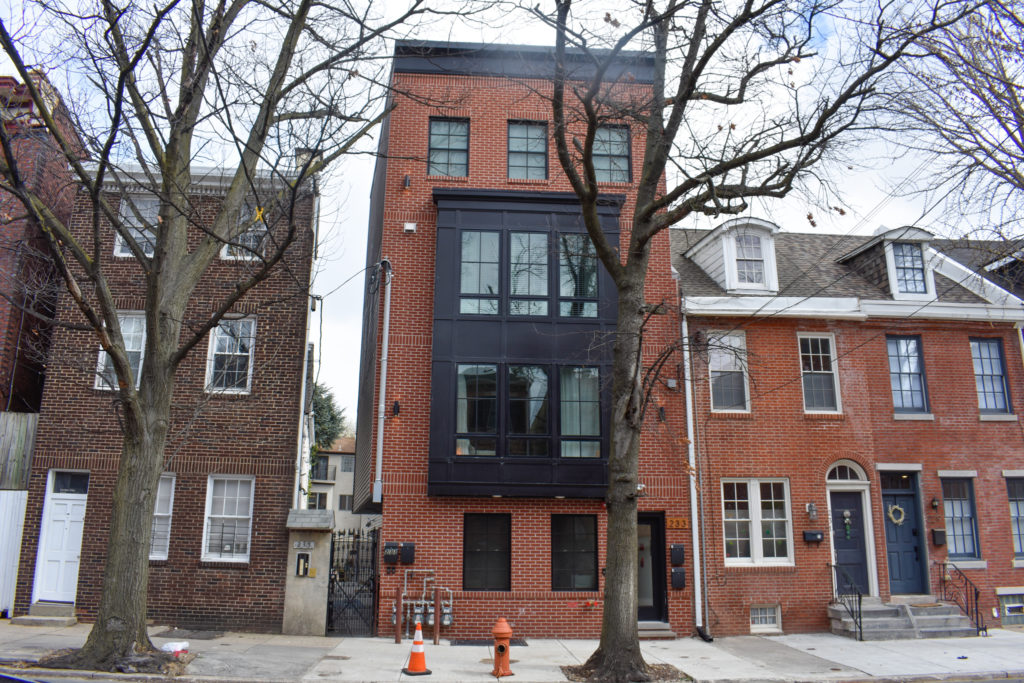
233 Christian Street. Photo by Jamie Meller. April 2022
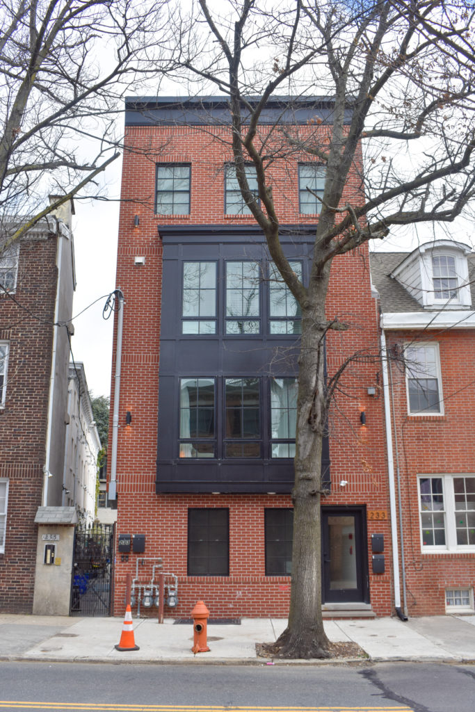
233 Christian Street. Photo by Jamie Meller. April 2022
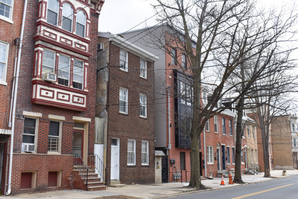
233 Christian Street. Photo by Jamie Meller. April 2022
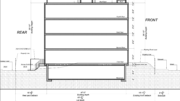
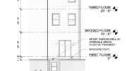
The building maxes out its allowable height, rising 38 feet to the main roof, 41.5 feet to the parapet, and 48 feet to the top of the pilot house. Although the structure rises only slightly higher than its neighbors, the height difference gives it the necessary prominence to allow for dramatic views of the nearby Center City skyline from the roof decks.
Residences feature hardwood floors, white quartz countertops, and stainless steel appliances in the kitchens. Last May, one of the units was sold for $575,000.
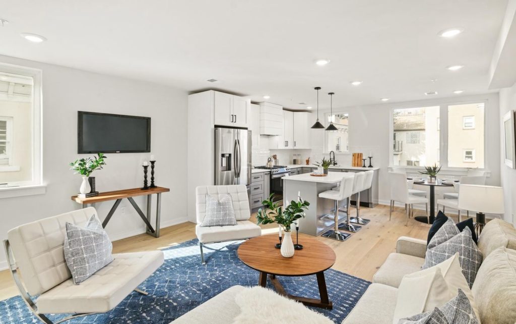
233 Christian Street. Interior. Living room
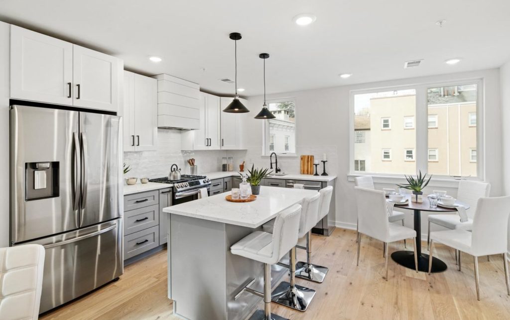
233 Christian Street. Interior. Kitchen
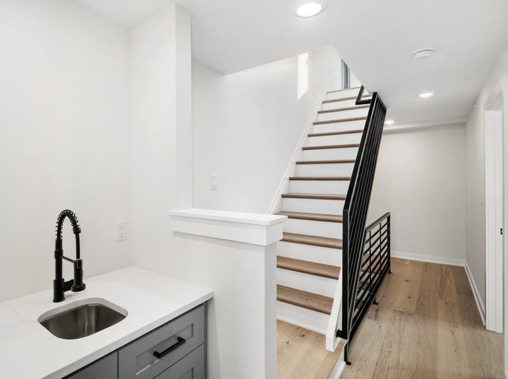
233 Christian Street. Interior. Hallway
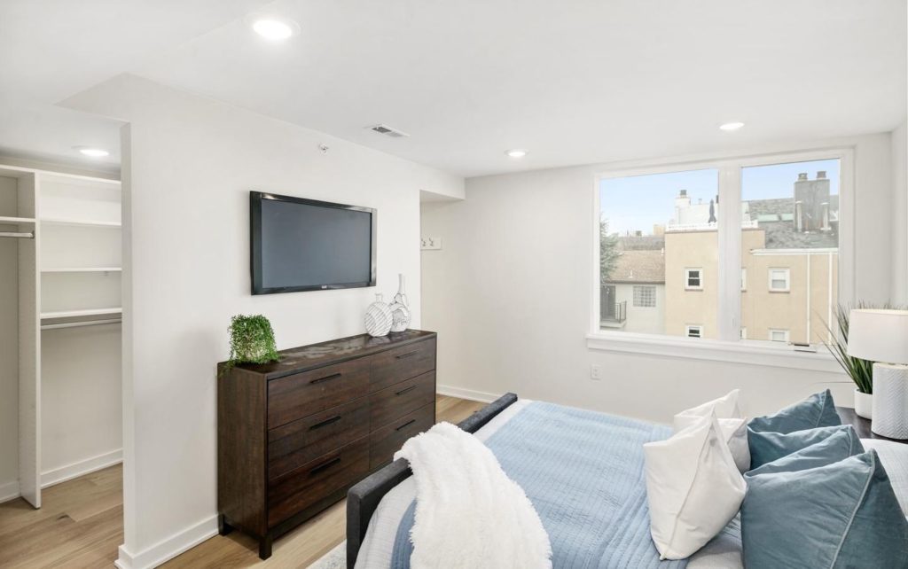
233 Christian Street. Interior. Bedroom
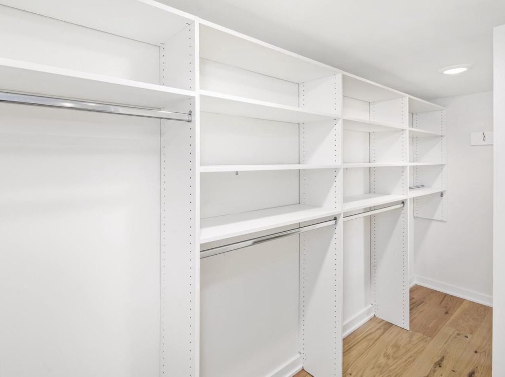
233 Christian Street. Interior. Walk-in closet
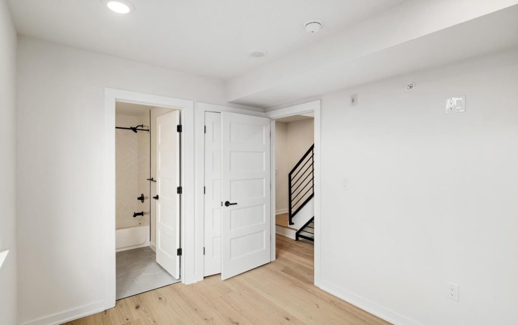
233 Christian Street. Interior. Bedroom
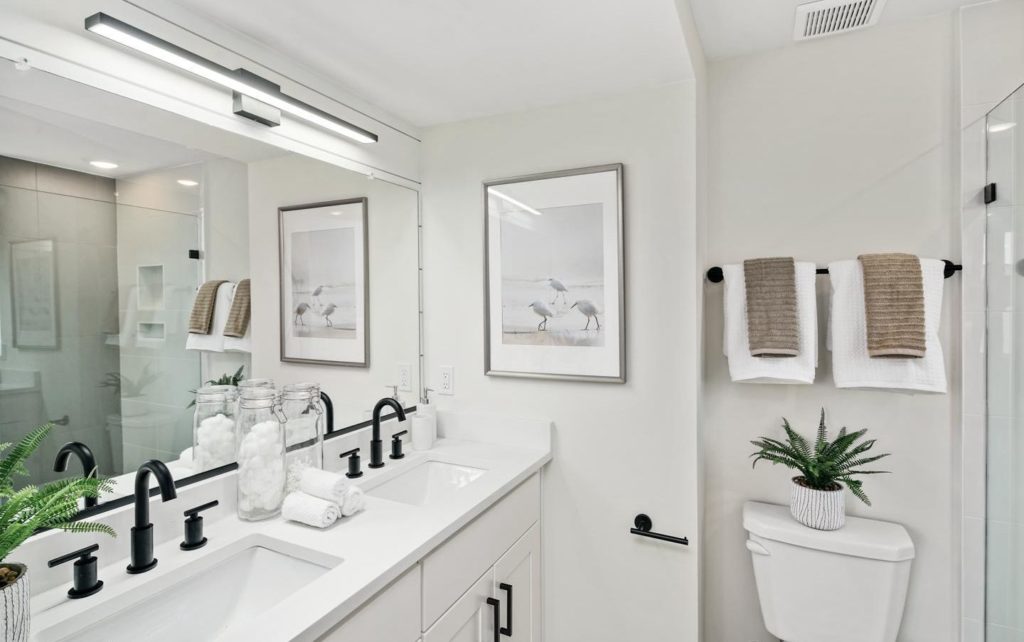
233 Christian Street. Interior. Bathroom
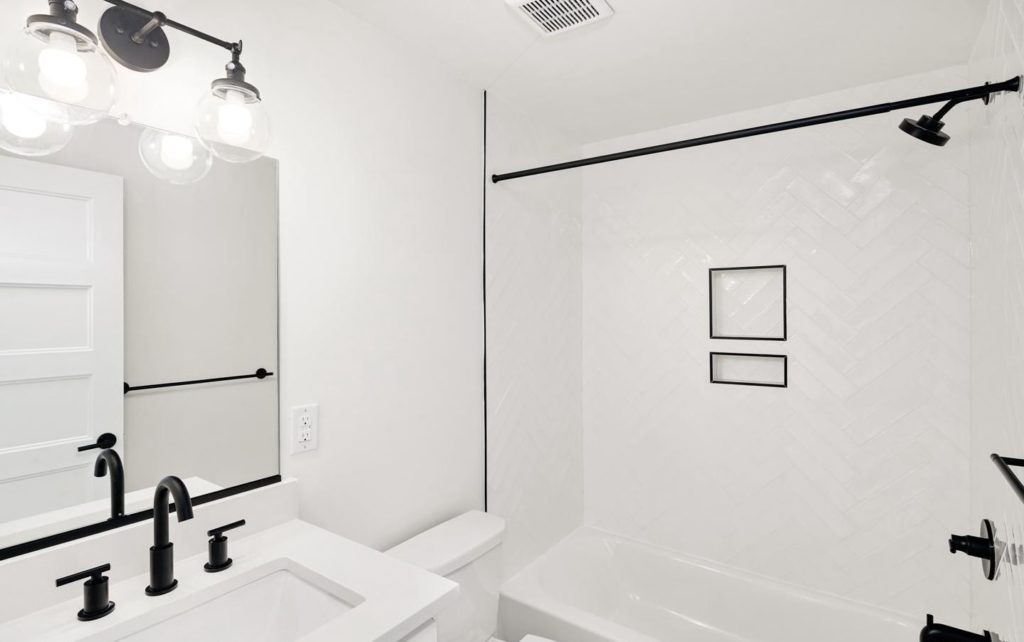
233 Christian Street. Interior. Bathroom
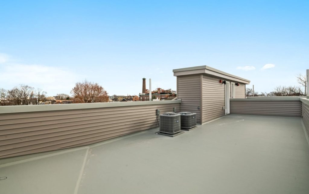
233 Christian Street. Interior. Roof deck (looking southwest toward the Sparks Shot Tower; skyline views are in the opposite direction)
233 Christian Street is situated in a quaint neighborhood densely built out with predominantly prewar residential stock, and as such offers few significant sites for redevelopment that would not require demolition of distinguished structures. However, such opportunities do exist throughout the desirable, centrally-located (though subway-distant) neighborhood, such as a block to the east at 841-51 South 2nd Street, where a four-story, 42-unit mixed-use building with ground-floor retail will soon replace a recently demolished suburban-style strip mall.
Subscribe to YIMBY’s daily e-mail
![]()
Follow YIMBYgram for real-time photo updates
Like YIMBY on Facebook
Follow YIMBY’s Twitter for the latest in YIMBYnews

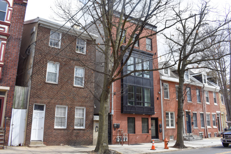
While the interiors are typically builder bland and characterless, the architecture of the facade is a great example of how to infill with character.
If anything, the interiors are average. There’s nothing outstanding about them yet there isn’t anything bad about them, either. Just standard new construction interiors. What makes these particular ones “bland and characterless”? In the real estate market, particularly with condos (as is the case with this building), it makes the best marketing sense to sell units as a blank slate that can later be customized by the buyer. Making units zany and unique may make them more interesting to some but it naturally limits the buyer pool as their uniqueness may not be for everyone (though, of course, practical reasons aside, I do wish there was more unique housing stock on the new construction market).
If I had any complaints, they would be about the ubiquitous ceiling-embedded lights. While they would make it an aesthetic and technical challenge to mount any chandeliers by the buyers, at least their spread-out placement makes sense for the large living-dining rooms.
the 1970’s giant can lights are the least expensive to flood the rooms with light, nothing more, nothing less. They rooms are sheetrock boxes with no trim: cabinets look i’ll fitted (they don’t quite touch the ceiling and without a crown at the top their just boxes against the wall, cheaply made (yes, to keep the price point down)….the finishes (black) in the bathroom are a nice touch but the cheapness of the materials comes through: …..old houses have character, and while this is a new house, it has the pretense of old which is a value.
and who wants to look right into the messy closet unless you only have 5 Armani grey suits, equally spaced?
7,014 square feet and 4 condo’s for $350,000.00 ??
Nice try by the developer for “fooling the tax assessor….”
Aren’t those gas meters and electrical conduits on the brick front a nice touch…..