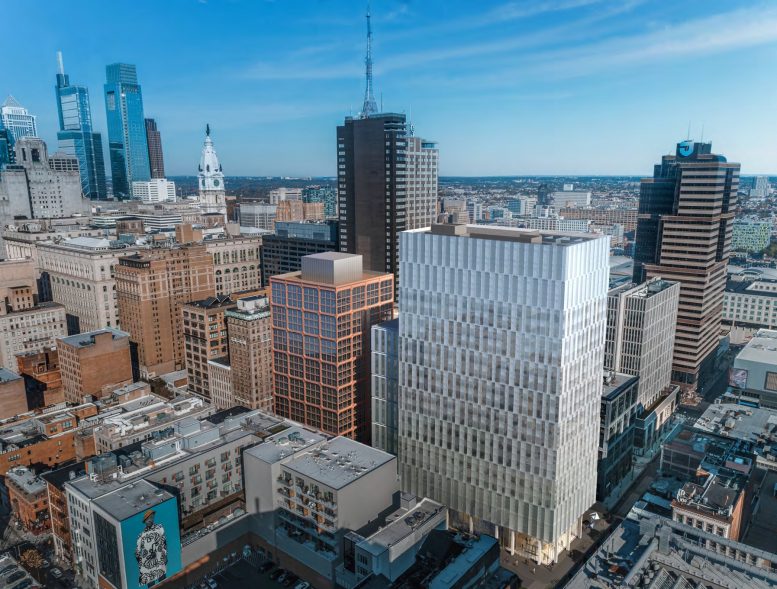
In the late 1980s, in rapid succession, a series of skyscrapers broke through the long-held “Gentlemen’s Agreement” that unofficially restricted Philadelphia’s buildings from rising above the 548-foot-tall pinnacle of City Hall, creating the now-iconic skyline of Center City. While the skyscraper cluster transformed the area to the west of City Hall, the Market East district to the east continues to lag behind in terms of an imposing skyline. However, East Market Phase 3, developed by National Real Estate Development as part of the East Market complex and currently under construction at 1101-53 Chestnut Street, will boost the local skyline with a pair of towers rising 364 and 288 feet tall. The buildings will bring one million square feet of medical office, residential, and retail space to the neighborhood, and will add a sizable public plaza. Today we take a detailed look at the transformative project.
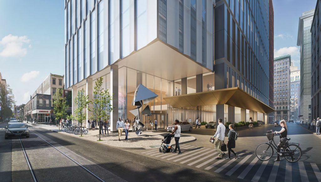
East Market Phase 3. Credit: National Real Estate Development / Ennead Architects / Morris Adjmi / BLTa via CDR
East Market Phase 3. Credit: National Real Estate Development / Ennead Architects / Morris Adjmi / BLTa via CDR
East Market Phase 3 looking northwest. Photo by Thomas Koloski
The Complex
East Market Phase 3 is the latest expansion of East Market, a mixed-use, multi-building development that so far extends two blocks to the south to Market Street between South 11th and South 12th streets. Completed over the past few years, the complex consists of a mix of renovated buildings and ground-up construction, anchored with an expansive array of ground level retail. In 2018, the developer celebrated the completion of Phase 1, comprised of 1100 Ludlow, a 200,000-square-foot office building, The Ludlow, a 17-story high-rise with 322 luxury apartments, and The Girard, a 23-story tower that counts 300 residential units. Phase Two involved the renovation of the Stephen Girard Building, a 13-story prewar high-rise.
East Market Phase 1 and 2. Looking southeast from Market Street. Credit: BLTa
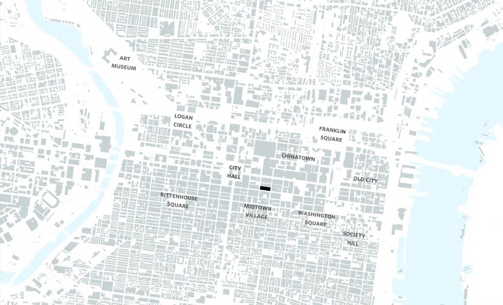
The complex centers on Chestnut Walk, a two-block-long pedestrian promenade that runs mid-block north-south between from Clover Street to Market Street. Retail flanks the landscaped forum, which functions as a much-needed outdoor public area in a crowded district with a dearth of public space. Its location underscores its importance, as the Reading Terminal Market and the recently renovated Fashion District Mall (formerly The Gallery) sit on the opposite side of Market Street, and the Philadelphia Convention Center is located a block further to the north. The plaza has already proven immensely popular over its short operating span.
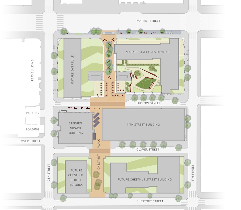
General master plan of East Market. Credit: BLTa
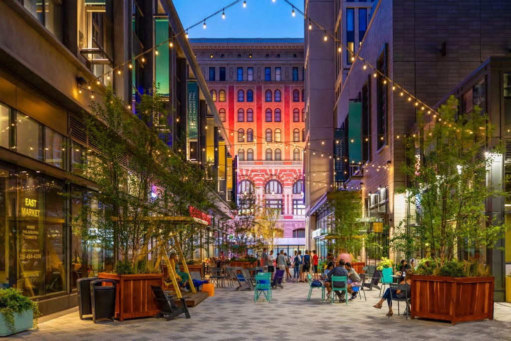
Chestnut Walk at East Market Phase 1 and 2. Credit: National Real Estate Development / Ennead Architects / Morris Adjmi / BLTa via CDR
Phase 3 provides a significant encore to the development, expanding its area by a third and spanning the block between Chestnut Street to the south, Clover Street to the north, South 11th Street to the east, and South 12th Street to the west. The block-long addition to Chestnut Walk will extend the promenade to Chestnut Street, solidifying it as a public corridor between two major commercial arterials. Flanking the Walk will be Chestnut East, a 364-foot-tall, 500,000-square-foot medical office tower, and Chestnut West, a 288-foot-tall, 250,000-square-foot residential high-rise with 396 apartments.
East Market Phase 3. Credit: National Real Estate Development / Ennead Architects / Morris Adjmi / BLTa via CDR
East Market Phase 3. Credit: National Real Estate Development / Ennead Architects / Morris Adjmi / BLTa via CDR
East Market – Chestnut East (the Thomas Jefferson Specialty Care Pavilion)
Chestnut East at East Market Phase 3. Credit: National Real Estate Development / Ennead Architects / Morris Adjmi / BLTa via CDR
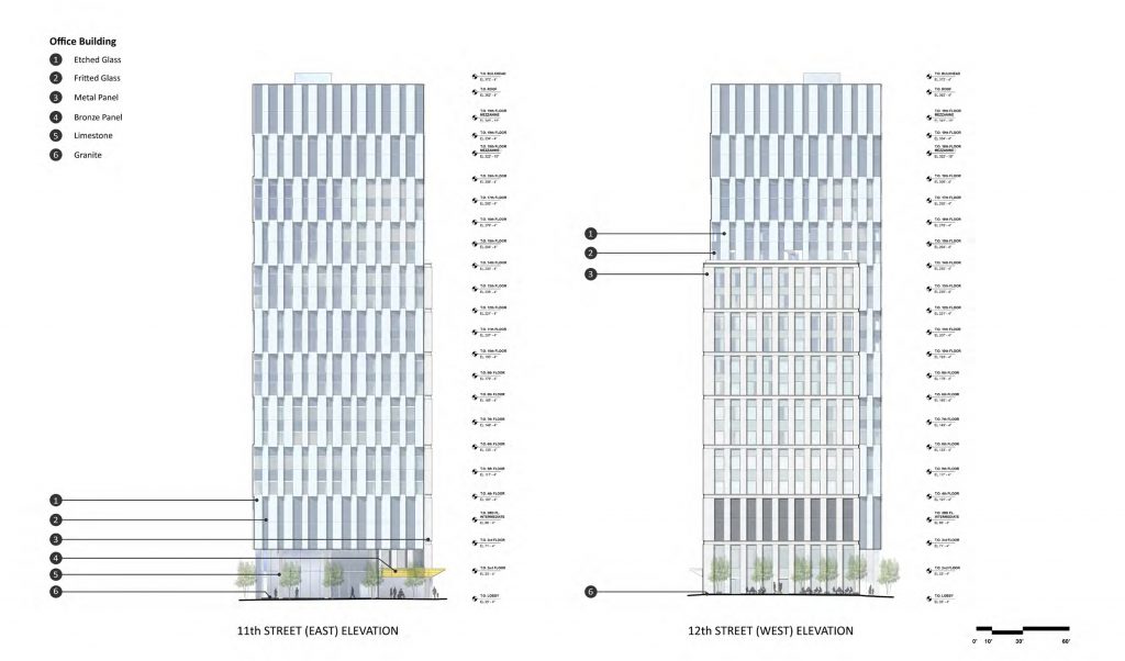
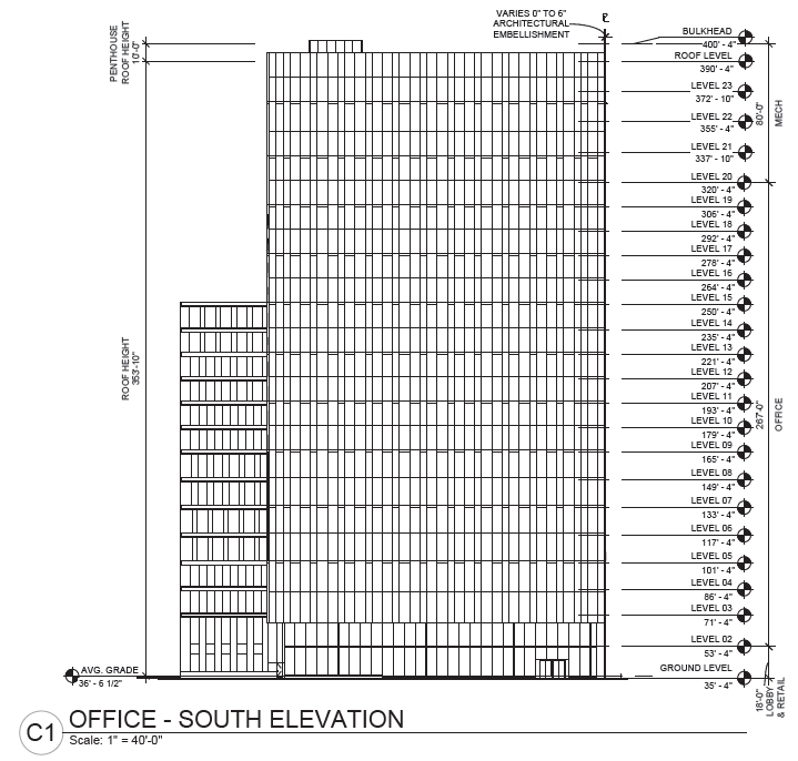
The larger building will be located at 1101 Chestnut Street, at the northwest corner of Chestnut Street and South 11th Street. The structure, which a Civic Design Review submission calls East Market – Chestnut East, will rise 354 feet tall to the main roof and 364 feet to the top of the bulkhead, and count 23 stories. The interior will contain 750,000 square feet of floor space, most of which will be used as medical office space for the Thomas Jefferson Specialty Care Pavilion.
Chestnut East at East Market Phase 3. Credit: National Real Estate Development / Ennead Architects / Morris Adjmi / BLTa via CDR
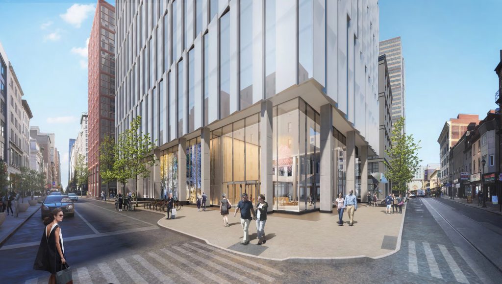
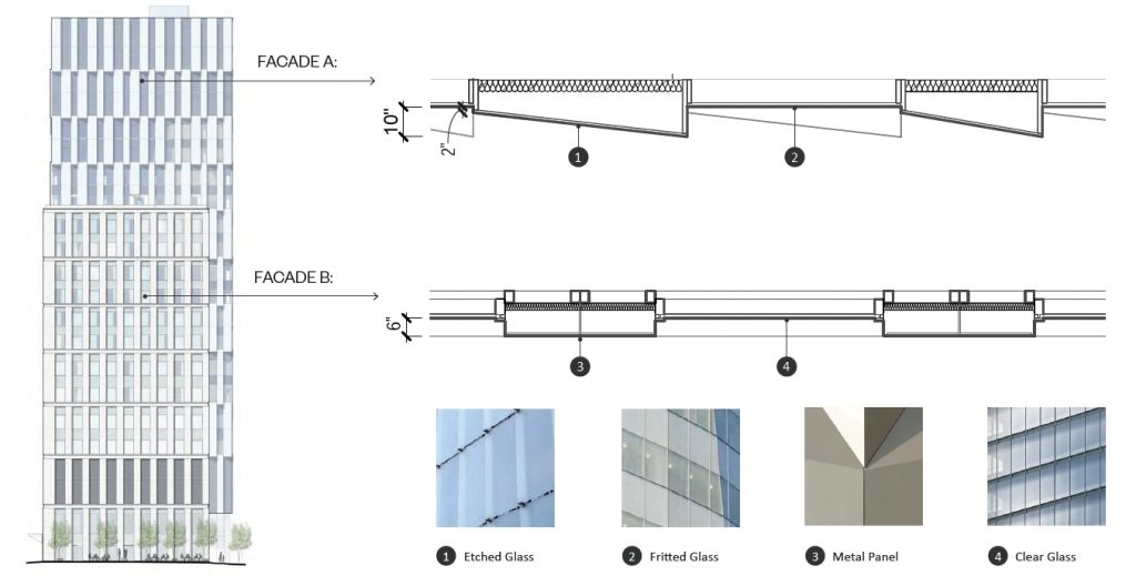
Designed by Ennead Architects, the structure will feature an off-white curtain wall that will appear at once light and airy yet restrained and institutional. At the tower’s main section, vertical panels of fritted glass, with etched glass windows in between, will rise two stories high, separated from their upper counterparts with coffered horizontal channels and staggered in relation to one another.
The double-height panel arrangement will visually reduce the apparent floor count by half, which will be sure to dismay proponents of “honest” structural expression and adherents to Louis Sullivan’s famed credo that “a skyscraper must be a proud and soaring thing, every inch of it.” However, the effect will also double the apparent floor height, creating an appearance of extra-lofty, upmarket interiors.
The fritted panels will be gently angled, which will add nuance to the otherwise restrained, Modernist design. No such angling will be found at the lower, “rear” section, which will rise 215 feet and 13 stories tall and will face north and west toward Clover Street and the Chestnut Walk. This section will be clad in vertical metal panels with clear glass in between, and will not use a staggered pattern. Though this appears to be a cheaper, “value-engineered” option in comparison to the primary system, it is still acceptable as it faces the less visible sides of the structure, is complementary to the overall design, and will provide variety to the bulky building’s appearance.
Chestnut East at East Market Phase 3. Credit: National Real Estate Development / Ennead Architects / Morris Adjmi / BLTa via CDR
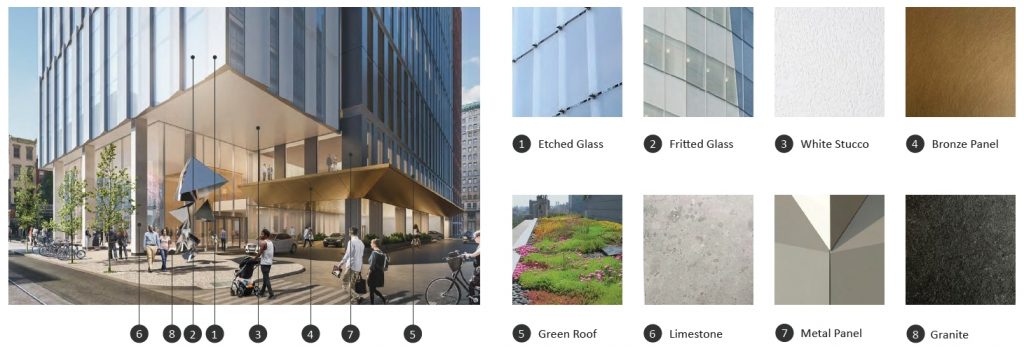
The ground floor will provide an open, welcoming experience, elevating the bulky office structure nearly 40 feet above the sidewalk on limestone-clad columns. An inset, all-glass wall will provide a sweeping view of the lobby, visually connecting the interior and its outdoor surroundings. In addition, the street level setback will add extra width to the sidewalk.
Chestnut East at East Market Phase 3. Credit: National Real Estate Development / Ennead Architects / Morris Adjmi / BLTa via CDR
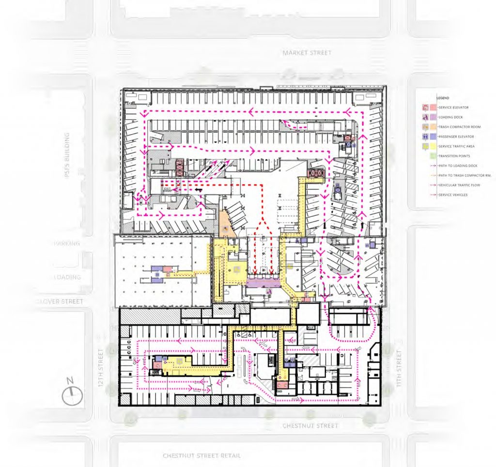
The ground floor will be used as lobby and retail space, which will face Chestnut and South 11th streets as well as the mid-block pedestrian promenade to the west, which will be an extension of the existing two-block-long Chestnut Walk to the north. The block-long section of Clover Street to the north will effectively become a service road for the complex, providing access to the drop-off zone in the northern section of the medical building and an entrance to a three-story underground garage, which will, in turn, connect to the existing underground parking space under the rest of the East Market complex to the north.
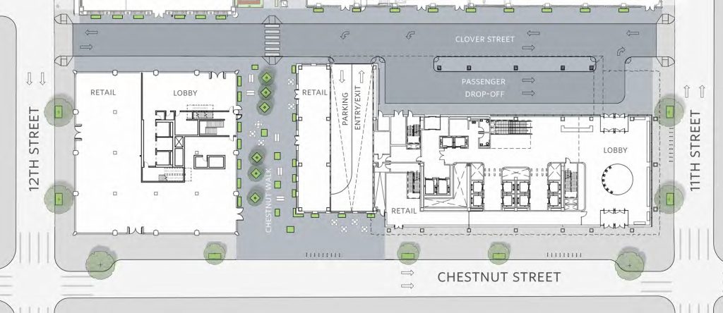
East Market Phase 3. Ground level. Credit: National Real Estate Development / Ennead Architects / Morris Adjmi / BLTa via CDR
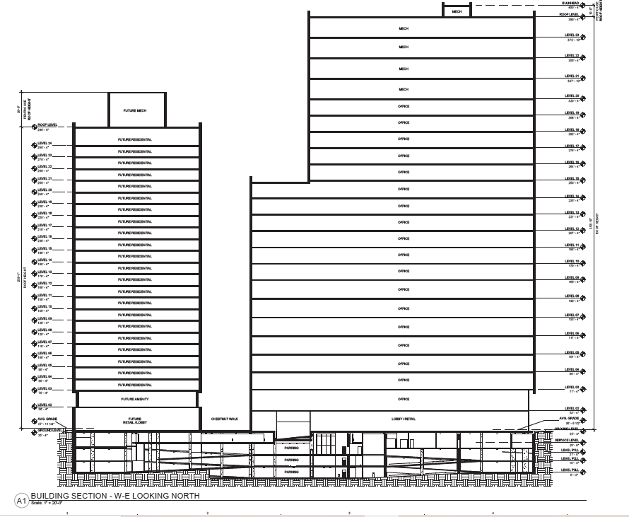
East Market Phase 3. Credit: National Real Estate Development / Ennead Architects / Morris Adjmi / BLTa via CDR
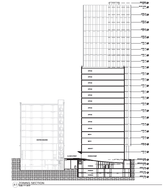
Chestnut East at East Market Phase 3. Credit: National Real Estate Development / Ennead Architects / Morris Adjmi / BLTa via CDR
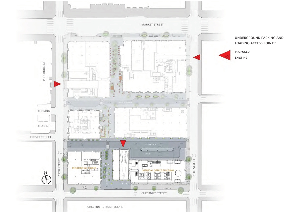
Site plan and underground parking entrances at East Market. Credit: National Real Estate Development / Ennead Architects / Morris Adjmi / BLTa via CDR
Underground level (P1) at East Market. Credit: National Real Estate Development / Ennead Architects / Morris Adjmi / BLTa via CDR
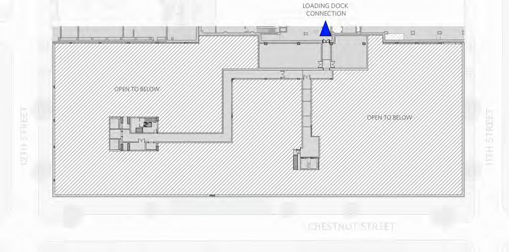
Underground level (mezzanine) at East Market Phase 3. Credit: National Real Estate Development / Ennead Architects / Morris Adjmi / BLTa via CDR
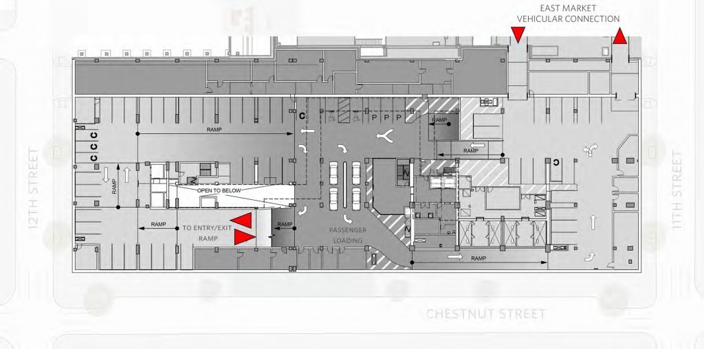
Underground level (P1) at East Market Phase 3. Credit: National Real Estate Development / Ennead Architects / Morris Adjmi / BLTa via CDR
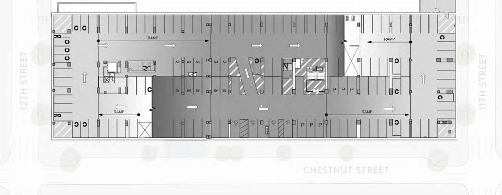
Underground level (P2) at East Market Phase 3. Credit: National Real Estate Development / Ennead Architects / Morris Adjmi / BLTa via CDR
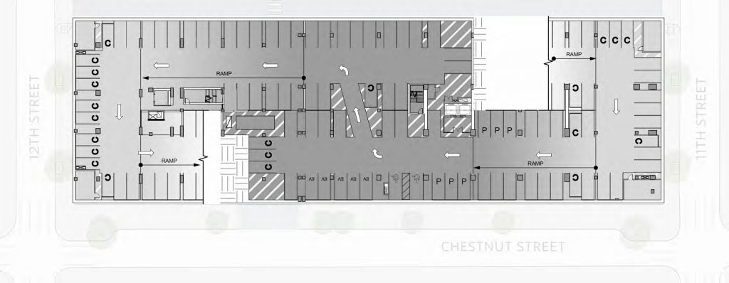
Underground level (P3) at East Market Phase 3. Credit: National Real Estate Development / Ennead Architects / Morris Adjmi / BLTa via CDR
A “Medical Office Building Welcome Center,” effectively a secondary elevated lobby, will span much of the second floor and will be accessed by a dedicated stair and a pair of elevators. On the north side, the Welcome Center will open onto an outdoor green roof, perched on a roughly ten-foot-deep cantilever clad in bronze panels on the underside.
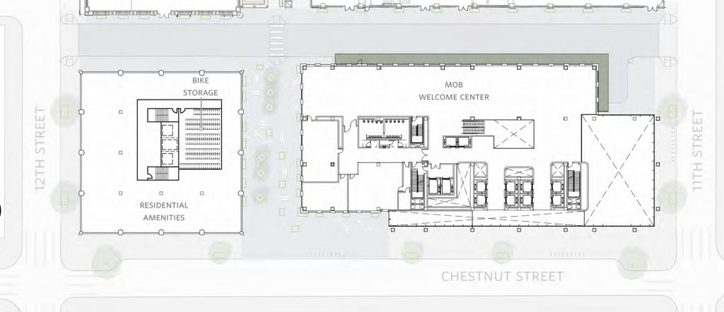
East Market Phase 3. Second level. Credit: National Real Estate Development / Ennead Architects / Morris Adjmi / BLTa via CDR
Medical office space will comprise floors three through 19, serviced by ten additional elevators and two stair banks. These floors will feature high ceilings, with 16-foot floor-to-floor height. Mechanical space will take up floors 20 through 23.
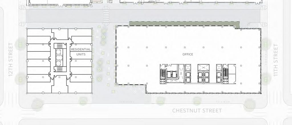
East Market Phase 3. Typical floor (lower). Credit: National Real Estate Development / Ennead Architects / Morris Adjmi / BLTa via CDR
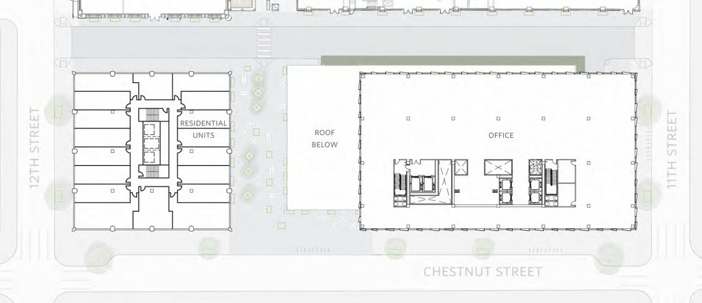
East Market Phase 3. Typical floor (upper). Credit: National Real Estate Development / Ennead Architects / Morris Adjmi / BLTa via CDR
Building designers aim to achieve LEED certification with environmentally-friendly features such as water efficient landscaping, water use reduction, use of recycled content and low-emitting and regional materials.
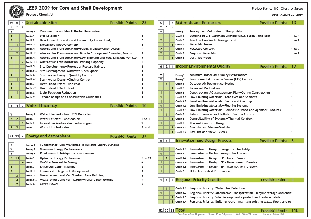
Chestnut East at East Market Phase 3. LEED checklist. Credit: National Real Estate Development / Ennead Architects / Morris Adjmi / BLTa via CDR
East Market – Chestnut West
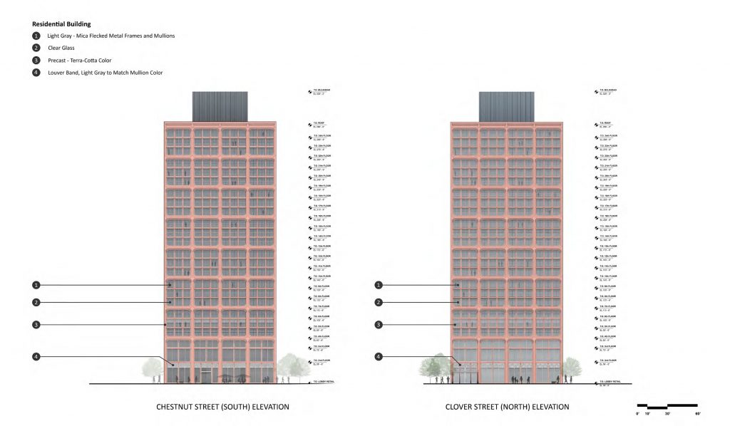
Chestnut West at East Market Phase 3. Credit: National Real Estate Development / Ennead Architects / Morris Adjmi / BLTa via CDR
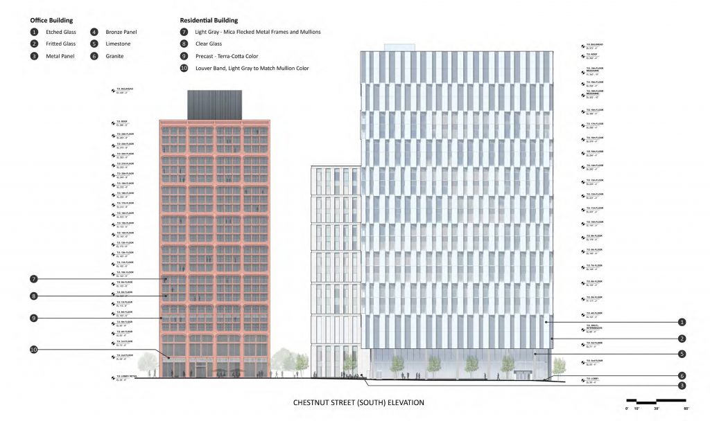
The second tower, called East Market – Chestnut West in the Civic Design Review submission, will be located on the opposite side of the block at 1199 Chestnut Street, at the northeast corner of Chestnut Street and South 12th Street. At 258 feet to the main roof and 288 feet to the penthouse roof, the high-rise will stand considerably shorter than its sibling to the east, though it surpasses the latter’s 23-story floor count. The discrepancy is explained with a much lower ceiling height, which, at ten feet floor-to-floor, falls far short of its counterpart’s 16- to nearly 20-foot floor-to-floor height, though it will still be enough to provide taller than average residential spaces.
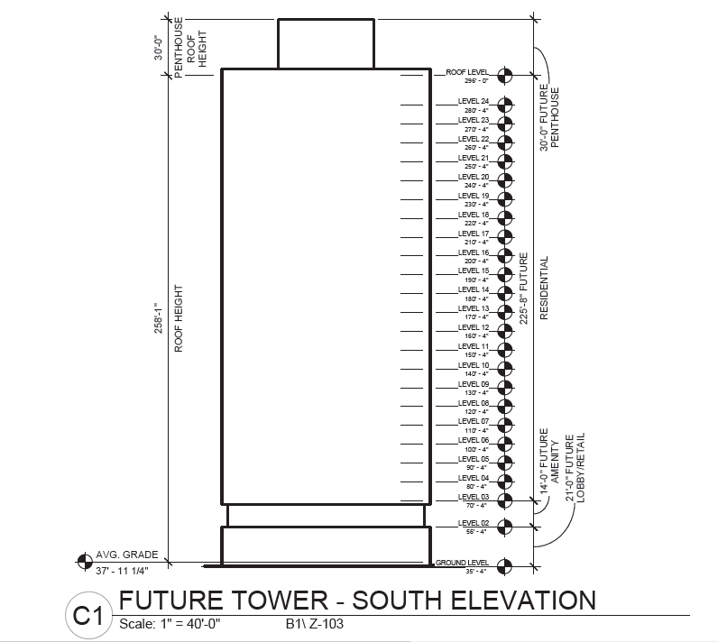
Chestnut West at East Market Phase 3. Credit: National Real Estate Development / Ennead Architects / Morris Adjmi / BLTa via CDR
In terms of interior space, the tower will contain only one-third as much space as its office counterpart. The majority of its 250,000-square-foot interior will be dedicated to 396 apartments and the associated amenities, as well as to retail space at the ground floor.
Designed by Morris Adjmi Architects, the residential tower simultaneously shares distinct design themes with the office building while also presenting an entire different style. In contrast to the east tower’s cool institutional feel, the west tower will feature a warmer, more intricate appearance, one more appropriate for a residential structure.
The building’s design is a study of the square form, which manifests itself in the tower footprint, at the bulkhead, and in the fractal-like façade grid, where three-story-high squares, clad in precast red-brown terra cotta, enclose three-by-three window groups. In turn, the square windows are divided into large, two-by-two panels, separated by mullions colored grey with mica fleck.
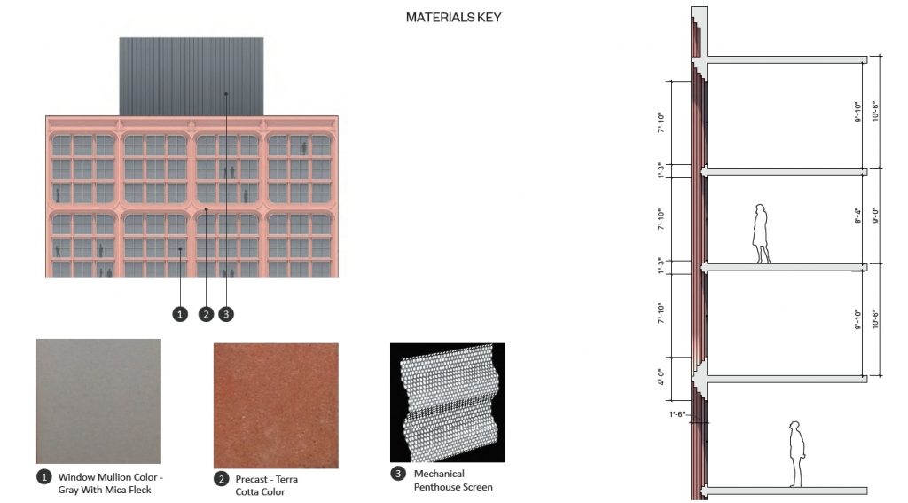
Chestnut West at East Market Phase 3. Credit: National Real Estate Development / Ennead Architects / Morris Adjmi / BLTa via CDR
Stepped tiers surround perimeter enclosures, creating an intricate, three-level hierarchy of depth with deep coffering at the three-story sections, shallower coffering separating individual windows, and still shallower mullions separating the window frames.
Gently rounded corners at the primary squares soften the building’s edges both literally and figuratively while creating concave lozenges at primary mullion intersections, adding further visual interest to the building while maintaining the square theme. At the top of the main section, an indented course reads as a contemporary interpretation of a cornice, echoing the traditional design element in spirit without violating the plumb, Modernist expanse of the façade.
At the base, the square modules elongate to rectangular proportions, creating a sufficiently grand appearance for the tall-ceiled spaces at the lower two floors, which will hold retail and a Clover Street-facing lobby at the ground floor and residential amenities at the second level. As an added bonus, rounded corners at the tops of the primary mullions effectively create grand, flat-topped arches, which read as a respectful nod to Center City’s classic prewar storefronts.
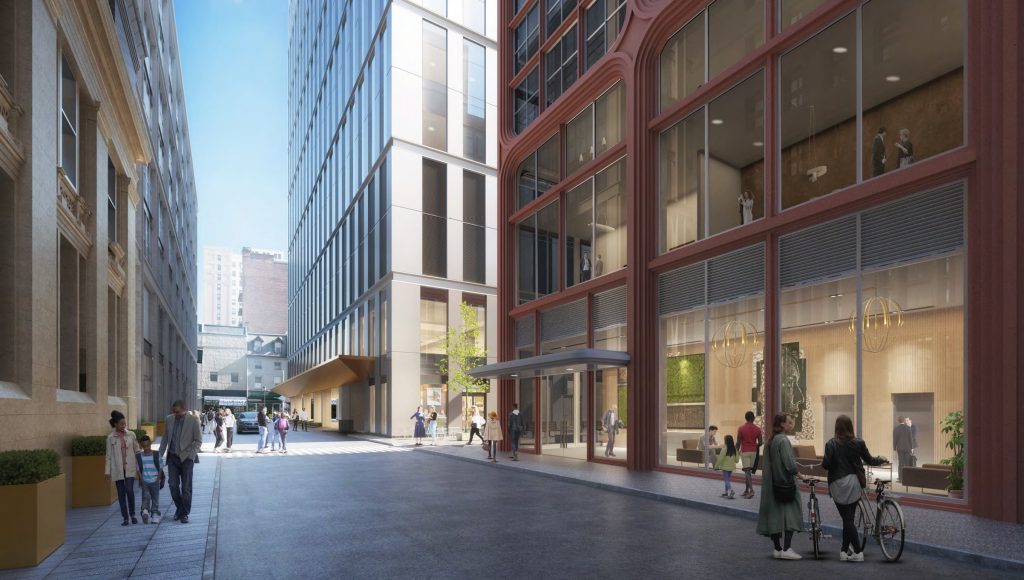
East Market Phase 3 as seen along Clover Street. Credit: National Real Estate Development / Ennead Architects / Morris Adjmi / BLTa via CDR
The overall result is one of the most intriguing of any projects in the city, with a well-proportioned design language at once simple yet sophisticated, clever yet understated. The design manages to read as unmistakably modern while observing a number of principles inherent to prewar buildings (which make up much of the surrounding context), such as earth-tone materials, sculpturality and depth of the façade, a clear base-shaft-pinnacle division, and loft-inspired paneled windows.
With its square façade modules, stepped mullions and rounded inset corners, the composition reads as a residential take on 55 Hudson Yards, a 780-foot-tall office skyscraper designed by Kohn Pedersen Fox and completed in New York City in 2019.
As an added bonus, the building interacts with its office counterpart via a shared floor division scheme. Though the medical office building groups floors in pairs and the residential tower groups them in threes, due to the above-mentioned difference in floor heights, both modules add to around 30 feet in height and thus read as a related yet distinct composition.
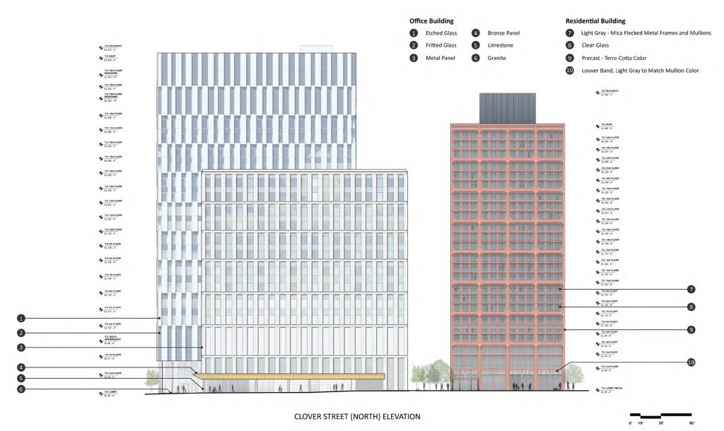
East Market Phase 3. Credit: National Real Estate Development / Ennead Architects / Morris Adjmi / BLTa via CDR
The only apparent drawback to the square theme in the overarching design is that it appears that the planners may have sacrificed function for form. The building’s service core, which features three elevators and two stair banks, is rather narrow and is oriented north-south. The arrangement would have been ideal for a north-south-oriented tower slab. However, as the design stands, the building’s square form results in the majority of apartments, particularly the east- and west-facing ones, to take on an elongated form that will provide minimal natural light to interior areas in individual units.
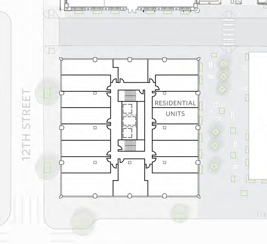
Typical floor plan at Chestnut West at East Market Phase 3. Credit: National Real Estate Development / Ennead Architects / Morris Adjmi / BLTa via CDR
A taller and slimmer building would had been able to house the same floor area and much better natural lighting for the units. Though it may have led to greater construction expenses (a building is less efficient when every added floor for the core services less of a useful floor area), the expense may have been recouped with more desirable, sunlit unit layouts an with more dramatic views from the upper floors. In addition, a smaller footprint would have allowed for an expansion of public space at the ground level.
However, the above comments are pure speculation on designer intent, and it is possible that height was hampered by city-imposed limits. If anything, the observation only reinforces the notion that the city ought to loosen restrictive and arbitrary height limits and to encourage creation of extra public space by private developers.
Like its office counterpart, the building also aims for LEED certification, employing many similar sustainability strategies.
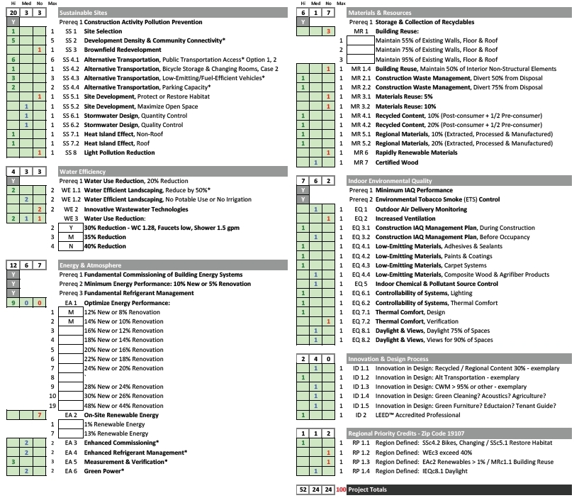
Chestnut West at East Market Phase 3. LEED checklist. Credit: National Real Estate Development / Ennead Architects / Morris Adjmi / BLTa via CDR
Design development
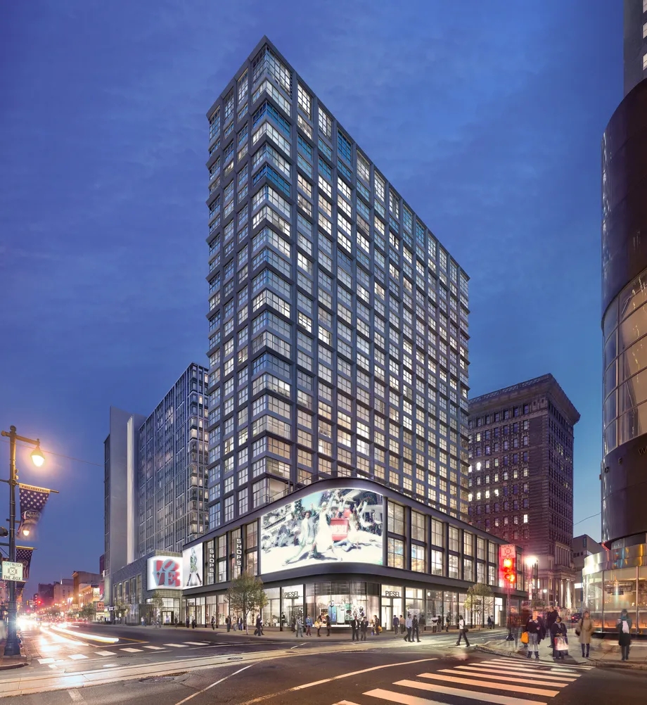
The current iteration of the proposal presents much clearer design intent and an improvement in quality over the preceding version. While vibrant and visually appealing, the design presented by BLT Architects appeared strikingly more generic, though it still exhibited a laudable degree of creativity on the architects’ part considering that it was likely only intended as a placeholder meant to convey the general feel of the project.
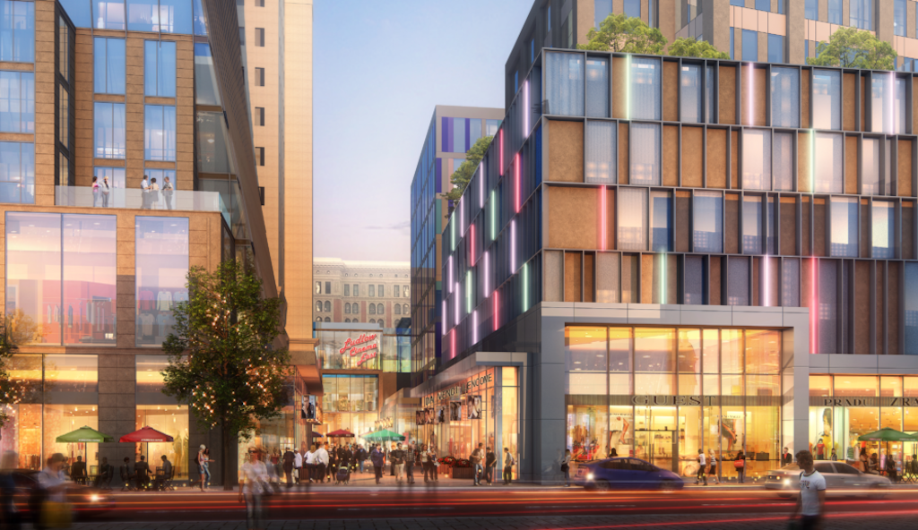
Prior design of Chestnut Walk at East Market Phase 3. Credit: BLTa
The design for the office building has also changed over time, with a prior iteration showing continuous, rather than staggered, vertical mullions.
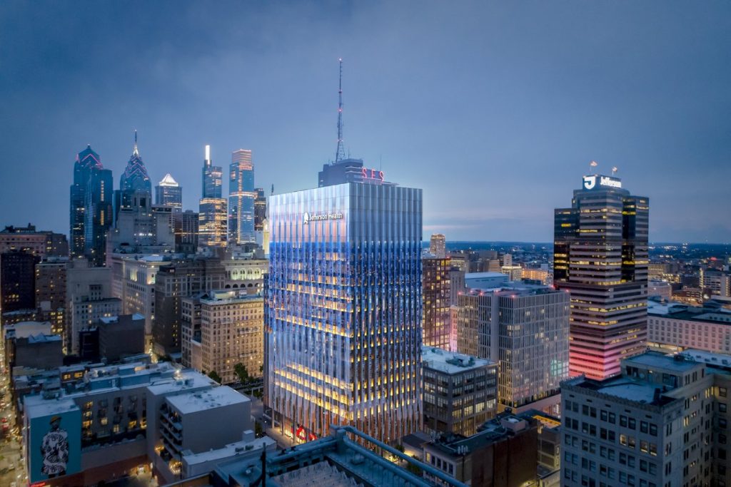
Thomas Jefferson Specialty Care Pavilion (1101 Chestnut Street) via Jefferson Health
Site context
East Market reinvigorates a formerly blighted area through a dense mix of residential, office, and retail space. The complex provides notable improvement at the street level, replacing dated and often inhospitable building fronts with new, transparent retail, widened sidewalks, plantings, and street furniture.
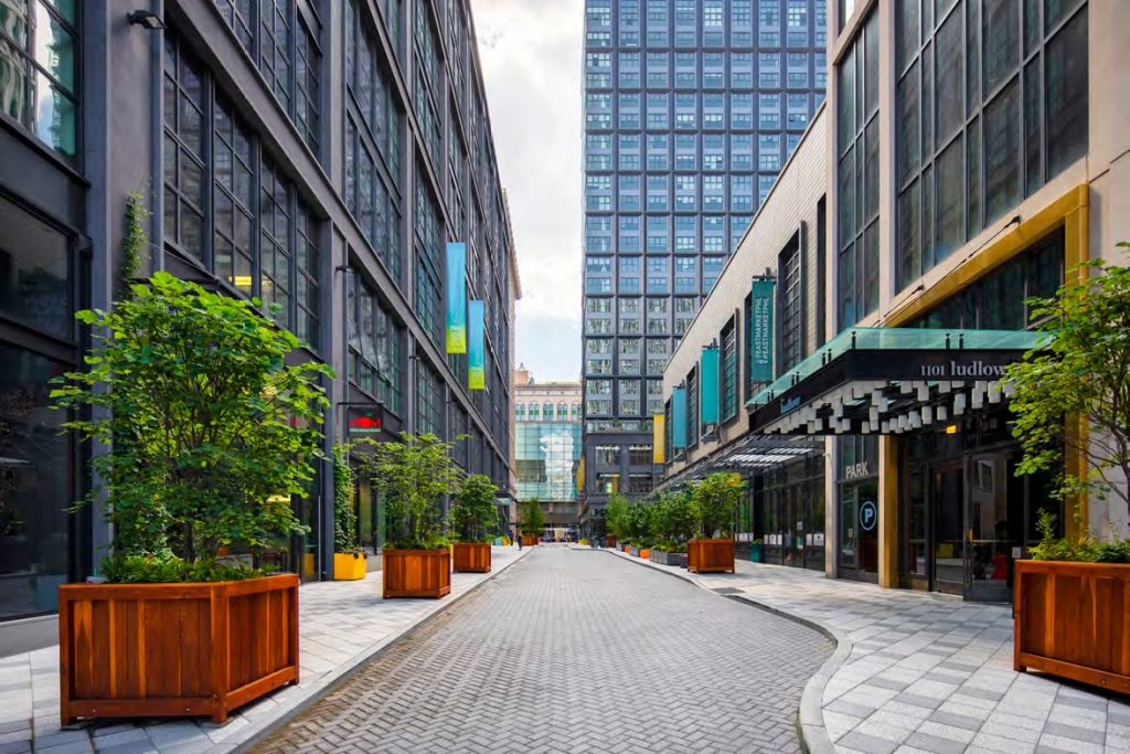
Chestnut Walk at East Market Phase 1 and 2. Credit: National Real Estate Development / Ennead Architects / Morris Adjmi / BLTa via CDR
East Market Phase 3 appears to expand on the urban-minded, pedestrian-friendly design principals described above, with renderings that show expanded public space and appealing street amenities. The salient public feature is the southward expansion of Chestnut Walk, an open-air pedestrian arcade that will run mid-block between Market and Chestnut streets. Small, well-articulated blocks, which the walk effectively creates, are conducive to pedestrian activity. Engaging public space will delight residents and visitors alike while generating added activity for local retail.
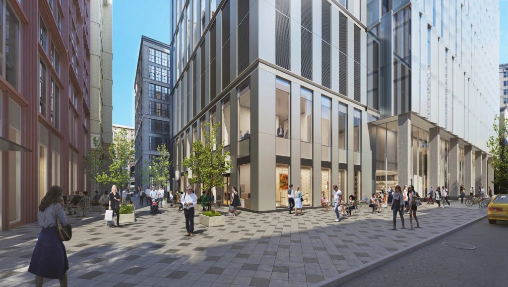
Chestnut Walk at East Market Phase 3. Credit: National Real Estate Development / Ennead Architects / Morris Adjmi / BLTa via CDR
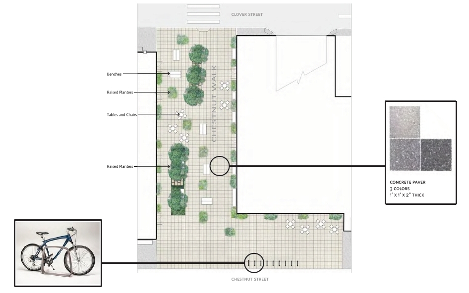
Chestnut Walk at East Market Phase 3. Credit: National Real Estate Development / Ennead Architects / Morris Adjmi / BLTa via CDR

Chestnut Walk at East Market Phase 3. Credit: National Real Estate Development / Ennead Architects / Morris Adjmi / BLTa via CDR
A variety of trees, shrubs, vines, and perennials will further enhance the street appeal and provide a sanctuary for local birds and insects.
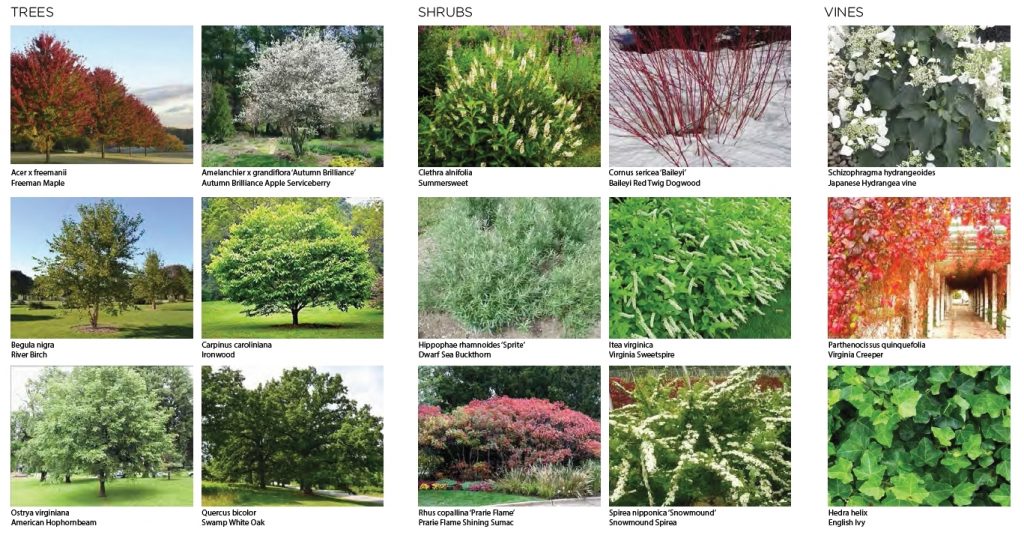
Proposed plantings at East Market Phase 3. Credit: National Real Estate Development / Ennead Architects / Morris Adjmi / BLTa via CDR

Proposed plantings at East Market Phase 3. Credit: National Real Estate Development / Ennead Architects / Morris Adjmi / BLTa via CDR
The Predecessor
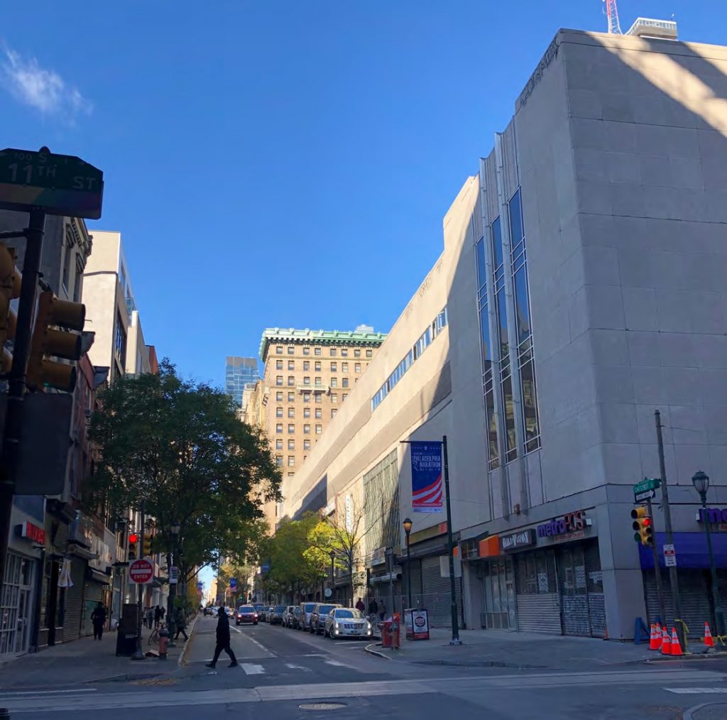
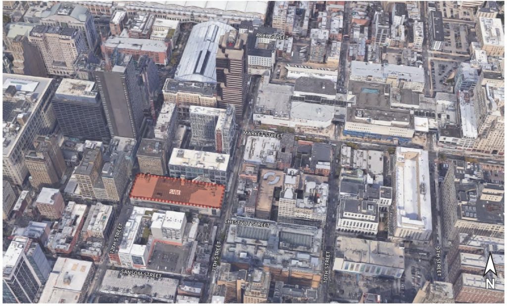
The former Chestnut Street Garage at the site of East Market Phase 3. Credit: Google via CDR
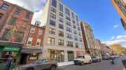
The development replaces a mixed-use Art Deco structure, built in the early 1940s by the Chestnut Street Association as an annex to the Snellenburg’s department store, which was situated further north at Market Street. At the time of demolition, the massive structure housed budget retail at the ground level and a garage on the upper floors.
Even in its early years, the bulky structure exuded an oppressive presence. The building was constructed at a time when the architectural establishment was transitioning from flamboyant Art Deco and Streamline Moderne to the International style, a sparse, Corbusian-inspired aesthetic that is often seen as the first major movement in mainstream Modernism (by contrast, Art Deco is generally considered to be a transitional, rather than purely modern, style).
Unfortunately, the staid design inherited precious little influence from Art Deco and some of the worst traits endemic to Modernism. Although it exuded an undeniable air of power, where massive horizontal slabs were balanced with thin yet dramatic, Art Deco mullions, the overall form was overbearing and graceless.
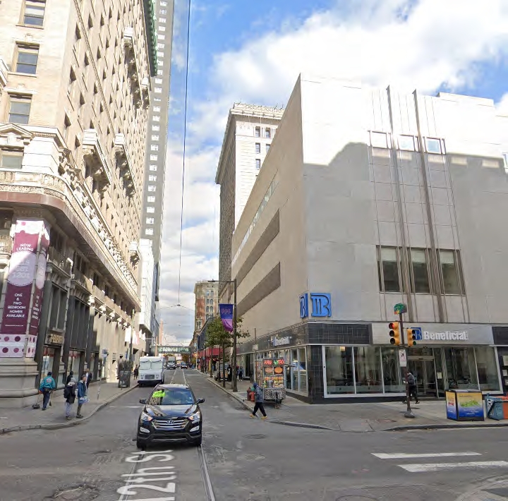
The former Chestnut Street Garage at the site of East Market Phase 3. Credit: Google via CDR
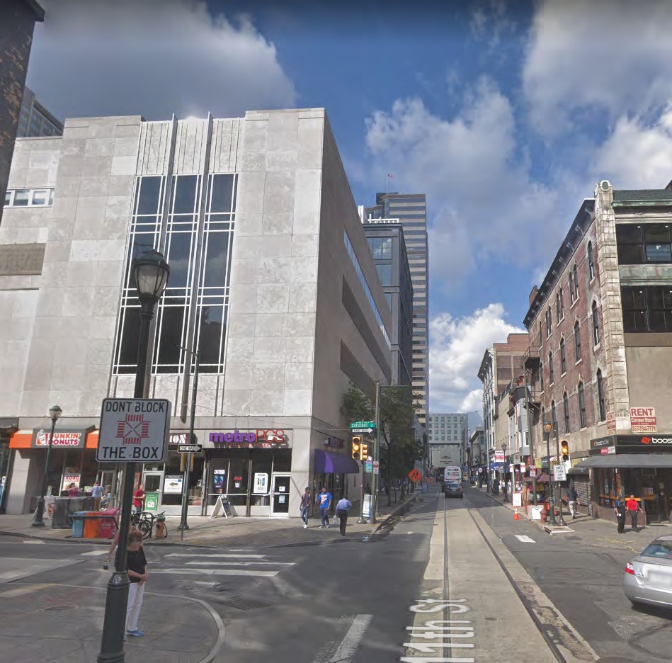
The former Chestnut Street Garage at the site of East Market Phase 3. Credit: Google via CDR
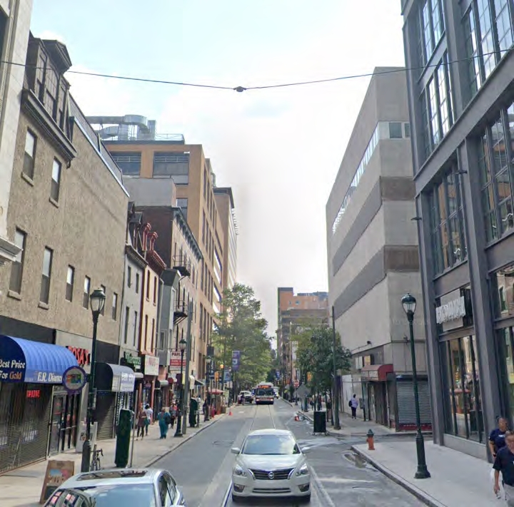
The former Chestnut Street Garage at the site of East Market Phase 3. Credit: Google via CDR
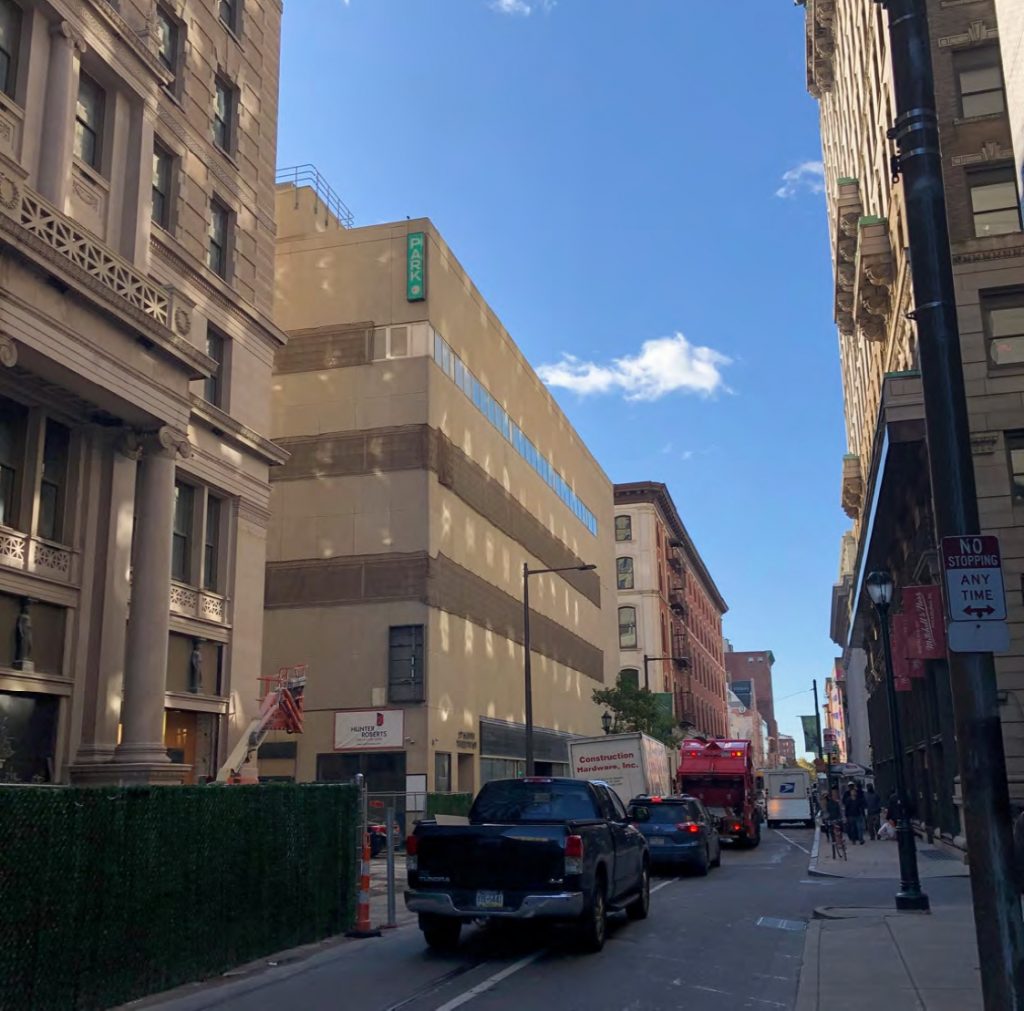
The former Chestnut Street Garage at the site of East Market Phase 3. Credit: Google via CDR
Limestone panels, used extensively in both Art Deco and in the International Style, gave the building a pleasant classical color and texture yet offered little else aside from blank, featureless walls punctuated by disappointingly small windows, which, to make matters worse, were mostly covered up in later years.
Over the years, further alterations and drab dark tile with stained store awnings, made the structure a mild eyesore, even when considering its few redeeming qualities such as the Art Deco fins that glimmered brilliantly in the sunlight. This is one of the very few instances where we could easily say “good riddance” when faced with the prospect of the demolition of a World War II-era, Art Deco-inspired building.
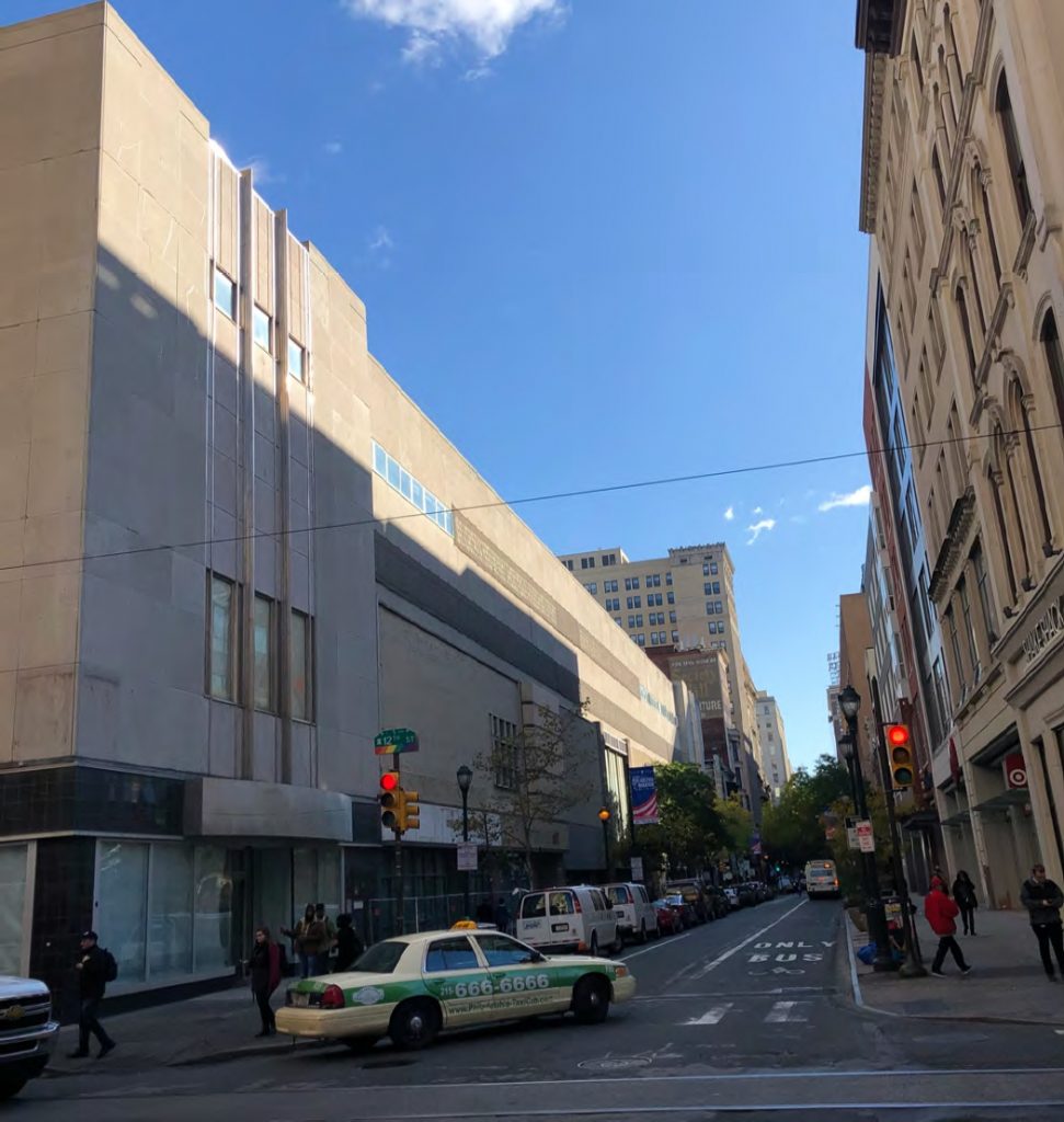
The former Chestnut Street Garage at the site of East Market Phase 3. Credit: Google via CDR
An intriguing, if derelict, feature sat at the rear of the structure, where a four-level skywalk crossed above Clover Street and connected to the building to the north. Although as drab and poorly maintained, the skywalk was a rare feature, especially given its diagonal alignment, and created an intensely urban, Blade Runner-esque atmosphere in the gritty, canyon-like alley. While the new design is an improvement in numerous ways, in a way we wish that there was a way to integrate a successor skybridge into the design.
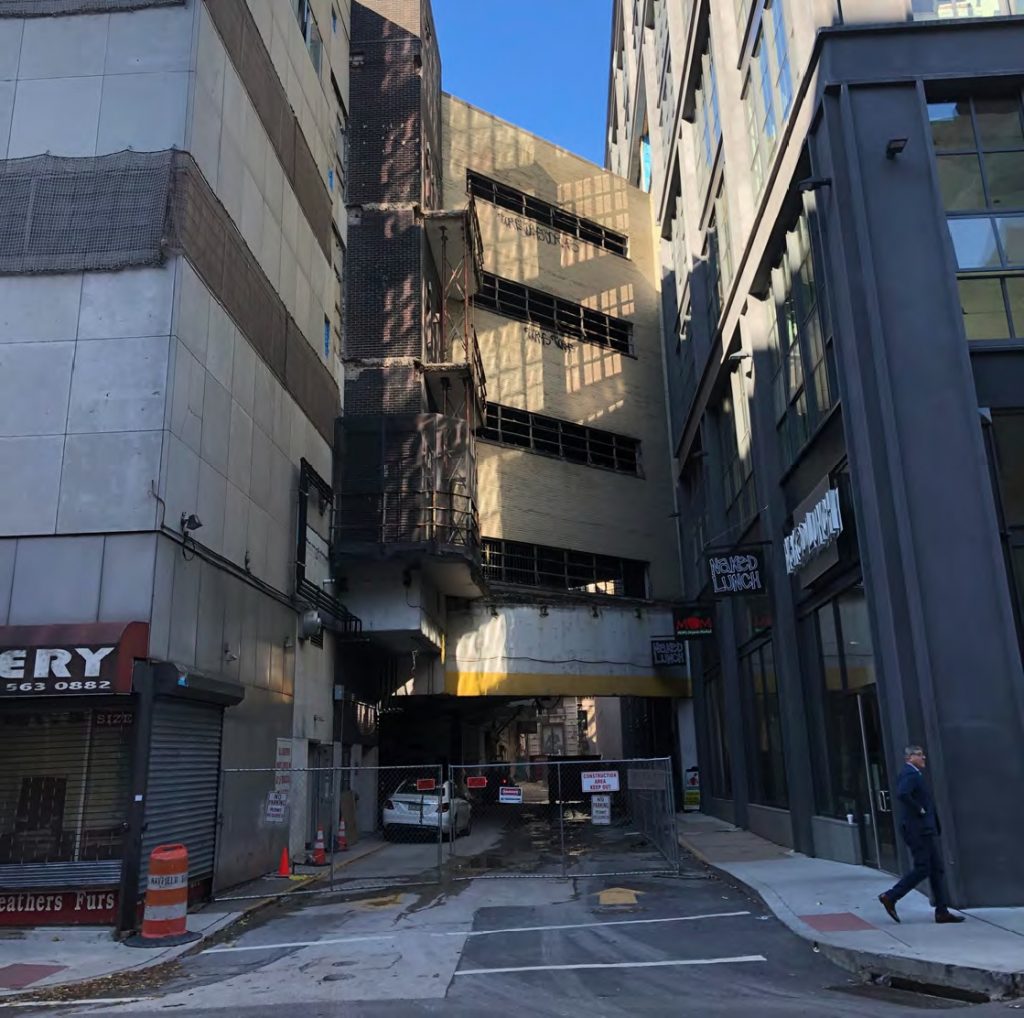
The former Chestnut Street Garage at the site of East Market Phase 3. Credit: Google via CDR
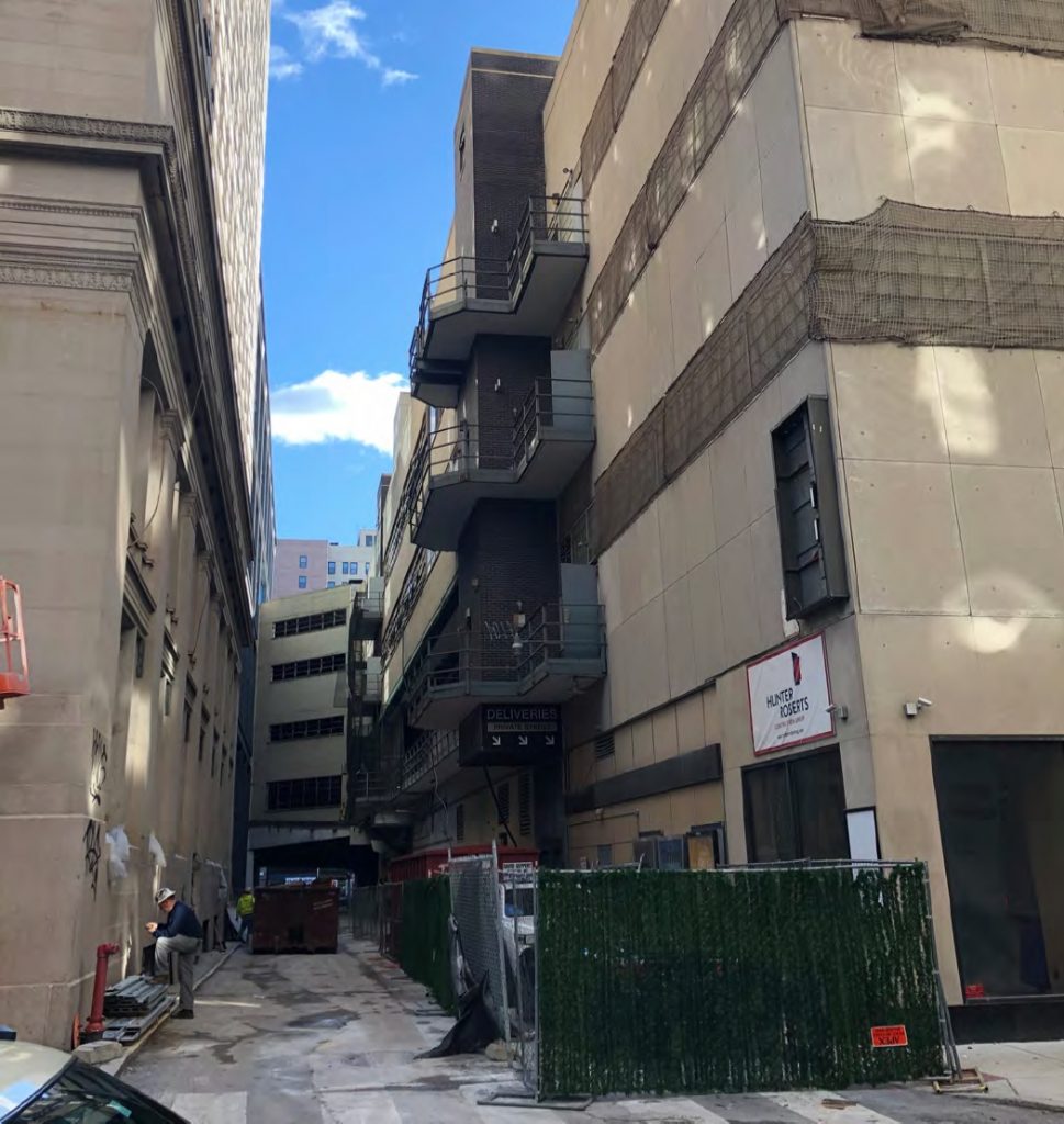
The former Chestnut Street Garage at the site of East Market Phase 3. Credit: Google via CDR
A much more successful, and arguably the city’s most famous, early modern structure stands just up the street at 1200 Market Street. The Loews Philadelphia Hotel, originally known as the Philadelphia Savings Fund Society Building, was built in 1932, a decade before the Chestnut Street garage. The 36-story skyscraper was built just a year after the Empire State Building, yet while the former was a classic, if somewhat restrained, example of Art Deco, the PSFS Building boldly embraced the emerging International style, shedding ornamentation in favor of a minimalist, sculptural exterior.
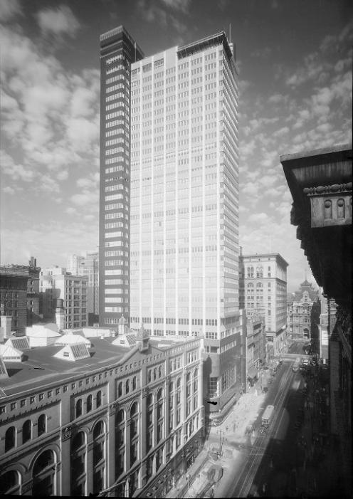
PSFS Building. Image from Hagley Digital Archives
The PSFS Building is often cited as the “first International Style skyscraper built in the United States.” While this is a somewhat contentious topic among some, both in terms of what comprises the International style, what may be considered a “skyscraper,” and which transitional structures may qualify as both, the tower’s architectural achievement, bold design, and sheer expressive power are undeniable. The same cannot be said about the former Chestnut Street garage, and its demolition may hardly be considered an architectural loss.
Current Status
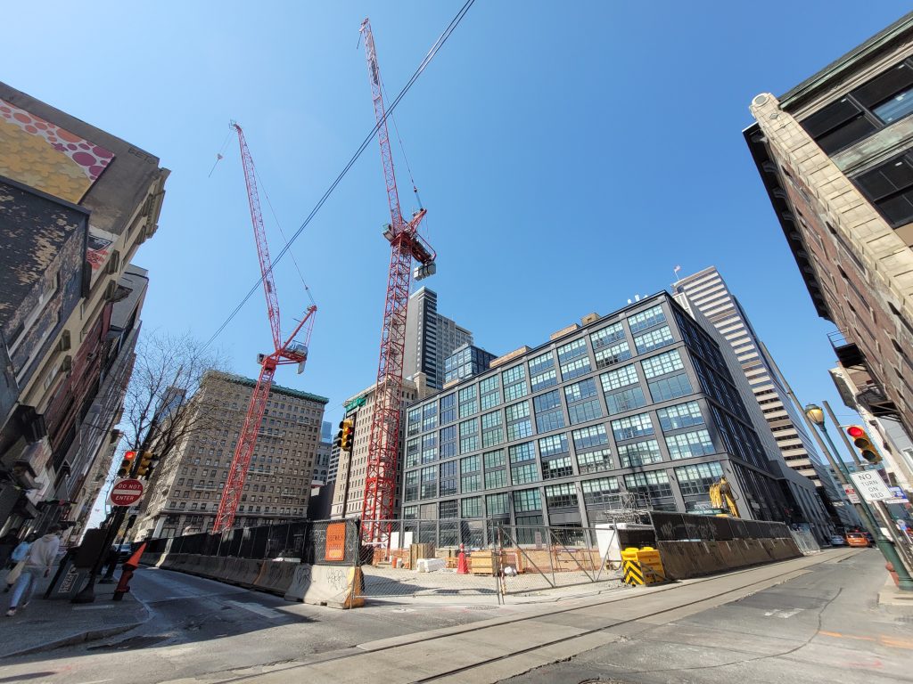
The garage was demolished in early 2020. Excavation commenced around the summer. At this time, foundation work and concrete pours for the underground levels is in full swing, and two tower cranes stand at the site. For more photos, check out Philly YIMBY’s latest construction update.
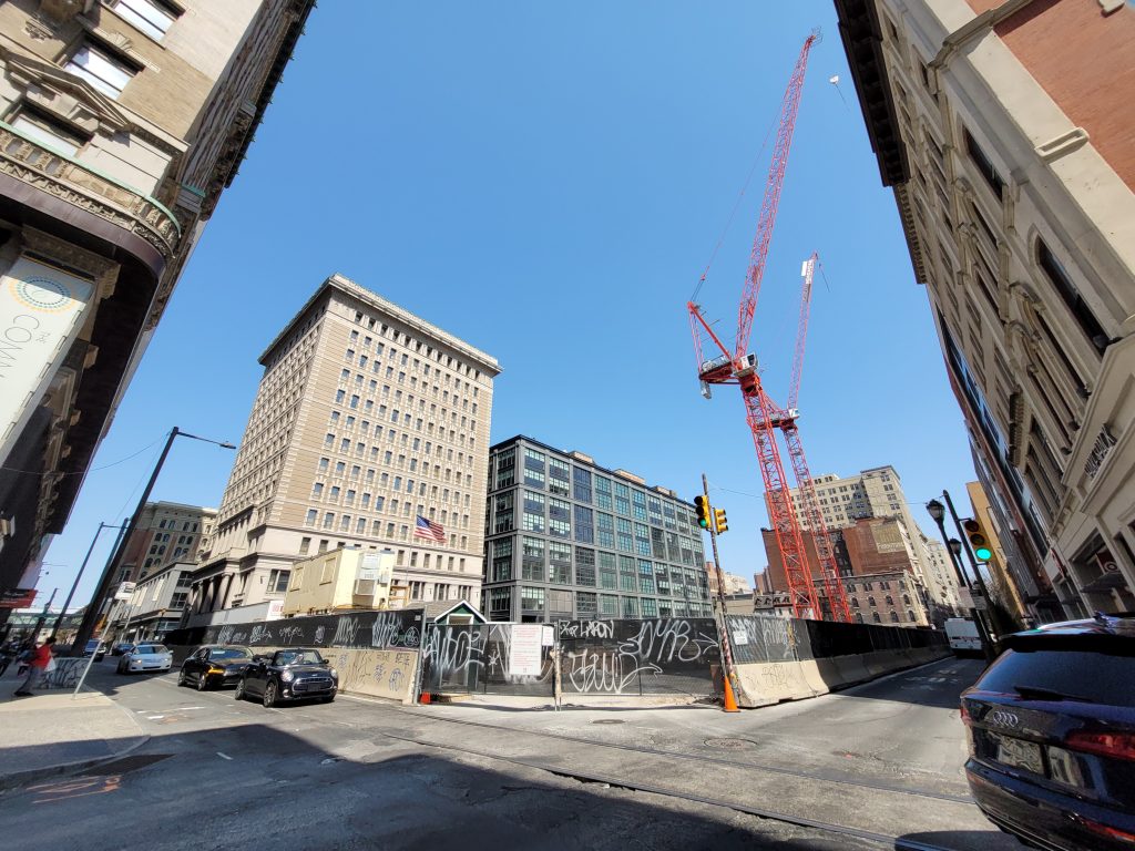
East Market Phase 3 looking northeast. Photo by Thomas Koloski
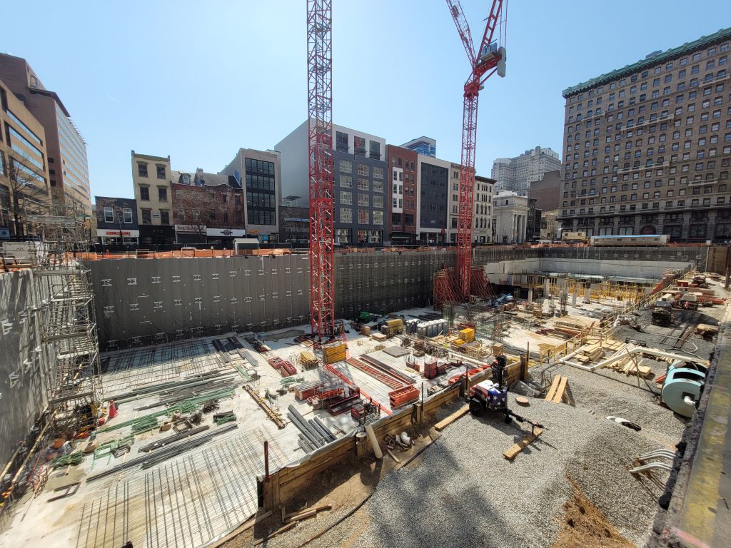
East Market Phase 3 site looking southwest. Photo by Thomas Koloski
Conclusion
East Market Phase 3 may not be the tallest or the most ambitious development currently in progress in the city. However, it is a project of utmost importance to Center City and to Philadelphia as a whole. The development will add thousands of construction jobs and thousands more permanent jobs upon completion, which is significant for a city hard-hit with a high unemployment rate.
The medical office tower will provide a significant expansion for the Jefferson Health campus, which dominates the neighborhood and recently expanded to the 32-story high-rise at 1101 Market Street, re-branding the former Aramark Tower as the Jefferson Center. The new building will help keep Philadelphia as a world-class medical and institutional center.
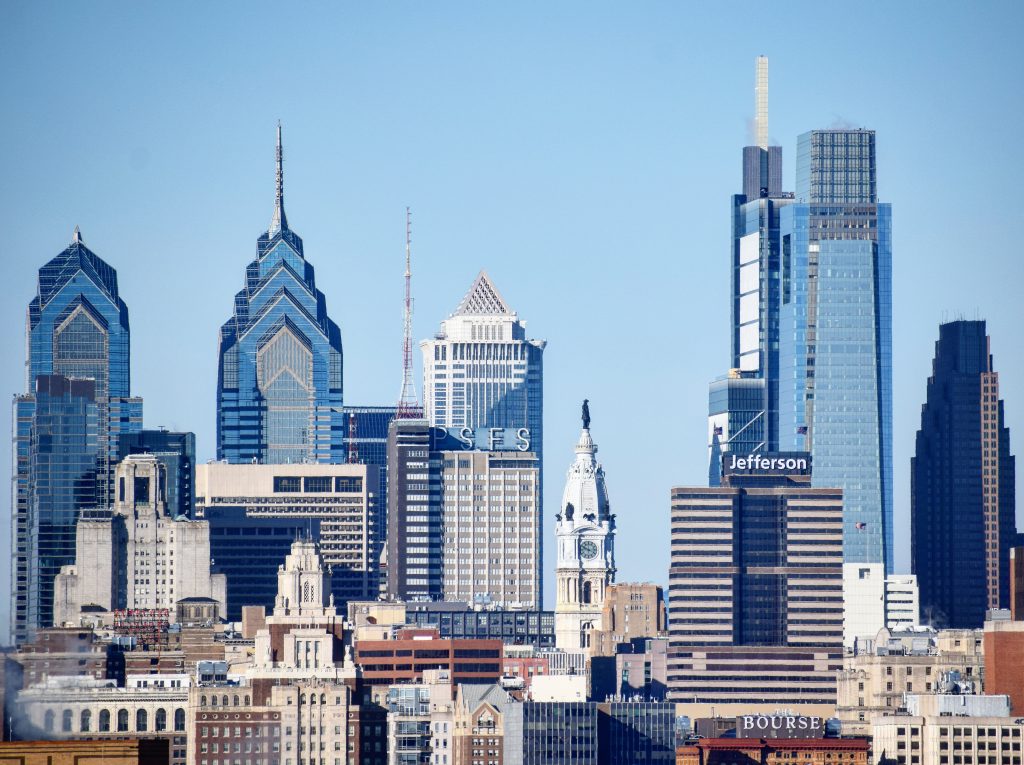
Jefferson Center January 2020. Photo by Thomas Koloski
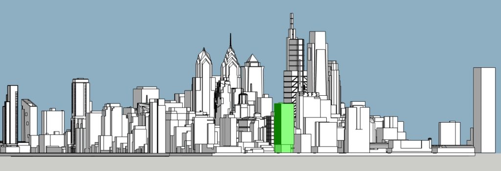
Thomas Jefferson Specialty Care Pavilion. Model by Thomas Koloski
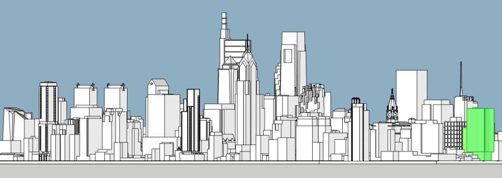
Thomas Jefferson Specialty Care Pavilion. Photo by Thomas Koloski
The residential component will significantly boost the local housing market and will help provide round-the-clock pedestrian presence on the block, which will greatly benefit the predominantly commercial area. New public space and street improvements will further improve the area’s pedestrian realm.
The complex replaces an eyesore structure with two buildings intricately designed in a way that allows them to read as parts of a single composition while maintaining distinct identities that respond effectively to their interior use.
Neither building will be a major landmark on the skyline, as they barely exceed the surrounding 200-foot building plateau. However, the two towers will notably reinforce the compact yet prominent Market East skyline cluster, until now dominated solely by the 491-foot-tall (794 feet if including the antenna) PSFS Building and the 417-foot-tall Jefferson Center, and will help pave the way for more dense development in the area, which we anticipate to occur in the near future.
East Market Phase 3. Credit: National Real Estate Development / Ennead Architects / Morris Adjmi / BLTa via CDR
Subscribe to YIMBY’s daily e-mail
![]()
Follow YIMBYgram for real-time photo updates
Like YIMBY on Facebook
Follow YIMBY’s Twitter for the latest in YIMBYnews


Very interesting article. I am surprised the various proposals for midrise and highrise development to the east of this cluster are having some much trouble getting started (including the proposals that have popped up over time on Chestnut, the Jeweler’s Row hole, and anything at the former Disney hole). I hope that the incredible improvement here helps move those other projects along.
If we’re going to demo that beauty of a parking garage (which should have been historically certified, by the way), the least we could get is a supertall. But…this is philly so of course not.
VO, thank you for this comprehensive look at this block’s history, present and future. This post is worth saving for future reference. Thanks again.
Wow, quite the article, well researched and written. Is the apartment building called Chestnut west, built to the maximum the code allows? As is, its a very sharp looking building and a positive addition to CC. I wish it was tall enough to stick its head out above the surrounding building. A building that good deserves to be seen.
A really in-depth and informative article. Nicely done!
Do we know whether the apartment building is actually under construction now? Or just the dsign podium?
I’m impressed.
Very well written article with any spelling errors!
The parking garage may have been an eyesore for some, however; it served its purpose very well.
When I think about that parking garage, it reminds me of a rather large parking garage at 42nd @ Dyre Ave. in Midtown Manhattan (I personally loved that parking garage).
Hi Brian. Thanks for the kind words on both articles! I know that you’re a regular reader with a keen eye for Philly history but it seems that you’ve stepped away for a while, so here’s another extended feature with a touch of local history that you may have missed in the meantime, which may be up your alley:
https://phillyyimby.com/2021/05/a-detailed-look-at-torresdale-manor-residences-proposed-at-3600-grant-avenue-in-torresdale-northeast-philadelphia.html