Last June, Philly YIMBY reported that construction was nearing completion at BrüBox at 3120 Jefferson Street in Brewerytown, North Philadelphia. Since that time, the five-story, 32-unit rental building, alternately spelled BruBox (without the umlaut), has been completed and open to residents. Designed by Coscia Moos Architecture and developed by Khosla Properties, with Tester Construction Group as the contractor, the development spans 29,427 square feet and, according to permits, cost $5.15 million to construct. BrüBox offers residences ranging from studios to two-bedrooms and spanning 525 to 1,000 square feet and includes parking for ten cars and 11 bicycles.
At the time of this writing, units are available for rent from $1,370 to $2,300 per month. Additional fees include a one-time cat/dog fee of $300 (with $25 subsequent monthly fees) and $200 for unassigned parking.
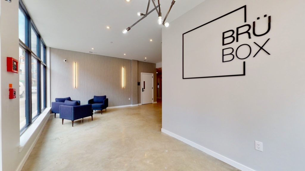
BruBox at 3120 Jefferson Street. Lobby
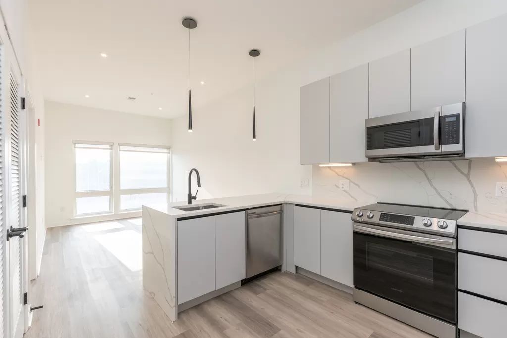
BruBox at 3120 Jefferson Street. Living and kitchen area
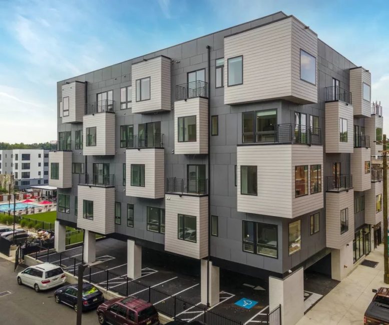
Despite having “box” in its name, the building’s design makes a welcome break from the city’s all-too-common boxy architecture in new construction. Cantilevered rectangular projections evenly spaced throughout the facade add depth and visual interest to an otherwise restrained exterior of dark gray panels and off-white horizontal siding.
Although eye-catching and novel for the streetscape, the regular spacing of the cantilevers ensures that the design is not so avant-garde as to clash with the architecturally conservative surroundings and the exquisite prewar Poth Brewery across the street to the north. Moreover, the staggered cantilevers allow for numerous, if rather compact, balconies.
The majority of the ground level is allocated to a ten-space parking lot. When a building is exposed to the street on its wide side, such arrangements tend to be rather pedestrian-unfriendly. Fortunately, BruBox rises from a mid-block site and faces its narrow side to the street, with lobby windows facing outdoors, the only exposure the parking lot offers to the sidewalk is in the form of the garage entrance.
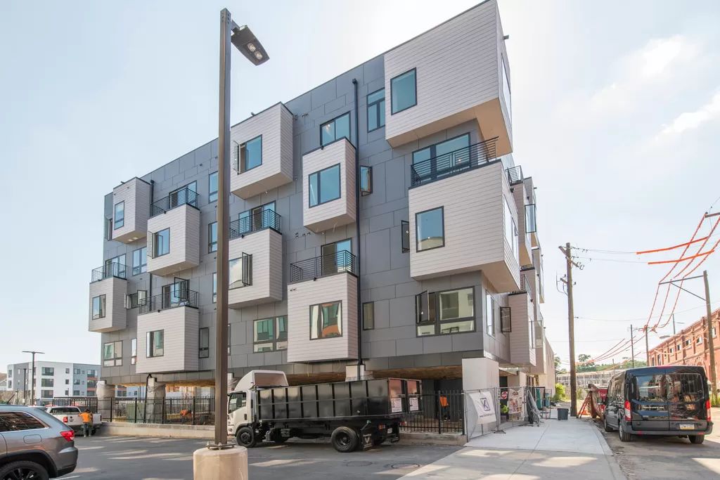
BruBox at 3120 Jefferson Street
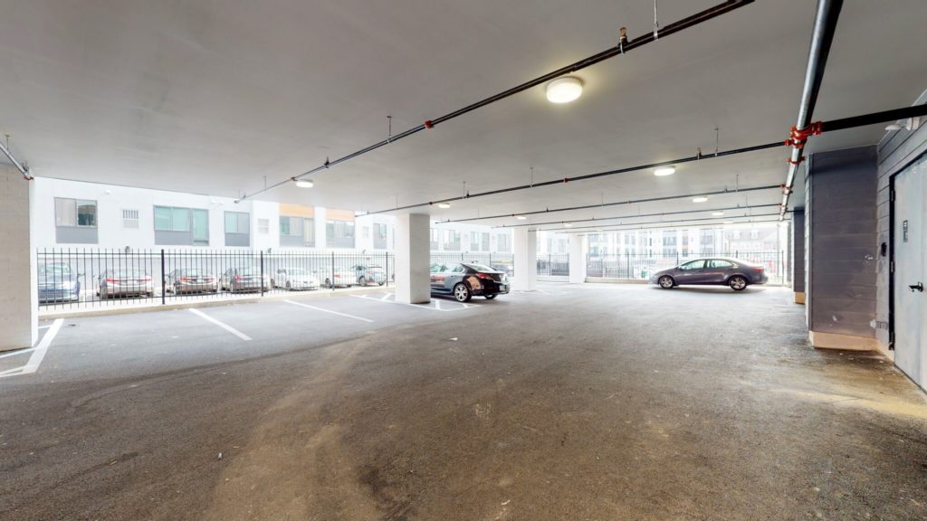
BruBox at 3120 Jefferson Street. Parking area
While the curb cut is not exactly a pedestrian-friendly feature, at least such an arrangement minimizes the detrimental sidewalk effect generated by the “car storage area” (a term urbanists sometimes use to derisively yet not wrongly refer to garages and parking lots). And while in-building parking is rightfully a contentious topic among planners, it is definitely more appealing to relegate it under or within a building rather than squander valuable ground space on an open-air parking lot.
The freestanding structure is set back from its neighbors on all sides, which is a wise gesture that allows for windows and sunlight, however minimal at some locations, on each of the four facades. It helps that the windows are generally large, while their varied sizes and large glass panes (some of the windows are mullion-free) contribute to the contemporary aesthetic.
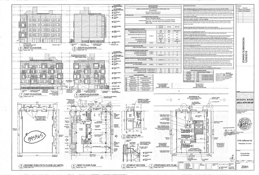
BruBox at 3120 Jefferson Street. Zoning submission. Credit: Coscia Moos Architecture via the City of Philadelphia
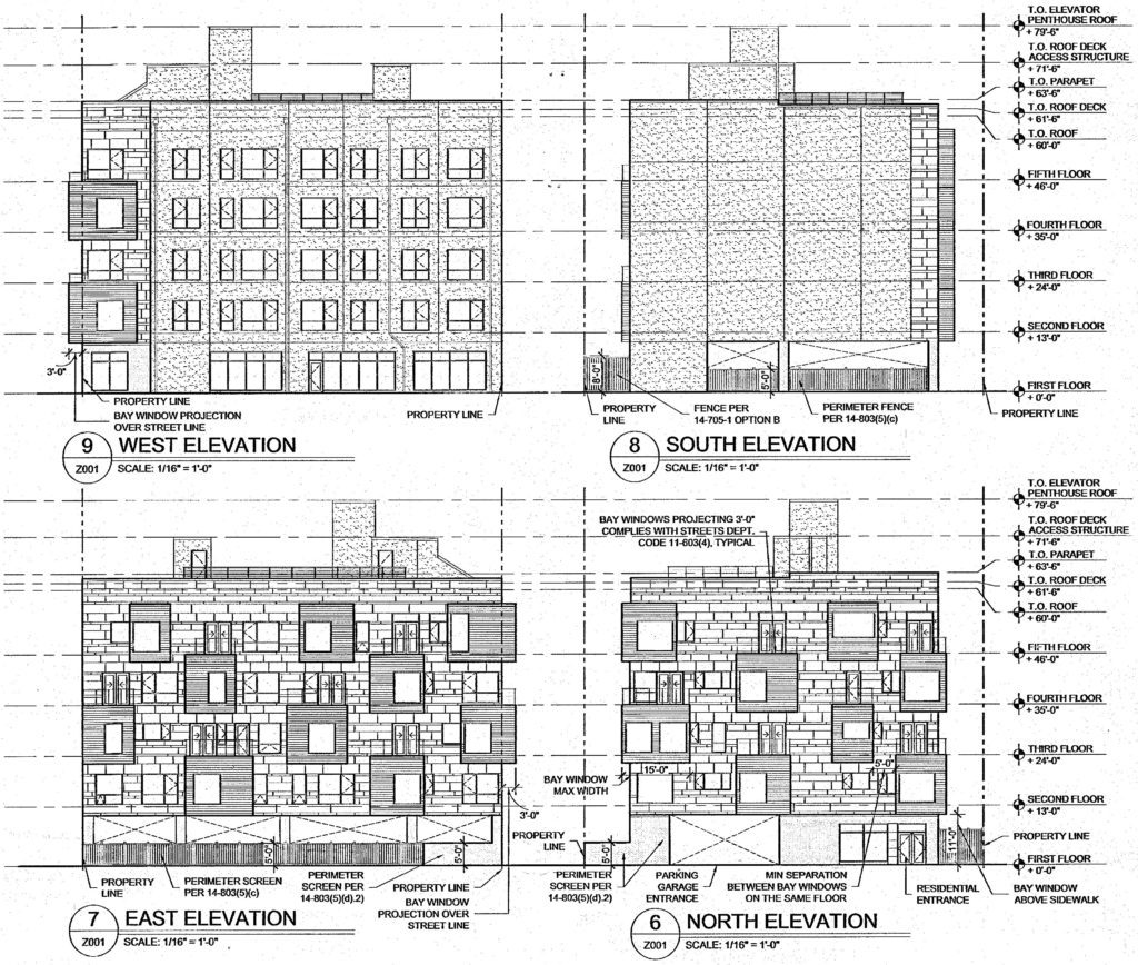
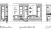
BruBox at 3120 Jefferson Street. Building elevations. Credit: Coscia Moos Architecture via the City of Philadelphia
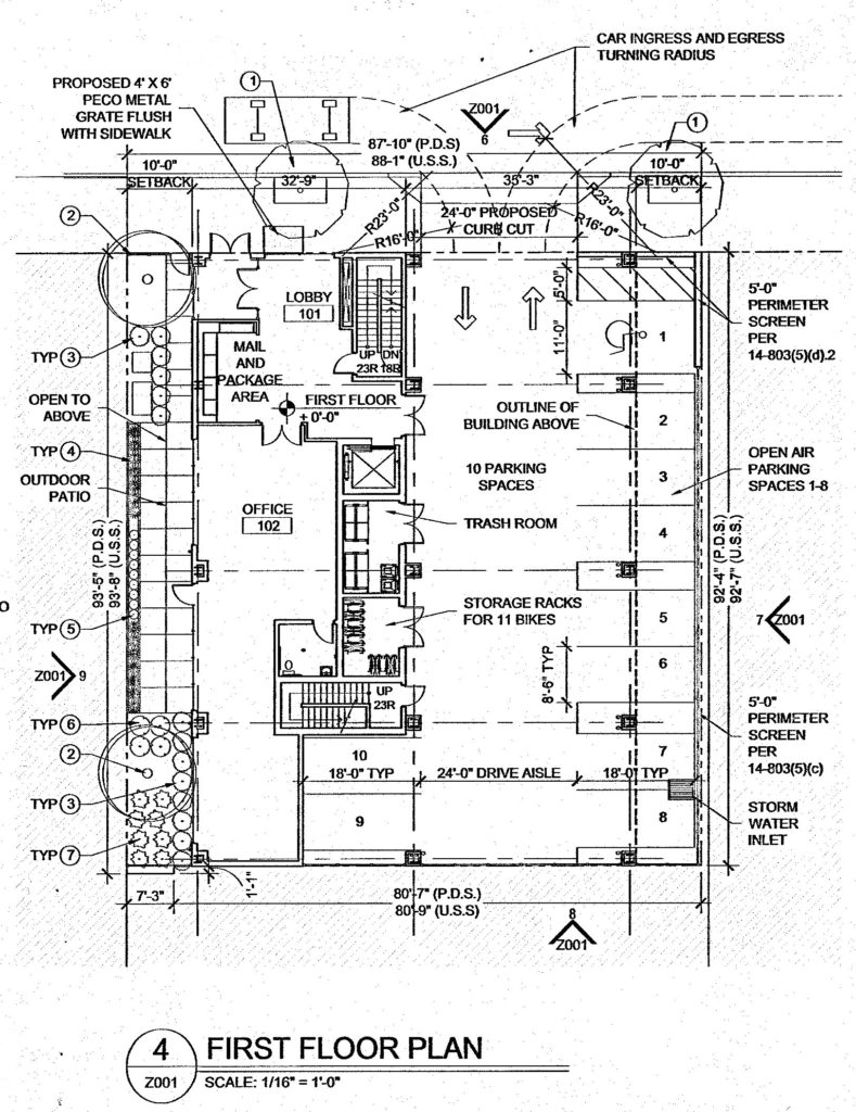
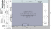
BruBox at 3120 Jefferson Street. Ground floor plan. Credit: Coscia Moos Architecture via the City of Philadelphia
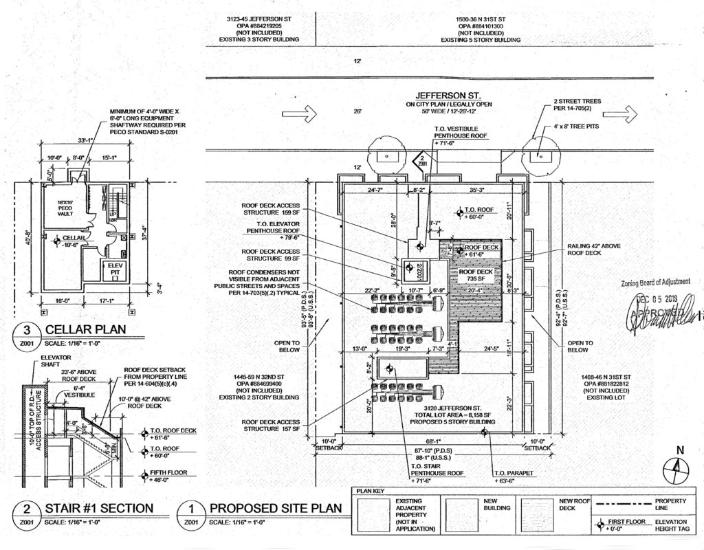
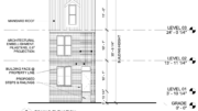
BruBox at 3120 Jefferson Street. Project detail. Credit: Coscia Moos Architecture via the City of Philadelphia
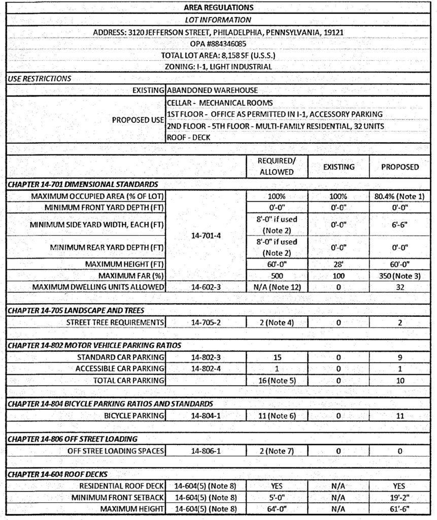
BruBox at 3120 Jefferson Street. Zoning table. Credit: Coscia Moos Architecture via the City of Philadelphia
The building rises 60 feet high to the main roof, maxing out the local height limit (the 64-foot-high parapet and 80-foot-high bulkheads do not count toward this limit). Clearly, developers such as Khosla are willing to use every inch of the allowable limit and would almost certainly be willing to go higher still, so it is highly unfortunate that the city chooses to handicap development and housing stock production with strict height caps, even at sites such as the one at hand, where no historic low-rise buildings would be in danger of being visually overwhelmed.
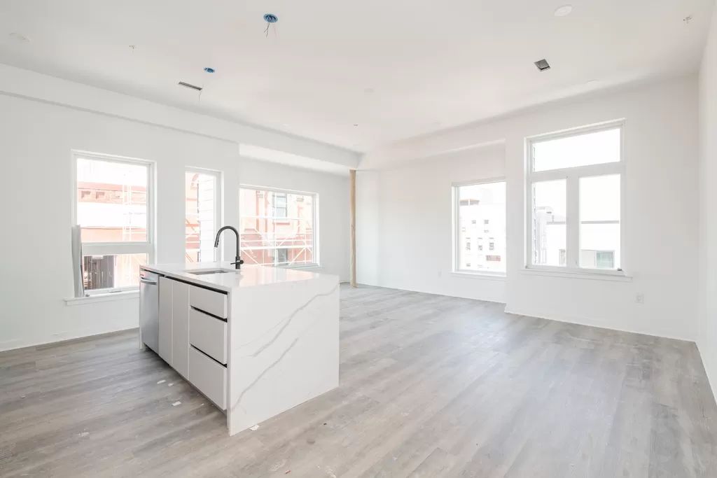
BruBox at 3120 Jefferson Street. Living and kitchen area
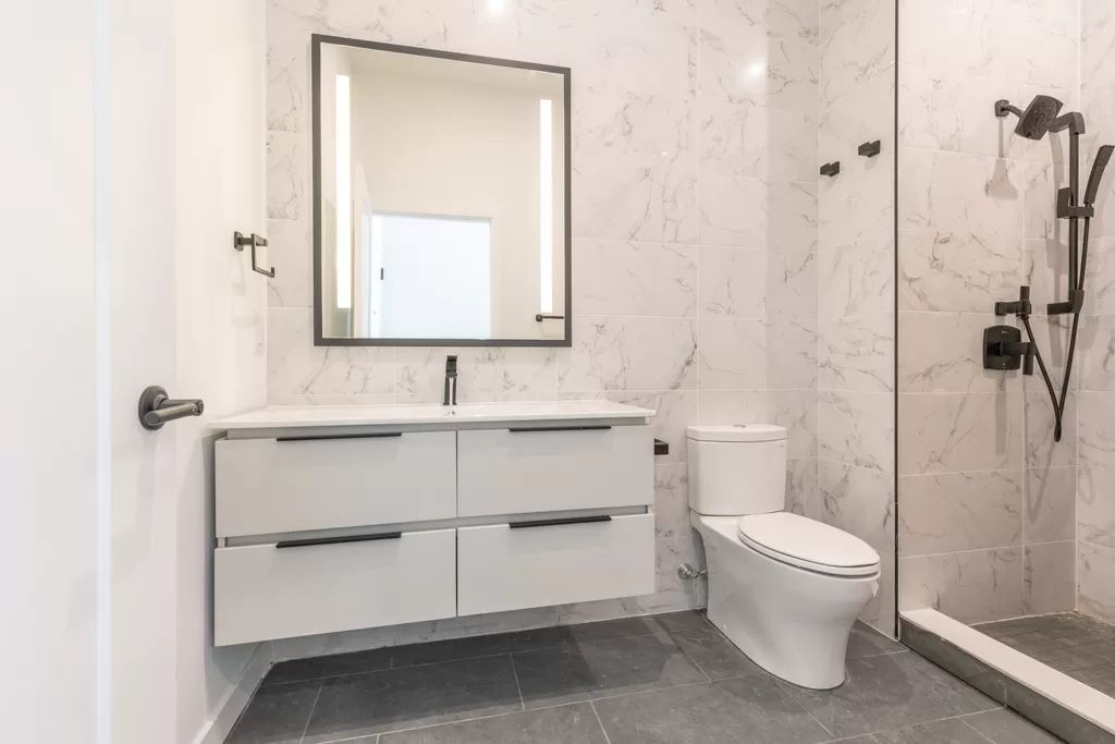
BruBox at 3120 Jefferson Street. Bathroom
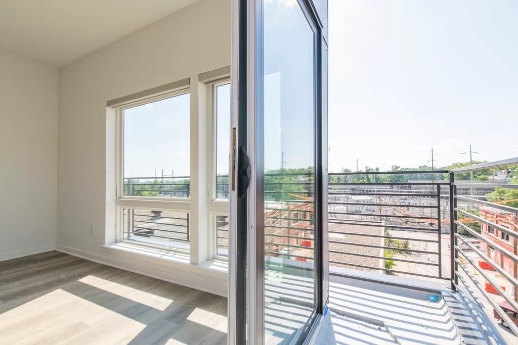
BruBox at 3120 Jefferson Street. Balcony
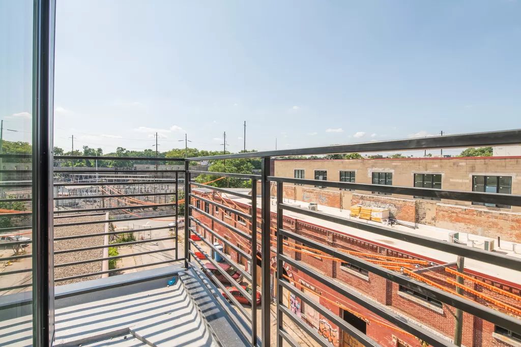
BruBox at 3120 Jefferson Street. Balcony
Although 60 feet is sufficient for six floors, the team behind BruBox instead opted for a five-story count, which, in turn, has allowed for lavish ten-story ceilings in residential units and an even higher ceiling at the ground floor.
In addition to tall ceilings, notable unit features include intercoms, quartz countertops and backslashes, waterfall island counters, dishwashers, recessed lighting, washers/dryers, and walk-in closets.
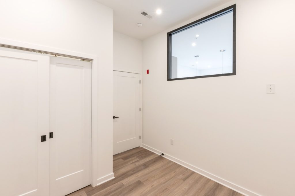
BruBox at 3120 Jefferson Street
Although the building boasts windows on every exterior, one interior image shows what appears to be a bedroom with a window looking out into a living room. If this is indeed the case and there are no other windows in the room, then this would qualify the space as a “windowless” bedroom, a worryingly common feature in new development across Philadelphia that persists even though Pennsylvania building code requires each bedroom to have at least one window facing directly outdoors.
Seeing such a bedroom at BruBox is particularly surprising, since, unlike many other bulky and squat developments, BruBox is a relatively narrow structure with freestanding facades on all four sides. While cheaper material expenditures are a significant incentive for short and squat structures, the city’s strict height limits also hold considerable blame, as they prevent builders from constructing taller buildings with smaller floorplates that would allow for windows in every bedroom.
Again, given the building’s ample window coverage on all four facades, we expect most bedrooms to have windows that face directly outdoors. If the room in the image is indeed a “windowless” bedroom, it is likely an outlier.
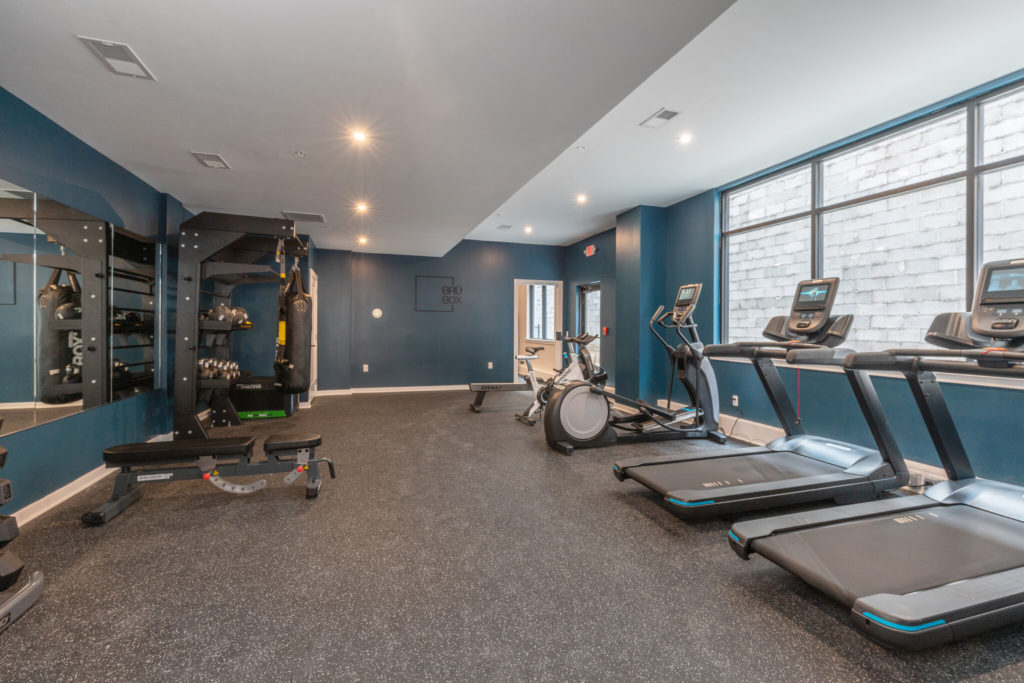
BruBox at 3120 Jefferson Street. Fitness center
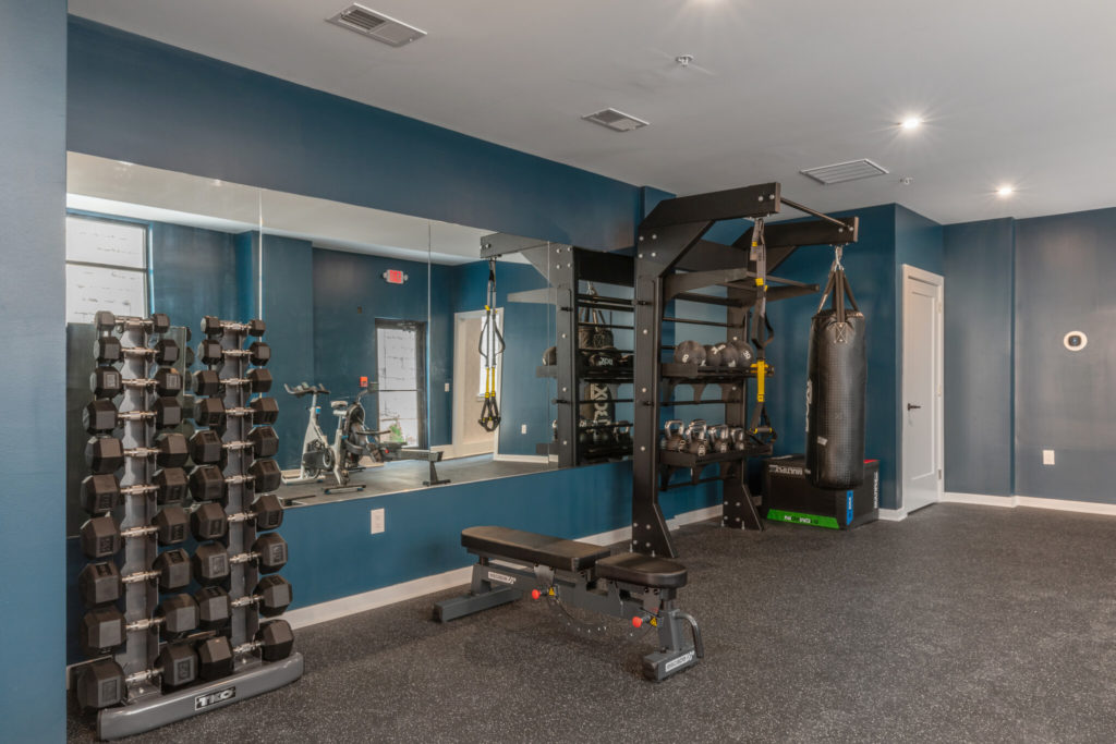
BruBox at 3120 Jefferson Street. Fitness center
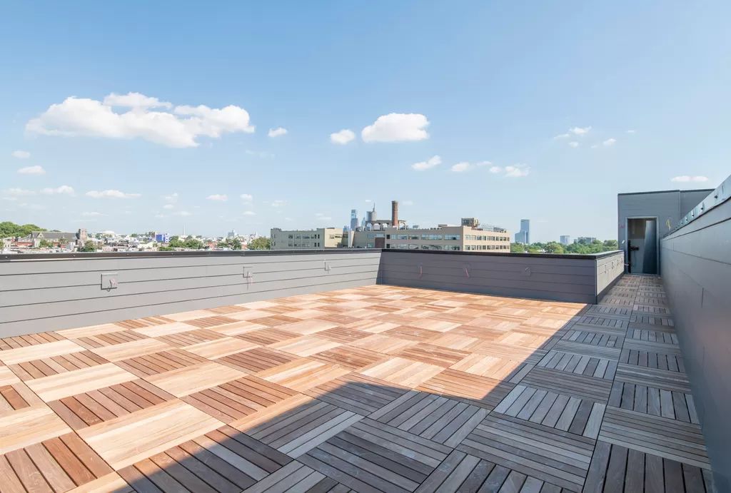
BruBox at 3120 Jefferson Street. Roof deck
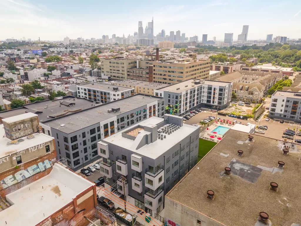
BruBox at 3120 Jefferson Street
In addition to car and bike parking, building amenities include an elevator, keyless latch entry systems, a security monitor, a fitness center, a package room, Amazon lockers. The building is fully sprinkled. BruBox also includes a roof deck that, while being rather roomy, utilizes a surprisingly small fraction of the roof, much of which which sits empty otherwise. If the roof structure may allow for this, we hope the developers would expand the roof deck in the future, or perhaps add a thin sedum layer that would allow for a green roof, which, in addition to aesthetic benefits, would improve insulation, lessen rainfall runoff onto the street, decrease the local heat island effect, and serve as a habitat for local birds.
BruBux stands on the south side of the block between North 31st and North 32nd streets, in the midst of Brewerytown’s central core district (spanning roughly between 30th and 32nd streets east-west and Thompson and Oxford streets north-south) that is notable both for its renovated factories and breweries as well as new mid-rise residential construction.
The district still has ample room for future growth; however, its benefits, which include adjacency to Fairmount Park relative proximity to Temple University, Center City, and University City, are somewhat outweighed by a lack of nearby subway or regional rail service.
An obvious and relatively low-cost solution would be adding a SEPTA regional rail line to the tracks that run along the neighborhood’s northern edge. Such a station would greatly improve the quality of life and boost commute times not only for newcoming residents, but also for the long-established working-class community in the surrounding area.
Subscribe to YIMBY’s daily e-mail
![]()
Follow YIMBYgram for real-time photo updates
Like YIMBY on Facebook
Follow YIMBY’s Twitter for the latest in YIMBYnews

Well they got the box correct. Should be more seabox. This reminds me of when you go to a third world country and they build new condos for the wealthy. “Modern” new clean line and ugly. The architechts used instead of autocad, the sims and found a new cheat to give them an apartment building!
I don’t understand why all these suggestions aren’t brought up at the hearings before approval of the designs? We don’t want buildings that will contribute to climate change or lessen quality of life.